Head Like a Kite redux
Posted on June 16th, 2011 by steve
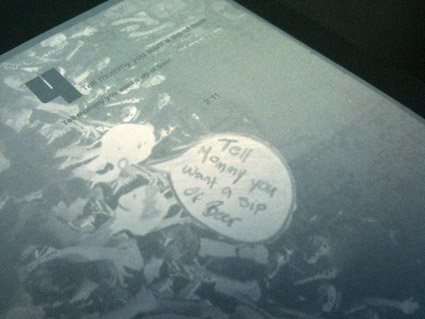
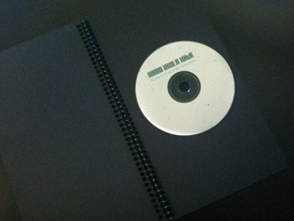
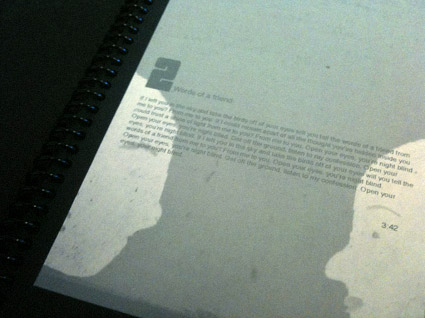
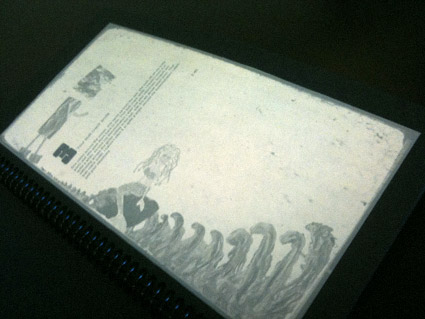
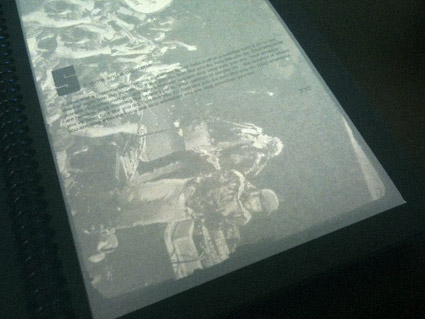
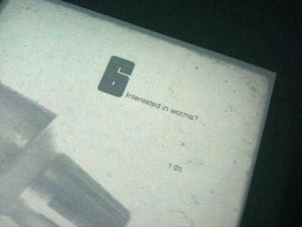
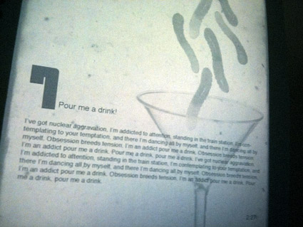
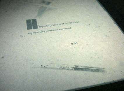
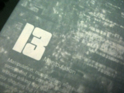
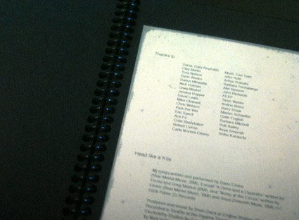
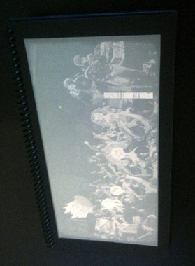
From my intermediate typography course: Student Allie Olcese’s experimental redesign of CD packaging for Head Like a Kite’s Random Portraits of the Home Movie.
Interpretative imagery veers from found photography, illustration, finger paints to hypodermic needles, gummy worms and tin foil – rendered in subdued, faded colors.
The final piece is housed in a wire-bound album, accented with carefully set 1970s-style shareware type.


Garmin 1490t GPS…
[…]while the sites we link to below are completely unrelated to ours, we think they are worth a read, so have a look[…]…
1.) Worth Reading…
2.) […]if you have a few minutes to spare take some time to read this post on[…]…
to provide additional guidance…
[…]which are designed to clarify the application of specific[…]…
1.) Color Scheme…
2.) […]example of a color scheme that I would like for my sites…
Travel Offers…
[…]all of these websites might not be completely relevant to our website but we absolutely believe you all should really go to all of them[…]…