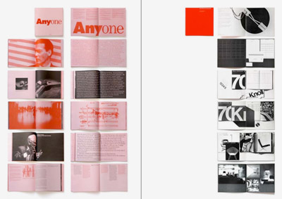
entries Tagged as [Swiss International Style]

‘A boldly different Star Trek experience’

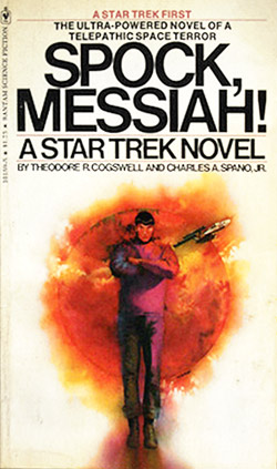
I read somewhere that this novel sent Gene Roddenberry into a tizzy. Don’t know if it were true, but this book has some nasty religion stuff, nymphomaniac Ensign Sara George, lots of sex and the crew in a nakkid crucifiction in the rain something or other. I remember reading this as a kid and thinking about the rather frank, adult content, This is NOT going to be made into a movie is it? Also thought: This Star Trek thing is pretty damn interesting (teenage hormones speaking, of course).

‘Ensign George was pure, unadulterated, wanton sex.’

Yeah.

This was one of the first original Trek novels, released in 1976. I loved the stark whiteness of the original glossy Helvetica-set cover (now faded); paired with wonderful artwork by Gene Szafran. Unfortunately, future printings ended up with more literal interpretations up front.

Here’s a blow by blow review. Snag a copy here (is this thing even still in print?)
Less and More: Braun in London

‘Transparent plastics and wooden veneers were mixed and colour schemes were limited to tones of pure whites and greys, the only splash of colour being allocated to switches and dials’

Designer Dieter Rams’ work for Braun inspired Jonathan Ive at Apple. And just opened at the London’s Design Museum is a Rams retrospective. Details here.

Too many type issues, so little time


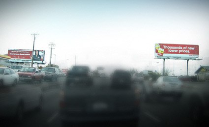
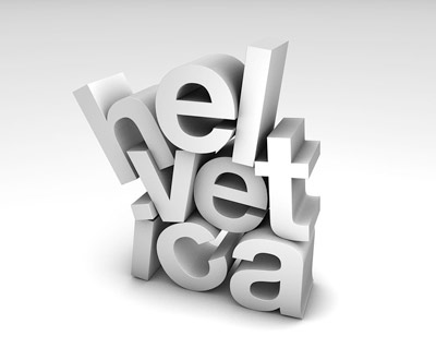
Competing Helvetica billboards, a visual from my morning commute

I’m not much of a purist. Well, that’s a lie. When it comes to type I am. Well, not always. I argue with myself a lot about it. It either works or it doesn’t. My litmus test: ‘Does it communicate?’ And if the goal for the local business is not to be read, then often, it works.

An article in this Sunday’s New York Times is all about this. Once one starts to see type, it’s all over. Read here.

Thanks to Susan and Jonathan for forwarding

More Swiss design


‘A Smoke Break To Remember’

Congress Hall in Biel, Switzerland. Not Photoshop, it’s real. Responsible party: Sabina Lang and Daniel Baumann. Details here.

Click image for larger version/jump.

Found via Twitter.com/Typegirl

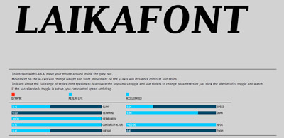
LAIKA: Interactive typography from Switzerland


LAIKA from Michael Flückiger on Vimeo

Traditional fonts are static. For their bachelor thesis, Michael Flückiger and Nicholas Kunz created a dynamic typeface called LAIKA.

LAIKA isn’t static. Style, weight, size, kerning and other properties can be adjusted on the fly using a control panel, as seen in the video. LAIKA can also respond to outside stimuli, such as people.

To test drive/interact with LAIKA, go here.


Interactive online interface for LAIKA

Found via Twitter.com/frank000

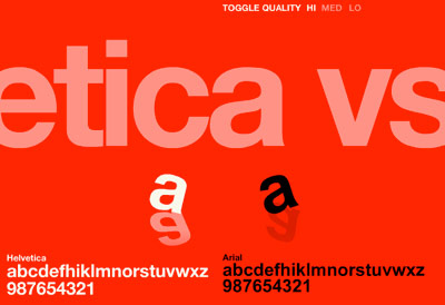
Helvetica vs. Arial: Game

This has been a favorite for awhile. Premise: You’re time-honored Helvetica and you get to beat the crap out of sneaky Arial. Unless Arial gets to you first.

Go here.

And call me crazy, but this game seems to go a bit faster these days. That bastard Arial has gotten even more aggressive!

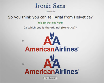
Helvetica vs. Arial: Identification

Take the quiz.

It ain’t easy. I actually got 19/20 and I supposedly know what I’m doing.

Swiss interpretations

A bunch of Helvetica posters here.

4:34 p.m.

My old store clock is noisy and uses big batteries. But it looks neat.

For as long as I could remember, San Francisco’s KFOG would play The Toyes’ Smoke Two Joints at quitting time on a Friday afternoon. Here’s three versions, including takes by Bob Marley and Sublime  . . .
 

get the playlist or create your own at mixpod.com
please support the musicians on my player by legally purchasing their music

Akzidenz Grotesk and industry

Köln-based graphic designer Tobias Battenberg projects Akzidenz Grotesk (the forerunner of Helvetica) onto industrial surfaces.


Found via Flores en el Atico

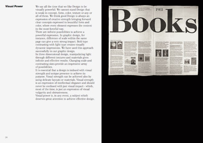
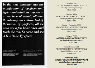
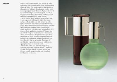
Vignelli’s new type book: free download

Swiss International Style guru Massimo Vignelli has released a new book on using type in graphic design. In it he explains in concise detail how it’s done. And as with all his work, it’s precise, clean, neat. Also, it’s free.

Download here: The Vignelli Canon [PDF]


Creative Commons License

the work at the mehallo blog. beta. is licensed under a creative commons attribution - noncommercial - no derivative works 3.0 united states license.  if reposting, credit must be given to steve mehallo - and if possible, please provide a link back to the mehallo blog. beta.

i include images for the purpose of critique, review, promotion and inspiration - and always make my best effort give credit/link back to the original source.  if i’ve screwed up, please fire me a note.

page layout based on the wordpress 'darkwater theme' by antbag, adapted and redesigned by mehallo.  valuable php assistance from bill mead.