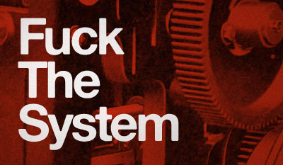
‘Fuck The System’

Just my mindset this morning.
Set in Alte Hass Grotesk, a free font based on the ‘cold type’ version of Helvetica. Download here.

Just my mindset this morning.
Set in Alte Hass Grotesk, a free font based on the ‘cold type’ version of Helvetica. Download here.
‘Legend has it that Helvetica came in and vanquished the competition. Paul Shaw shows that it didn’t happen that way’
In his new book, Helvetica and the New York City Subway System: The True (Maybe) Story, designer and historian Paul Shaw (below) takes a look at some Swiss type and the trains of the MTA.
Pre-order your copy here (book drops March 11, 2011). Official site here. Idsgn interview with Shaw here.
Found via Delve Withrington
Check out krystian ‘junkyard dogs’ kujda’s photostream at Flickr.
Reminds me of things in my garage.
Picking fonts, not the easiest thing to do. But design student Julian Hansen has created a poster that kinda breaks it down into easy solutions.
Click the above image for a full size version.
Are there really easy solutions?
Swiss design uberguru Massimo Vignelli believes so. Here’s I Love Typography’s take on The Vignelli Twelve.
Found via Typekit

NASA Meatball
Here’s a brief history of NASA’s logos, including the ‘meatball’ (above) and the ‘worm’ (below).
The worm was put to rest in 1992. If you wish, condolences can be left here.

NASA Worm
When it comes to official type, NASA is Helvetica, Futura, Times, Garamond and something . . . Victorian?
Article here.
Plus
Here’s a look at some goofy names for some other classic ‘bugs.’
‘TeuxDeux is a simple, designy, free, browser-based to-do app.’
A collaborative product from swissmiss and Fictive Kin. And it’s FREE.
Demo video above. Grab it here.