entries Tagged as [graphic design]

‘Do not fuck with graphic designers’


Before


After

I love good information graphics. And bad information graphics make my eyes bleed.

Check out this redesign by Robert Palmer (and strong letter to Rep. John Boehner) of a recent visual attack on the Democratic Health Plan.

This is an excellent example as to why graphic designers (well trained graphic designers) can do a lot more than just push buttons on a computer. Or make a logo look nice. Good graphic design is about good communication – and can be world changing.

(That’s my soapbox for the day. Thank you for reading.)

Found via Twitter.com/angelaglenn

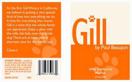
Eric Gill: The wine

Wine label inspired by the work (and life) of font designer Eric Gill (1882-1940). Student-designed project.

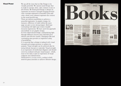
Armin Hofmann’s Graphic Design Bible

Like Helvetica? Like the Swiss International Style?

Armin Hofmann’s Graphic Design Manual (1965) is what I learned out of – and if it weren’t out of print, I’d be using it in my basics classes. (right now, I have a few slides made from my dog eared edition as part of a form lecture)

Graphic Design Manual breaks composition into basics: dot, line, confrontation, plus letters and signs. And it shows by example how these basics can be applied to good, clean graphic design: form, composition, typography.

I’ve seen it going for upwards of 90 bucks in some listings. As I write this, there are 22 used available at Amazon starting at $4.10.


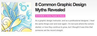
Totally blunt: 8 common graphic design myths revealed

Thinking about going into graphic design? Wanna know what you’re getting yourself into? What’s it all about?

Click the image and read thru:


Found via Twitter.com/Colorburned

Hm. More Blue Note mining  . . .


Image via dvisible magazine

Graphic designer Reid Miles and the Blue Note label – incredible album cover design. Here’s a great article on Miles.

And here’s the Wu-Tang albums as Blue Note releases. Found via Twitter.com/Sandoer.

What to expect from a graphic designer

Good graphic designers are trained to do amazing things in the realm of communication. And many clients just see the surface: make me a logo, I like yellow, so you should use yellow.

This article really nails it:

How to (and not to) work with a designer by Daniel Will-Harris

(Nails it so well, I’ve posted it as a link as part of the Manifesto at my website)

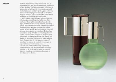
Vignelli’s new type book: free download

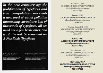
Swiss International Style guru Massimo Vignelli has released a new book on using type in graphic design. In it he explains in concise detail how it’s done. And as with all his work, it’s precise, clean, neat. Also, it’s free.

Download here: The Vignelli Canon [PDF]


Creative Commons License

the work at the mehallo blog. beta. is licensed under a creative commons attribution - noncommercial - no derivative works 3.0 united states license.  if reposting, credit must be given to steve mehallo - and if possible, please provide a link back to the mehallo blog. beta.

i include images for the purpose of critique, review, promotion and inspiration - and always make my best effort give credit/link back to the original source.  if i’ve screwed up, please fire me a note.

page layout based on the wordpress 'darkwater theme' by antbag, adapted and redesigned by mehallo.  valuable php assistance from bill mead.