‘Do not fuck with graphic designers’
Posted on August 1st, 2009 by steve

I love good information graphics. And bad information graphics make my eyes bleed.
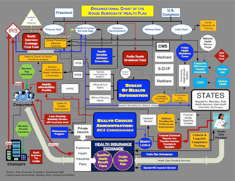
Check out this redesign by Robert Palmer (and strong letter to Rep. John Boehner) of a recent visual attack on the Democratic Health Plan.
This is an excellent example as to why graphic designers (well trained graphic designers) can do a lot more than just push buttons on a computer. Or make a logo look nice. Good graphic design is about good communication – and can be world changing.
(That’s my soapbox for the day. Thank you for reading.)
Found via Twitter.com/angelaglenn


Not too surprising that it reminds me of the Lifeskins design.
You noticed that too? ;)
the “before” one is appalling.
At first I thought I was looking at a board game then when I saw the second design I realized this is not the case! lol Big difference.
Garmin Nuvi 1490t GPS…
[…]just below, are some totally unrelated sites to ours, however, they are definitely worth checking out[…]…
1.) Color Scheme…
2.) […]example of a color scheme that I would like for my sites…
1.) More…
2.) […]if you want to read a bit more then I recommend the following[…]…