entries Tagged as [graphic design]
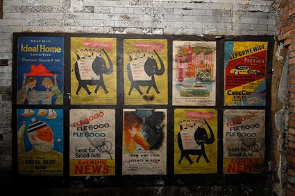
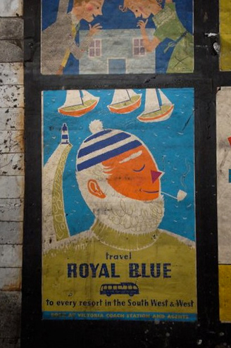
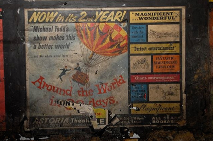
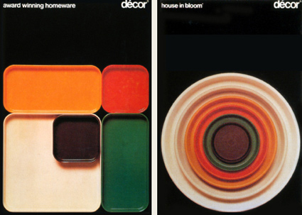
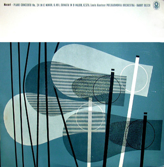
From England: Tube posters from 1959
‘Discovered in Notting Hill Gate tube station, 2010 – wholly inaccessible so please don’t ask the staff! These are official photographs so please credit London Underground.’
Flickr (with great details) here.
Found via Rebecca Cottrell; with credit to the London Underground
Zapfino: Really fast
‘Real time: 1 hour 28 minutes, footage was recorded nonstop in one sitting. I was going as fast as I could so there are some imperfections here and there.’
Student Tony Wang’s final project from my experimental typography course at The Art Institute of California Sacramento. Tony spent the past eleven weeks doing a multifaceted study of the work of Hermann Zapf.
It culminated in the above video – vector-based drawings/tracings of Zapfino caps.
Each drawing was hand rendered (no live trace) in Adobe Illustrator. (For my beginning courses, students have to draft letterforms by hand with pencil/compass. Tony’s beautifully realized final is the next logical step in the process.)
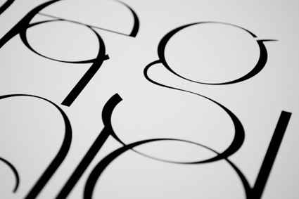
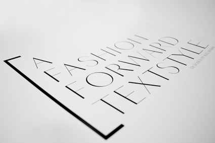
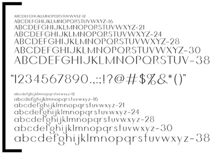
Meisky: Fashion ‘textstyle’
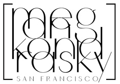
‘This typeface, titled ‘Meisky,’ was designed for a San Francisco fashion designer. With slim lines, geometrically balanced proportions and high contrast’ -kb
Fashion typeface designed by (a former student of mine) Kile Brekke. More details here.
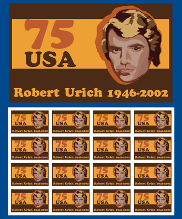
Robert Urich postage stamp
The work of Grace Kang.
Also, check out her downloadable Neutraface poster (scroll down to see).
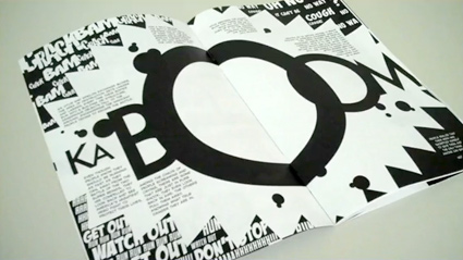
Virtue: Typographic comic book
‘comic books that use typography in place of imagery as the primary method of storytelling’
James Pannafino is working on producing a unique type-only comic book and is seeking funding thru Kickstarter. Website/more details here.
Found via James Saturnio
Mostly 2 letter Scrabble words
My wife is a Scrabble phenom. And one of her hush-hush strategies is the legal two letter words one can use in play.
For one of my specimens for my Chandler 42 fonts (above), she created a connected word chart listing these and a few others.
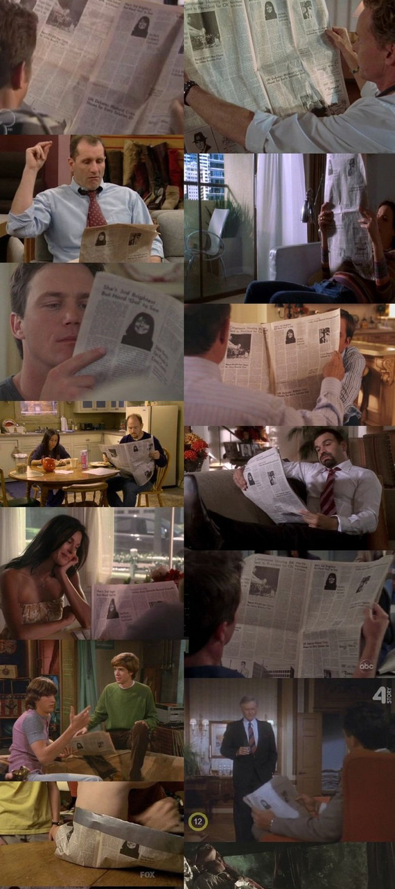
All the news on tee vee
‘Either they all use the same newspaper, or all these shows take place on the same exact day . . . which kind of makes my head hurt.’
Click to view larger/jump.
Found via Hoefler+Frere-Jones, The High Definite
