entries Tagged as [graphic design]

Dangers of Art School

We’re closing in on spring finals at the Art Institute. And I just got this note from a student:

School is like being hit by an invisible bus. A bus full of sardines, and being driven by a monkey. After being hit, the monkey flips you off, leaving you speechless and confused. So basically school is stinky and is going bananas.

And I’m thinking the ‘everything is due’ pressure is starting to sink in. And that I’m the monkey. And wow, I get to drive An Invisible Bus.

in perspective
But in all the melee going on right now, I’d like to see something more positive come of this. Usually the positive part hits when standing in a classroom filled with incredible final projects – which I hope happens next week.

This is my spin. It’s what I do these days:

I’m a game show host in a forced labor camp.

But – I was recently talking with web instructor and confidant Bill Mead – and we both agreed that we really love teaching in a creative environment. Because our students really are nuts. In such a great way.

And that’s so cool. It’s fantastic to be around all that creative energy all of the time.

The world needs more creative and fun people. Who work hard. Who can change the world.

more learnt in school
New video (above) from Raina and Brent as part of their totally random What I Learned in School series.

What started as a few photos is now a series. They’ve been making these pretty much on a weekly basis at this point.
Spot

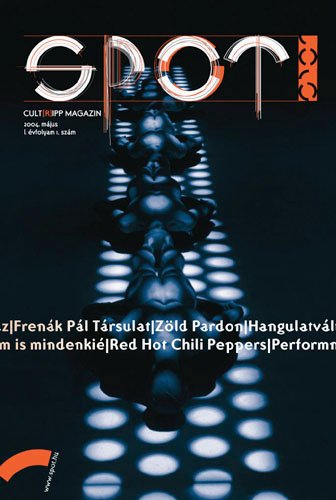
From 2004: Magazine cover design by Amondó Szegi, co-founder of the Fontana Font Foundry.

Magazines in motion

‘Photographer Alexx Henry and his team show you how a magazine might look in the not-so-distant future with the October cover and spread for Outside Magazine.’

Kinda like this, but different.

Found via Jake Favour

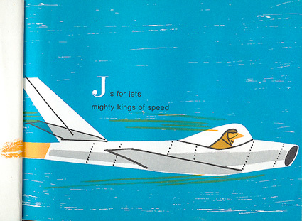
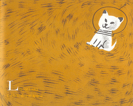
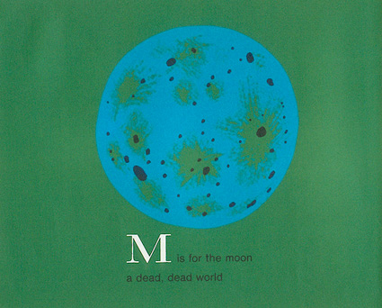
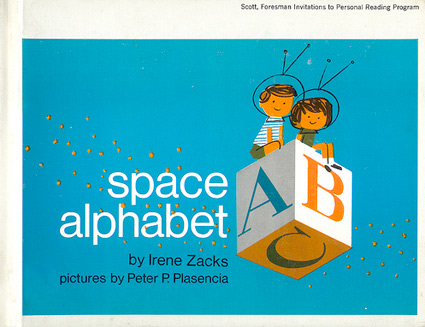
Space Alphabet, 1964

Flickr set here.

Found via Martin Klasch

‘It hasta be Shasta’

Shasta ad from the 1960s.

Found via wesclark

Air-vents

Air-vents are goood.

Vintage medical tape tin. Photo by mehallo.

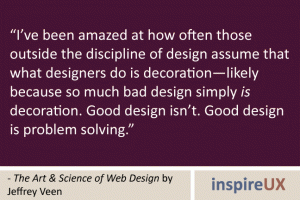
Defining terms: Design is not decoration

I’ve said this in the critiques in my design classes:

‘Are you a designer or a decorator?’

The distinction is a designer is a problem solver. In graphic design, a designer is a problem solving communicator. Graphic design is a communication field and the nuance in definition is what can separate novice from professional. [Read more →]

David Carson in Berlin

‘I think David Carson is at a loss for what rules to break, as he has now done away with them all’ -yves

‘David Carson is the David Byrne of design.’ -leandro

‘bullshit. all bullshit’ -pablo

Still pissing people off, still provoking.

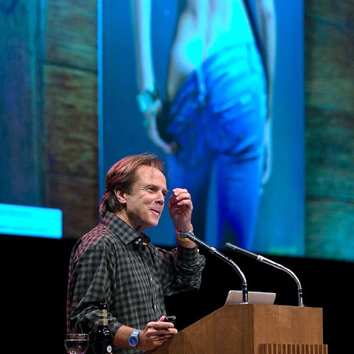
Here’s a summation of David Carson’s talk at TYPOBerlin 2010.


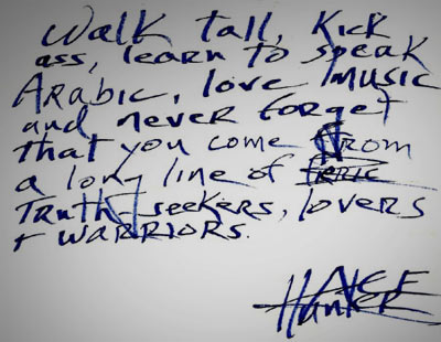
HST quote

Nothing could ever top the Hunter S. Thompson talk I attended back in 1990.

Drove miles to see THE Gonzo journalist himself; HST showed up on stage, bottle of whiskey in hand, drunk. Hit on the woman presenting him. Mumbled a bit, started yelling at the audience, they yelled back. Went on for a few minutes. Then he left.

Tickets were 18 dollars.

Gill Sans in French

Gill Sans video by Matthieu Dufour and Carl Soper.

(France also had French Futura.)

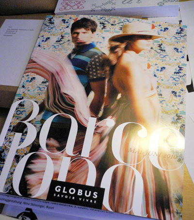
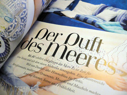
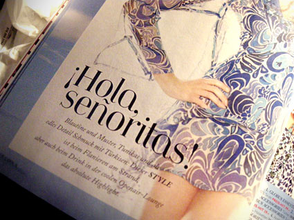
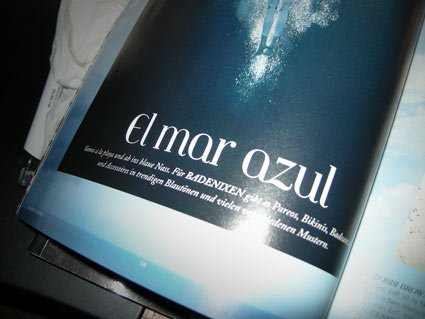
Jeanne Moderno in Basel

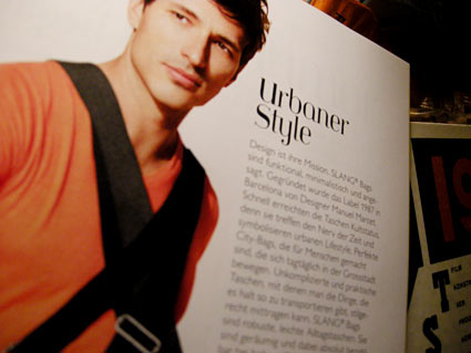
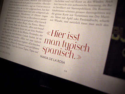
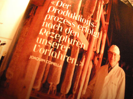
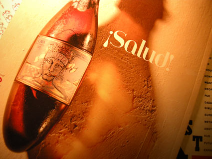
‘I was at a department store here in Basel and this in-store magazine caught my eye. The focus is Barcelona and all the headings are set in what must be Jeanne Moderno!’ -Nina

Nina Stössinger not only snagged me a copy of Globus Savoir Vivre‘s Barcelona issue; she also popped it in the mail. It just arrived a couple days ago.

It’s always great to see my fonts in use. Especially when the designer uses my funky accents.

First two photos by Nina Stössinger, the rest by mehallo

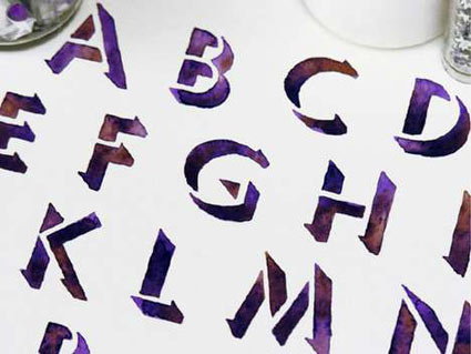
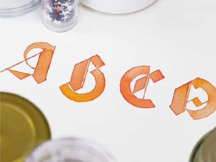
Sasha makes type

The work of Sasha Prood.

Found via Trendhunter


Creative Commons License

the work at the mehallo blog. beta. is licensed under a creative commons attribution - noncommercial - no derivative works 3.0 united states license.  if reposting, credit must be given to steve mehallo - and if possible, please provide a link back to the mehallo blog. beta.

i include images for the purpose of critique, review, promotion and inspiration - and always make my best effort give credit/link back to the original source.  if i’ve screwed up, please fire me a note.

page layout based on the wordpress 'darkwater theme' by antbag, adapted and redesigned by mehallo.  valuable php assistance from bill mead.