New W
‘The last logo ran for 20 years’
A few months back, Stefano Tonchi jumped over from singular letter T magazine to reboot singular letter W magazine. And the results are quite elegant.
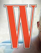

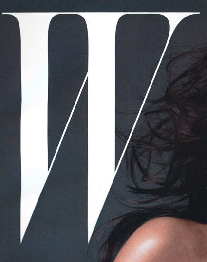
Up front, design director Joseph Logan dropped W’s bulky old double stroked W (above) in favor of a more classical approach.
A new, condensed italic ‘Didone’ W now gives sharp edges to the top left corner; the open space on the right allows for some headroom.
Inside, modern condensed type runs throughout – with W now organized by the five Ws of journalism: ‘Who What Where When Why,’ with ‘How’ (quite possibly) reserved for another magazine with big letters on its cover.
Article on the changeover here. Official W magazine website here.
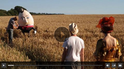
And below, a video about the makeover; click to view/jump.