entries Tagged as [graphic design]
Food in Jars
I love canning stuff. And it’s getting to be the time of year to cram some stuff into bottles.
Pictured, logo design by Roger Estes for Marisa McClellan’s Food in Jars blog.
A color-coded Ralphs
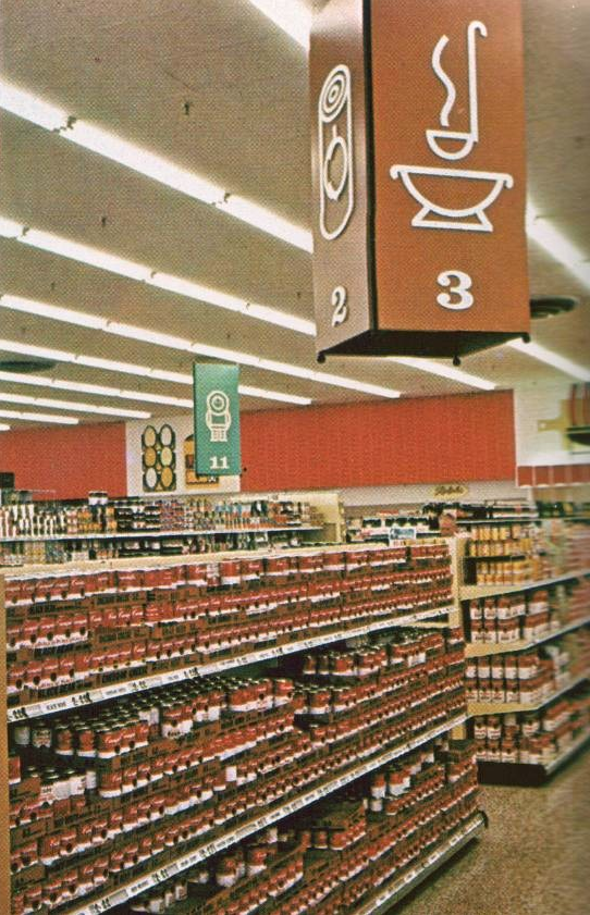
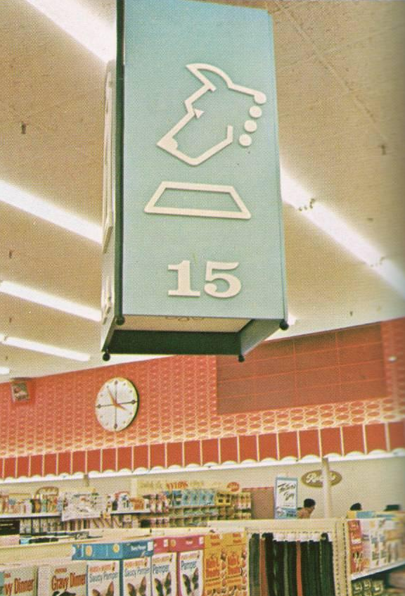
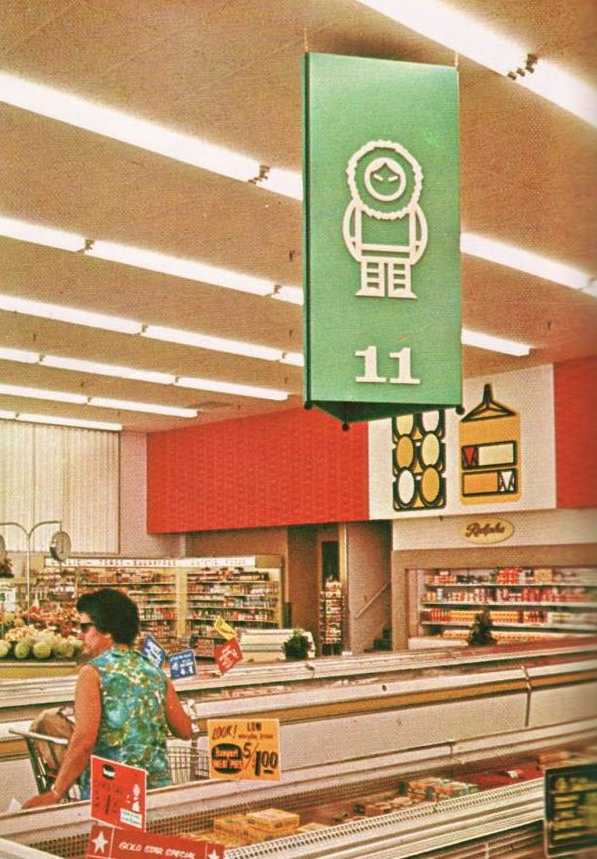
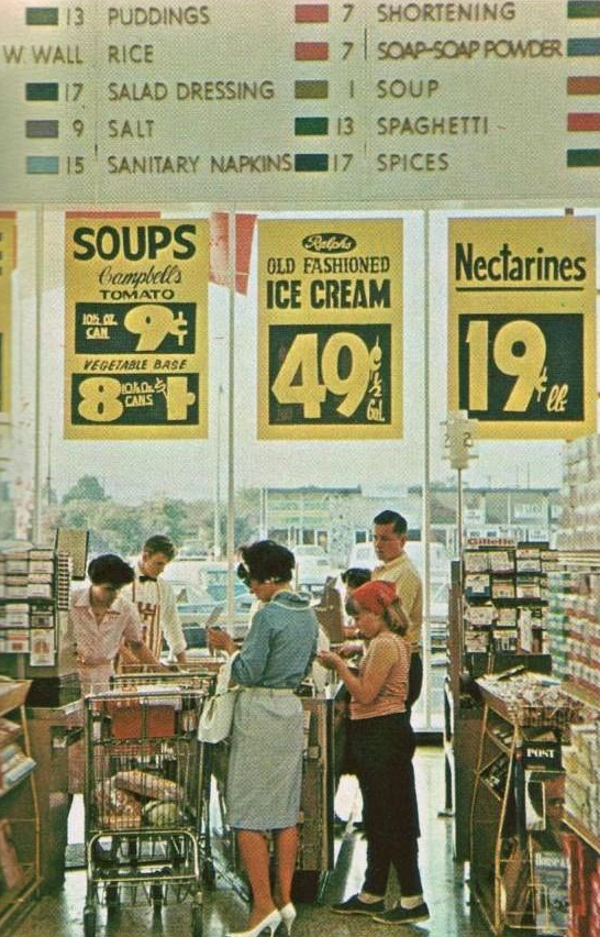
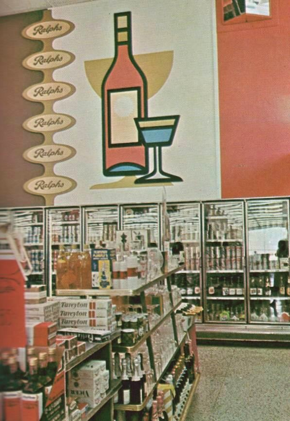
‘And so was born the ‘shop-at-a-glance’ concept’
An ill-fated design experiment from 1965: Ralphs remodeled with departmentalized, color-coded graphic icons. Article here.
I use a lot of color coding in my own work – but with the assumption that the end user will need other organizational tools to find their way around. ‘Shop-at-a-glance’ never quite caught on; tho I’d love to see what data Ralphs collected as part of their process.
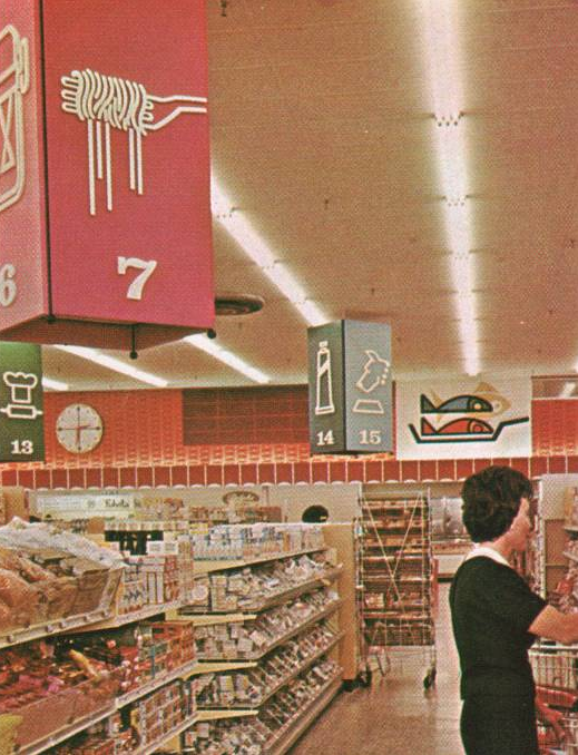
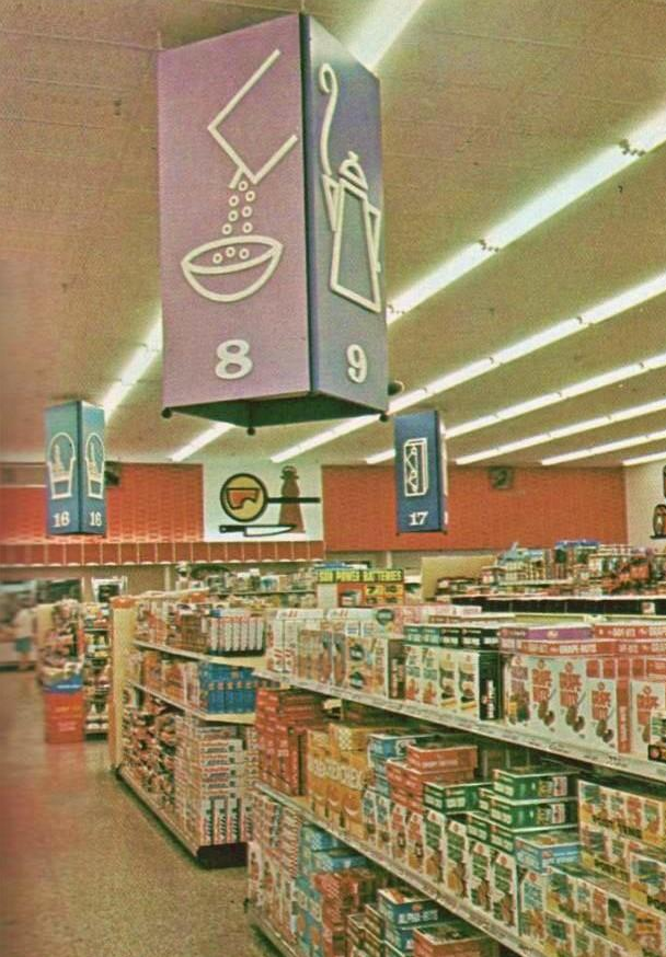
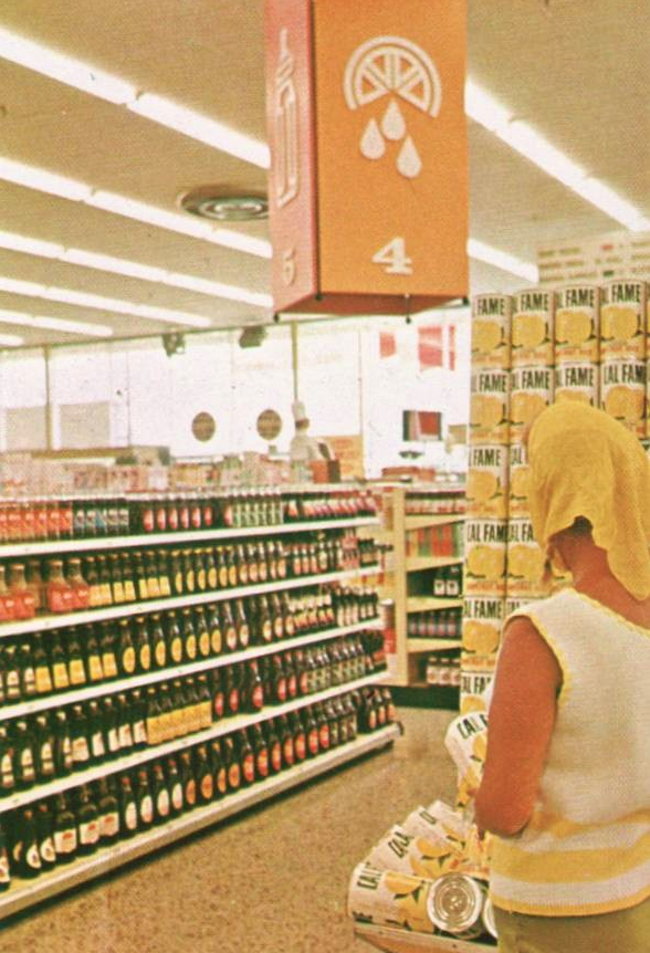
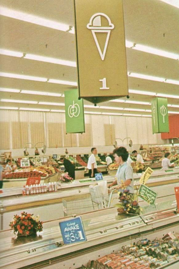
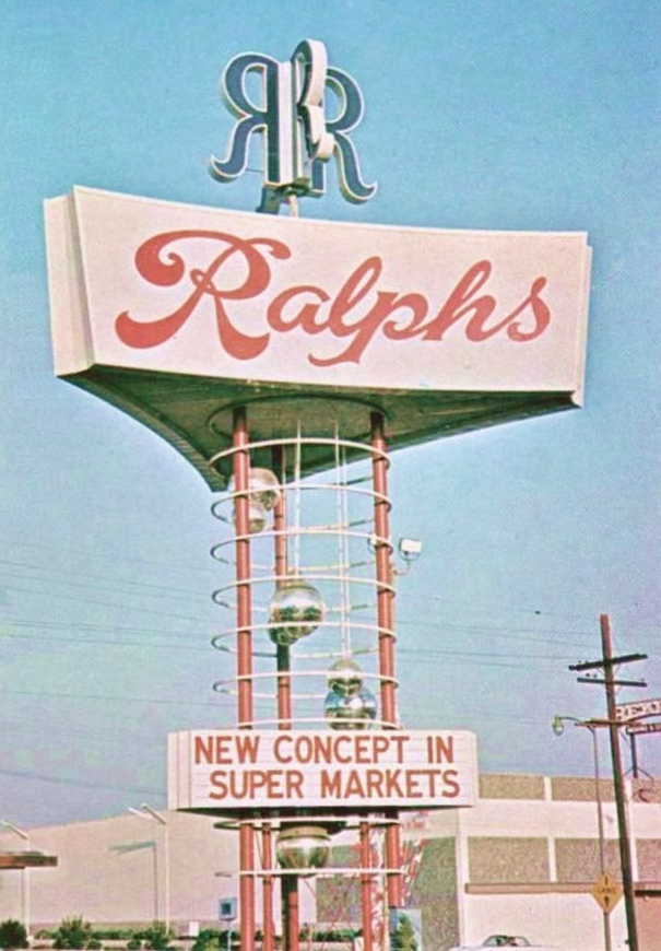
Found via Pleasant Family Shopping
Black Friday
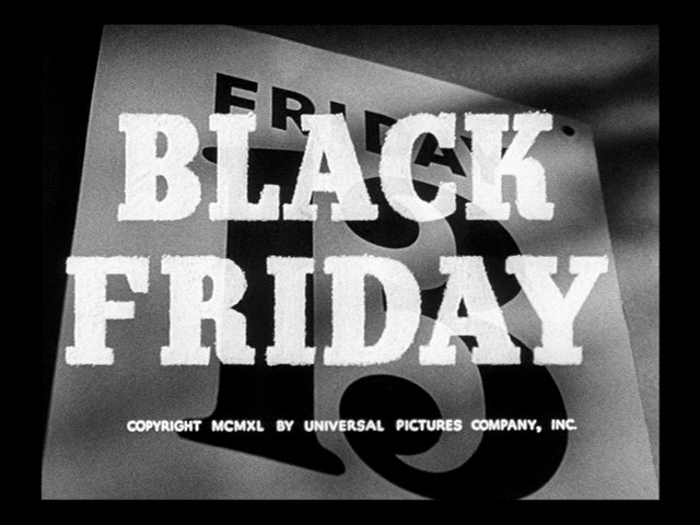
‘the terror of suffocating to death in a closet’
May visit a few stores today just as a behavioral study.
Title card and trailer for Black Friday (1940).
Found via nineteenfortyone
Designing fonts: Shaping, kerning, tools
I’ve been drawing some form of type since the 1980s. And have been teaching type for several years now.
It’s hard to ‘go digital’ when introducing typography, since letterform history goes back hundreds (and thousands) of years.
So I still use 15th century era handtools in my introductory type courses.
Good fonts still contain elements from long ago – and today, all we really do is recreate what was once done with broad pens – using digital tools.
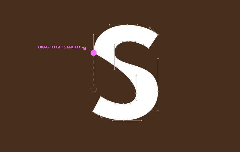
font games!
To get a taste of how ‘us professionals’ render type these days, check out Mark MacKay’s brilliant Shape Type (pictured above) and Kern Type. Both are nutshell adaptations of today’s process – kerning being a majorly overlooked, but necessary typesetting skill.
digital type tools
Fonts today are vector-based, so a mastering the basics of Adobe Illustrator is the start.
Beyond this, there are a bunch of applications on the market for drawing fonts. FontLab is the big one, Fontographer is the old one with the easy interface – and TypeTool is a barebones student-discounted alternative. Unlike Illustrator, these font tools take into account how letters are drawn, with built ins that make it easy to adjust edges. Karen Cheng’s Designing Type is also a must resource to have.
And I do all my logo drawings directly in FontLab – after multiple sketches in pen and ink. It’s just easier that way.
Shape Type found via Mark Nutini
Champagne Valentine
The work of Amsterdam-based collective Champagne Valentine.
Reel features Stefan Hattenbach’s first typeface, New Global.
A World Without Type . . .
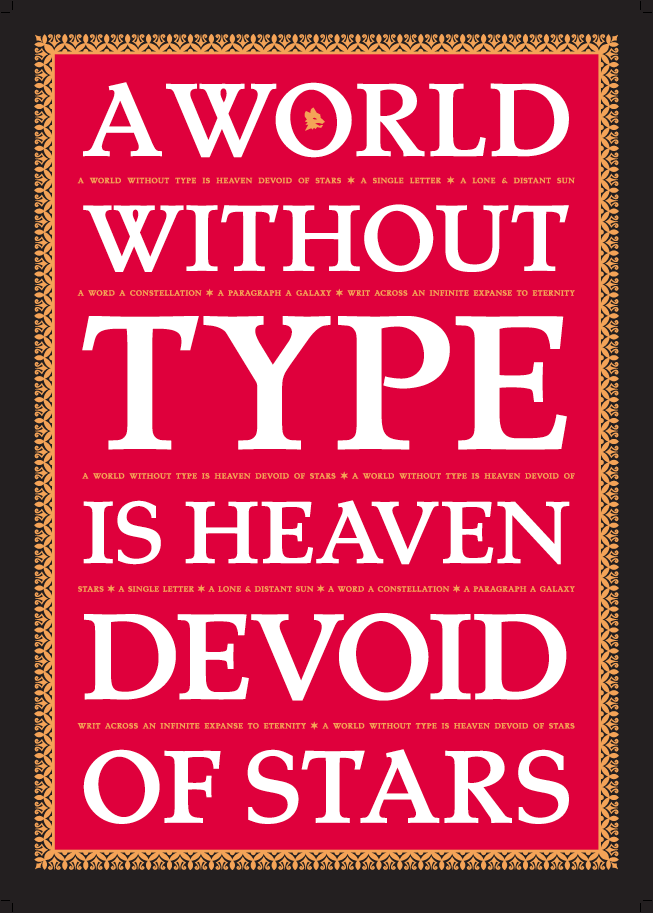
‘Screen-printed in Tokyo on beautiful, red Plike paper with gold, white and black inks.’
Just released: Limited edition typography poster designed by Swedish type designer Stefan Hattenbach, set in his own Tarocco Bold.
Available here.
