entries Tagged as [fonts]

Jenson’s Italic


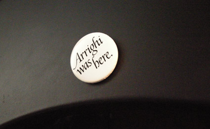
‘Arrighi was here’ button by George Abrams

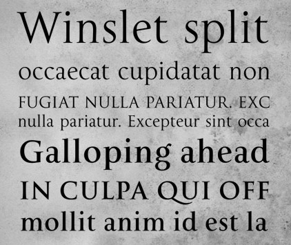
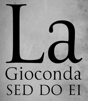
Any current drawing of the type work of Nicholas Jenson (1420-80) that includes an Italic is doing a little fudging. Since (like Trajan and lowercase), Italic wasn’t quite around yet when Jenson was making type.

Typically the work of Ludovico Arrighi (1475–1527) is adapted as the companion font to Jenson – as the Italic.

Monotype did this with its Jenson-influenced Centaur – and Adobe Jenson sports an Arrighi-influenced italic. [Read more →]

Trajan with lowercase

Why doesn’t the Trajan font have lowercase?

Traditionally, Trajan is based on a carefully drawn and carved inscription at the base of Trajan’s Column in Rome – crafted sometime around 113 A.D.

And basically, lowercase didn’t exist yet. What we call lowercaseminuscules, our second alphabet – evolved over the next 1000 years (or so).

So what would Trajan look like if it actually did have a lowercase? This is open to interpretation.

Dave Farey and Richard Dawson’s La Gioconda is one take on this, adapting the 16th Century lettering of Giovanni Francesco Cresci as the companion letterforms.

Check it out here.

Reimagining the Roman Colosseum with type

‘Over the course of the next 12 months, the artwork was handcrafted character by character, totaling roughly 250 hours of work from start to finish. Characters from the Goudy Trajan and Bembo Pro typefaces form the Coliseum (or Colosseum)’

Cameron Moll’s limited edition Colosseo letterpress posters. Video above, more project details here.

‘Vulgar, 60-year-old emoticons’

‘Nick Martens digs into the pages of the great dictionary that chronicles the history and development of the English language, and unearths some typographic gems.’

Great article about obscure typographic references in the Oxford English Dictionary. Read it here.

Photo found via emdot

Making Metal Typefaces in the 21th Century

‘This project has a dual goal of documenting the almost-lost skill of creating metal fonts and of capturing the personality and work process specifically of practitioner the late Canadian graphic artist Jim Rimmer (1931–2010)’

Richard Kegler’s long-delayed documentary, Making Faces: Metal Type in the 21st Century, has just secured just enough funding for completion.

For more about the film, go here and here.


Rimmer and Kegler

McGrew is back


‘Mac McGrew’s 1993 2nd, revised edition is an important book for any printer, collector, student or aficionado of letterpress type. Equally valuable as a typeface reference and an insightful history of the typemaking industry in America.’ –Letterpress Type

THE book on metal typefaces cast in America (hint: not all of them have been digitized) is Mac McGrew’s American Metal Typefaces of the Twentieth Century.

Long out of print, this 398 page resource is available once again. Snag your copy here.

Pictured: my dog eared, Post-It note filled edition.

Found via Steve Matteson

The Clarendon trend


Jason Munn

Just had a discussion – and major test question – involving 19th Century wonder Clarendon in my history class. As a type, Clarendon has been popping up all over the place for a bunch of years now.

I use it (paired with Jenson) for handouts in my introductory type course at ARC, up until recently, it was the corporate font for Starbucks  . . .  it just boldly says, read me.

New article (and cool samples) posted by SOTA’s Tamye Riggs here.


Jessica Fleischmann


Madeleine Eiche


Simon Dovar and Nils Davey

Picking fonts

‘Is there a way to know what fonts will work together? Building a palette is an intuitive process, but expanding a typographic duet to three, four, or even five voices can be daunting.’ –H&FJ

‘how do I pick the right font?’
. . .  is the most common question I’m asked in my type courses. And my answers aren’t usually simple. I liken it to picking the right suit, tie and shoes.

What handbag will work best, nail polish, lipstick, gloss or none, which eye liner will simply look great  . . .

One learns by doing. [Read more →]

Type-driven advertising

Many, many samples: Ads using fantastic typography. Go here.

Found via Veer

Joos Italic

‘Joos is a revival of an upright italic created in 1536 in Gent. This work is not a formal revival but it faithfully fits into the scheme of Joos Lambrecht (punchcutter), which was to idealize roman types by bringing together the characteristic graceful shapes of italics and the angularity of romans.’

Not all Italics are slanted – they have their origins in calligraphy.

More about Laurent Bourcellier’s beautiful Joos fonts here.

Found via Colin M. Ford

More characters!

Poster by graphic designer Michael Ciancio, available thru his website.

Found via Apartment Therapy


Creative Commons License

the work at the mehallo blog. beta. is licensed under a creative commons attribution - noncommercial - no derivative works 3.0 united states license.  if reposting, credit must be given to steve mehallo - and if possible, please provide a link back to the mehallo blog. beta.

i include images for the purpose of critique, review, promotion and inspiration - and always make my best effort give credit/link back to the original source.  if i’ve screwed up, please fire me a note.

page layout based on the wordpress 'darkwater theme' by antbag, adapted and redesigned by mehallo.  valuable php assistance from bill mead.