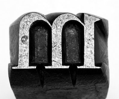
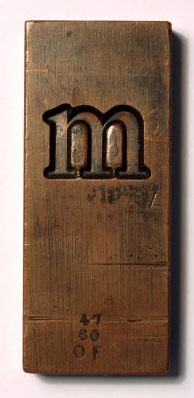
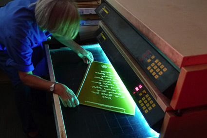
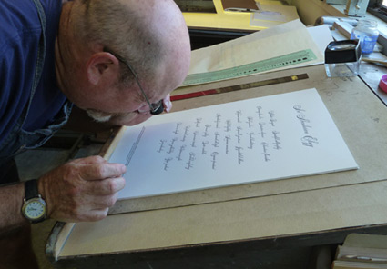
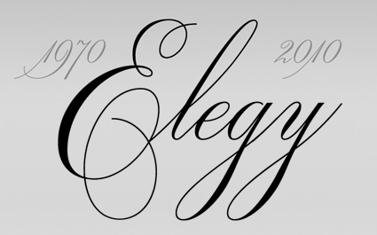
entries Tagged as [fonts]

Recasting Caslon

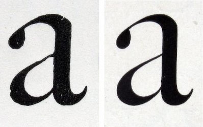
“Caslon’ is an example of what became known in the commercial world of the 20th century as a ‘brand’: a family name that was not only widely recognised by customers but which stood as a guarantee of long-standing integrity.’

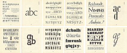
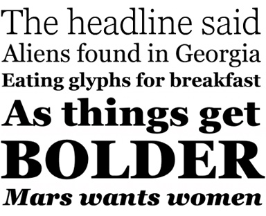
William Caslon’s types keep making a comeback.

One of the first revivals was made in the late 1800s by Chiswick Press, London.

Full story here.

‘Shitty piece  . . .  It is very bad history’

‘It was Benjamin Franklin’s favorite typeface, and the first printings of the Declaration of Independence and the U.S. Constitution were set in Caslon.’

I am a history junkie.

And I loved the scene in HBO’s John Adams miniseries when Adams disputed the accuracy of the above painting (video, below). And how Ben Franklin’s approach to French diplomacy was more  . . .  ardent, than formal.

(I also loved how the miniseries used titled camera angles – like the United States was founded by villains from the old Batman tee vee series)

William Caslon’s fonts were the typefaces of the American Revolution.

Here’s some great reads on early American documents – as handy PDFs.

And here’s a link to John Adams on DVD.

Caslon ‘g’

Student and Caslon g from my Spring typography course [artnm 303] at American River College, Sacramento.

Class starts up again this Friday August 28, 2010. Waiting list is full. Can’t teach everyone.

It’s gonna be an unavoidable ‘that teacher’s an asshole’ session.

Self portrait by Samantha Costanilla

Pepsi and the Font Me mug

My type mug goes well with the real Pepsi that’s back in stores this month.

Get the mug here.

Recueil d’Alphabets à Dessiner

Pages from Recueil d’Alphabets à Dessiner by René Henry Munsch (1951).

More here.

Found via Biggest Apple

Georgia, expanded


A few fonts from the new Georgia Pro type family

Matthew Carter’s Georgia is among my favorite fonts. And recently, Georgia turned into something a bit  . . .  more.

I love that Georgia exists, or the interwebs would be Times forever (well, until WOFF kicks in) – and without Georgia, the argument that sans fonts online are more legible (which I think is hooey) sort of wins.

And if you’re reading my blog directly online (without using RSS), you’re reading Georgia. It does what I like it to do. Reads well. [Read more →]

Metal Spiekermann!

Isla Waite’s extremely heavy, laser cut student final from my most recent experimental typography course. Her research subject was Erik Spiekermann.

No digitally-made drop shadows here.

Type Munching Dinos by Tiffany Valdez.

Stephen Fry and the Guttenberg Press


Part one

‘Fry travels across Europe to find out how Gutenberg kept his development work secret, about the role of avaricious investors and unscrupulous competitors and why Gutenberg’s approach started a cultural revolution.’

Stephen Fry loves design. That’s one of the reasons he’s really cool. [Read more →]

TypeCon next week, Wood Type today

‘We’ll explore the hot button topic of web fonts; antique type and lettering of the textile trade; the typography of Disneyland; making smart fonts even smarter; the influence of Charles Eames; liquid typography; west coast ‘Cholo’ style graffiti; and so much more.’

typecon 2010: babel
Big typography conference next week in Los Angeles. Wood Type preview in Carson today. Designer talks, workshops, dealer room, font makers, stuff.

and me
I’ll be giving my first ever TypeCon talk as part of their Type & Design Education Forum. My title is Tell Lies in the Classroom and Get Away With It. It will be as weird as what I normally do in a classroom.

Promise. [Read more →]

Elegy in letterpress

‘The broadside is printed on Mohawk Superfine Eggshell, White, 100t. Everyone attending TypeCon 2010 will receive a copy, courtesy of type quizmaster Allan Haley.’

A broadside tribute to ITC’s new Elegy font – printed in letterpress at Patrick Reagh Printers in Sebastopol, CA. The poster was typeset by the wonderful Ilene Striver – who’s managed to talk me into giving a presentation as part of TypeCon’s Education Forum – next Thursday. More about TypeCon in my next post.

More info about the broadsheet here.

Elegy


Original ITC logotype handlettered by Ed Benguiat, 1970


Elegy typeface designed by Jim Wasco, 2010

“Where can I get a font of the script used for the ITC logo?’ For almost four decades, this has been one of the most frequently asked questions of ITC. The answer has always been the same: ‘You can’t. The ITC script logo is handlettering and it is not available as a font.”

Now it is. Introducing: ITC Elegy. Two years in production, Jim Wasco took apart Ed Benguiat’s original Spencerian-style script and put it back together with updated spacing and a bunch of stylistic changes.

Detailed article here.


Comparison: Elegy and the original

Found via Delve Withrington


Creative Commons License

the work at the mehallo blog. beta. is licensed under a creative commons attribution - noncommercial - no derivative works 3.0 united states license.  if reposting, credit must be given to steve mehallo - and if possible, please provide a link back to the mehallo blog. beta.

i include images for the purpose of critique, review, promotion and inspiration - and always make my best effort give credit/link back to the original source.  if i’ve screwed up, please fire me a note.

page layout based on the wordpress 'darkwater theme' by antbag, adapted and redesigned by mehallo.  valuable php assistance from bill mead.