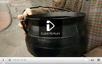
‘John Challen, manager of Blists Hill Victorian Town, explained why Abraham Darby I’s iron cooking pot changed the world’
Click to play/jump.
For more about the Darby Pot’s major contribution to the Industrial Revolution, check out the first episode of GoD. For more about Abraham Darby I, go here.
I’ve known Marian Bantjes a few years – mostly thru emails and online notes. I found her work years ago, it blew me away so I put it in an exhibition.
And in watching her recent TED video (above), I’ve noticed some career parallels. Though I’m not looking at a parallel of work (not even close), what I see is a parallel of thinking.
design rut
I’ve been a designer working ‘behind the scenes’ for over two decades.
I was a paste up artist and I have the scars to prove it. My first graphic design courses were part of a drafting program – no computers – and today I’m shocked at how important work habits developed during that time have become. I don’t consider my work innovative or new – simply bulletproof. And I’ve made a lot of money for a lot of other people. And mostly, I’ve never quite fit in with my contemporaries. And the battles that come from this have raged on for a long time.
A few years ago I had to ask myself this tough question:
Why the fuck do I no longer enjoy what I do??
The answer was telling. And not very simple. Part of it involves the temporary nature of my field. Most of what I’ve designed, doesn’t exist anymore.
But most of the problems I saw came from letting too many other people have control over what I do and how I do it. Working within perceptions of how others see my field – graphic design – really took the wind out of my sails. For this simple reason:
Graphic design can be so much more than people who work in our field think it is.
I seem to see this. But not many others do.
turnaround
About two years ago I made the conscious decision that I will only work on jobs that I enjoy.
This is a key decision, in that I’d reached a bottomed out, enough is enough point in my career. I had some serious work and financial setbacks and had to put a stop to the . . . bleeding. For lack of a better term.
And the work I have in right now, I love doing.
I love teaching, so I just took on SEVEN classes (all typography, one design history course) and this was one of the most fun quarters/semesters I’ve had. And in my spare time, I draw fonts, design really goofy stuff and post whatever inspires me to this blog. Because I love it.
Will it lead to something else? Who knows? Who cares?
But enough about me. Watch Marian’s talk. She’s figured it out, mostly. And what she does – what all visual artists do – is very important.
‘Now that we’ve got you interested in learning CPR and the abdominal thrust, go get properly certified by taking a class through one of the many certifying authorities in your local area’ –Super Sexy CPR
If someone strips down to their underwear in order to Heimlich me, I’m going to feel a tad awkward. Just sayin.
Found via Victoria Arriaga (another former student of mine)
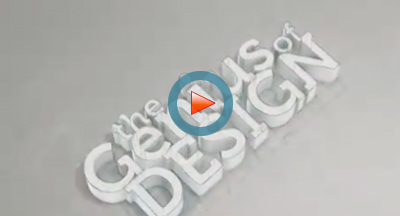
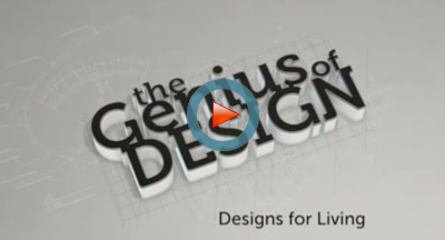
‘This five-part series tells the story of design from the Industrial Revolution through 20s modernism, the swinging 60s, the designer 80s and up to the present day. Features interviews with star designers like Philippe Starck and creatives from Apple and Ford; as well as design fans like Stephen Fry.’
Finally in the US we have a peek at the BBC’s brilliant series on design history, The Genius of Design. Posted above are episodes one and two. With logotype set in Museo, of course.
Update: The BBC blocked the Vimeo postings of these episodes – but – I found the bloody things posted on a server in China. Really. Click on the above images/links to jump/watch. And hey at this point, I’m not posting them myself. Just providing links.
Would love to have the entire series on a US-friendly (Region 1) DVD.
Found via (former student) James Saturnio and (other former student) Ai Buenafe
‘Real time: 1 hour 28 minutes, footage was recorded nonstop in one sitting. I was going as fast as I could so there are some imperfections here and there.’
Student Tony Wang’s final project from my experimental typography course at The Art Institute of California Sacramento. Tony spent the past eleven weeks doing a multifaceted study of the work of Hermann Zapf.
It culminated in the above video – vector-based drawings/tracings of Zapfino caps.
Each drawing was hand rendered (no live trace) in Adobe Illustrator. (For my beginning courses, students have to draft letterforms by hand with pencil/compass. Tony’s beautifully realized final is the next logical step in the process.)
We’re closing in on spring finals at the Art Institute. And I just got this note from a student:
School is like being hit by an invisible bus. A bus full of sardines, and being driven by a monkey. After being hit, the monkey flips you off, leaving you speechless and confused. So basically school is stinky and is going bananas.
And I’m thinking the ‘everything is due’ pressure is starting to sink in. And that I’m the monkey. And wow, I get to drive An Invisible Bus.
in perspective
But in all the melee going on right now, I’d like to see something more positive come of this. Usually the positive part hits when standing in a classroom filled with incredible final projects – which I hope happens next week.
This is my spin. It’s what I do these days:
I’m a game show host in a forced labor camp.
But – I was recently talking with web instructor and confidant Bill Mead – and we both agreed that we really love teaching in a creative environment. Because our students really are nuts. In such a great way.
And that’s so cool. It’s fantastic to be around all that creative energy all of the time.
The world needs more creative and fun people. Who work hard. Who can change the world.
more learnt in school
New video (above) from Raina and Brent as part of their totally randomWhat I Learned in School series.
What started as a few photos is now a series. They’ve been making these pretty much on a weekly basis at this point.
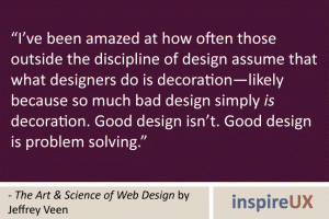
I’ve said this in the critiques in my design classes:
‘Are you a designer or a decorator?’
The distinction is a designer is a problem solver. In graphic design, a designer is a problem solving communicator. Graphic design is a communication field and the nuance in definition is what can separate novice from professional. [Read more →]
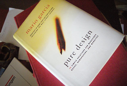
‘Included are insights into designing covers, formatting pages, selecting photos, using content, choosing a color palette, and picking type for newspapers, magazines, books, and websites’
Another great read. One of my favorites, Mario Garcia’s Pure Design is simple, to the point. A great overview of how to design for publications – from someone’s who been doing it a helluva long time. My copy is maimed by highlighter pen, my own notes and scribbles.
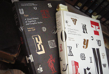
These two oversized coffee table books – which were published in the past year or so – are an odd sort.
Both volumes of Type A Visual History of Typefaces and Graphic Styles sell themselves as design history books.
They have the current editor of Meggs (and similar cover design), but the history is really just a backdrop (with, unfortunately, poorly annotated notes) to what the books are all about: They’re actually an incredible collection of rare typography specimens dated c. 1830-1930. [Read more →]