‘what i learned in school today’
Ever wonder what goes on in a creative classroom?
There is play, but it’s also a lot of hard work. Ask anyone in my Typography 3 course – this quarter, I’ve been doing Project Runway-like timed challenges every single week. Difficult, grueling – but students’ results have been incredible.
It takes years to become a graphic designer.
Usually 4-6 years of professional training. Which is why just buying Adobe Creative Suite won’t cut it.
There is no ‘design’ button on the computer that one can press. Creative thinking aids good design communication.
The button is a myth. Just like this.
Our years of training is also why us design professionals don’t take clients seriously when they say, ‘my teenage nephew could do work just like what you do.’
‘oh look, there’s a camera on this computer’
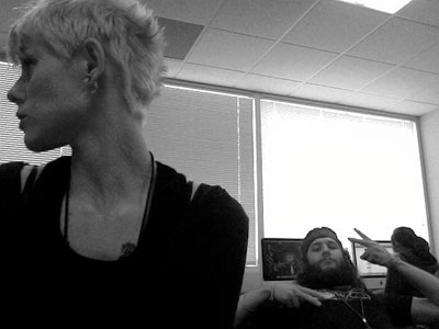
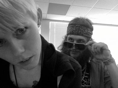
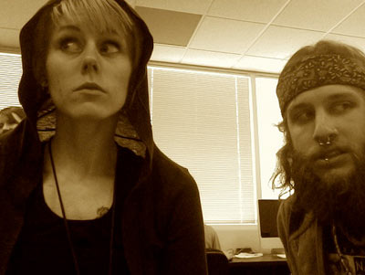
Shots taken at The Art Institute of California Sacramento, just a few days ago.
Pictured are students Raina Dayne and Brent Tyler goofin in their Digital Message Making class. With special appearances by instructor Holly Hadley and the always jovial Philip Roes.
More photos here.


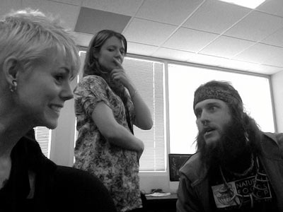
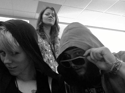

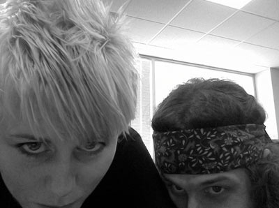
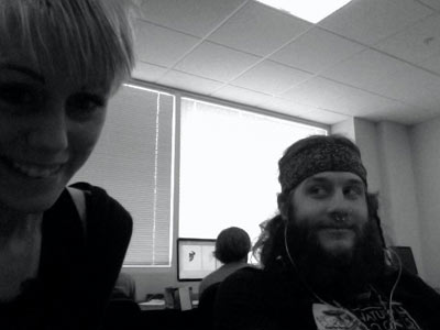






















HAHA! love these pics! I just checked out the “enhance this” movie, the dude who looks like Bon Jovi got the worst lines EVER… vector in?? what??
ps. there were boobs yesterday. (do I get fired now?)
You talking about MacGyver?
You’re fired. :)
Love the pics. looks like too much fun for a school! No wonder Phil is always jovial!
‘my teenage nephew could do work just like what you do.’
I HATE THAT LINE!!! I have lost too many jobs too family members. It is quite upsetting.
Recently I sent a project to a friend from high school, and he said, no joke, ‘That logo looks really cool, but I think it would be better if you brought it into photoshop, and put a lense flare on it. That would make it look tight.’
….
I think you should need a license to own photoshop.
I should include this too…
He then proceeded to take it into photoshop, put a lense flare on it, and blended it over the front of a camera lense, curving, distorting, and destroying my clean and simple logo.
…….
Again, there should be a law.