entries Tagged as [design]
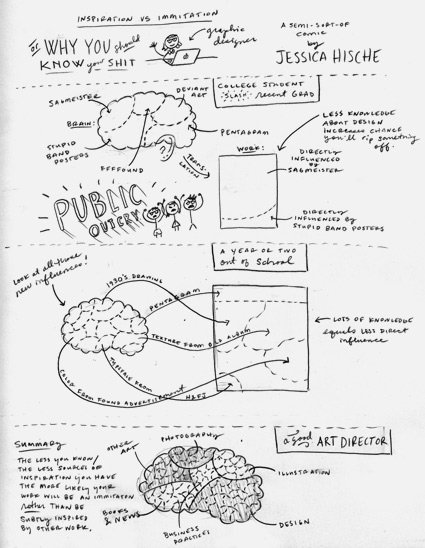
Brains on inspiration
‘Why you should know your shit’
Above, a look at how inspiration from multiple sources work better than tunnel vision. And design school tends to help with this.
Good design influences are everywhere. Ignoring it is like cutting off a limb. Or two.
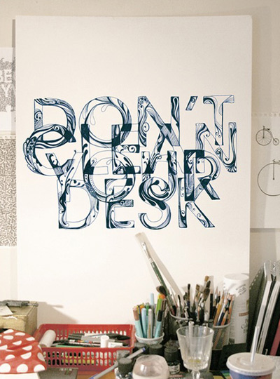
Illustration by Jessica Hische. Click to view larger/jump.
Taste and graphic design
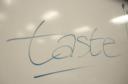
I’ve been drawing my ‘taste’ chart on a white board for about six or seven years now.
Taste in graphic design is a concept I’ve been aware of for a long time – but as I looked out at what other designers were doing, taste wasn’t always a part of it. I kept seeing graphic designers who were stuck in one mode and not going any further.
‘I know that’ – is typically the term that shuts down most creativity. I’ve heard it from a lot of professionals in my field.
Diversity is the key to being a graphic designer today. Understanding concepts of other design industries – fashion, interior, architecture – even music – takes one further.
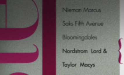
So one day in a classroom, I spontaneously drew this ‘taste’ chart.
I’ve since used it with clients, students and other designers to show different ways of approaching graphic design – so we’re not all just sitting here with blinders on, our heads in the sand. [Read more →]
Infinity elephants
‘Vi hart is the creator of fun math-based craft/drawing videos shown in time-lapse with her own narration.’
Website here.
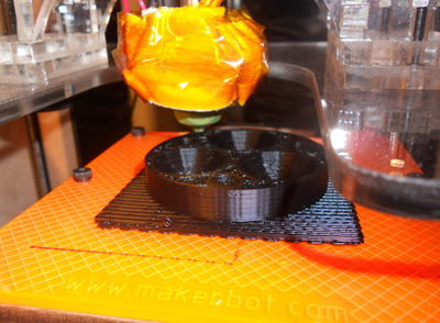
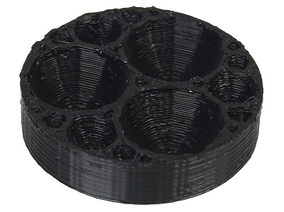
Video doodles (above) led to the 3d-printed Apollonian gasket, below.
Found via Odedadali
Gravity
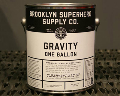
Available at Dave Eggers’ Superhero Supply Store in Brooklyn. Which is really just a front for 826NYC.
TED Prize talk below.
Found via theclickclickpress
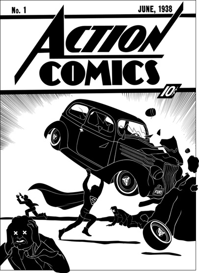
Action Comics 1
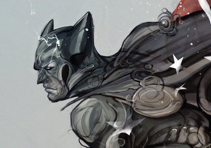
Action Comics No. 1 as ‘covered’ by illustrator Tom Addison.
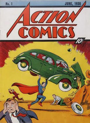
More comic book ‘covers’ here. The original Action No. 1, below.
