entries Tagged as [design]
Hadank
‘Hadank is a display typeface developed from hand-lettered words in a German printer’s letterhead from the 1920s’
Andrew Leman makes props for the motion picture industry. And along the way, he’s built a collection of fonts to help with making said props authentic.
Order his Hadank fonts here. Website (with interview video) here.
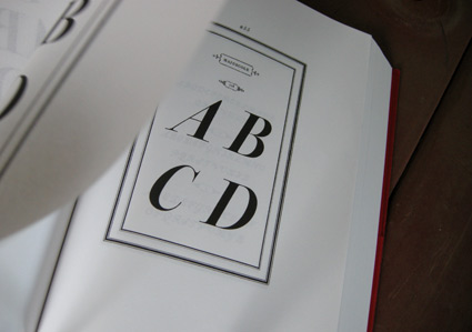
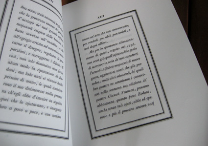
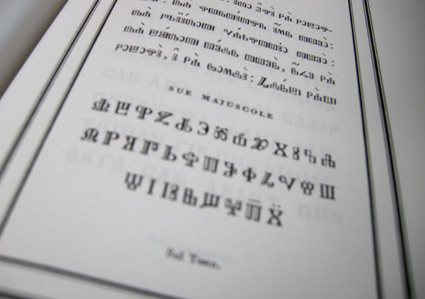
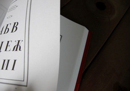
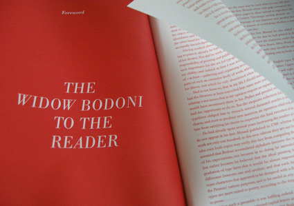
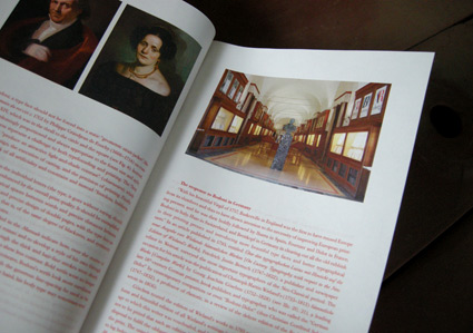
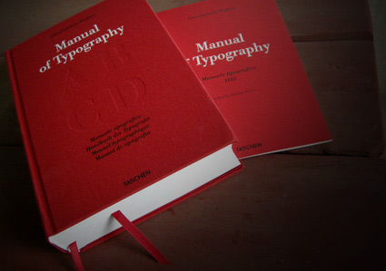
Bodoni’s Manuale Tipografico
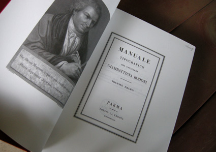
‘Published posthumously in a limited edition of 250, features 142 sets of roman and italic typefaces, a wide selection of borders, ornaments, symbols, and flowers, as well as Greek, Hebrew, Russian, Arabic, Phoenician, Armenian, Coptic and Tibetan alphabets.’
My birthday was last week and to my surprise, my wife got her hands on Taschen’s limited edition reprint of Giambattista Bodoni’s masterwork, his Manuale Tipografico (1818).
Bodoni had almost unlimited funding and resources at his disposal – so the details in his large body of types (he just kept going) is beyond what is seen in most revivals of his work. ITC Bodoni comes damn close, but a lot of Bodoni’s original designs end up on the cutting room floor.
My Jeanne types (named for my wife) have roots in Bodoni – and I used some digital resources to research his Manuale. But it is great to now actually have a print edition in my collection – cause I’m not done with tinkering.
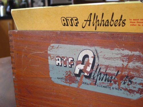
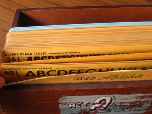
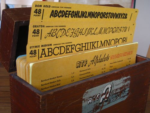
ATF kit
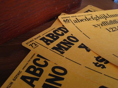
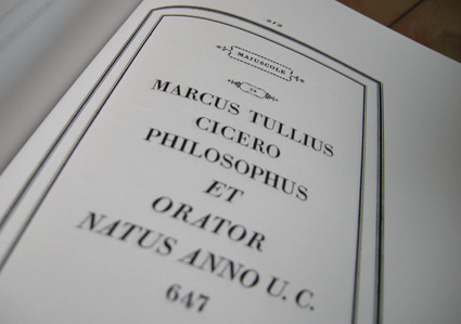
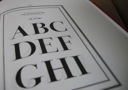
‘Features over 100 cards with specimens from the 1951 type catalog, showcasing dozens of fonts in their various weights and point sizes.’
American Type Founders was the largest metal type company in the world. They came to an end in 1993 in an ill-planned bankruptcy auction.
Tons of type history (literally) were melted down for scrap. Many records and original drawings were destroyed.
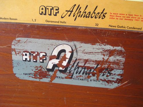
Pictured, Just My Type’s recent acquisition: ATF’s 1951 merchandising case.
Hische in photos
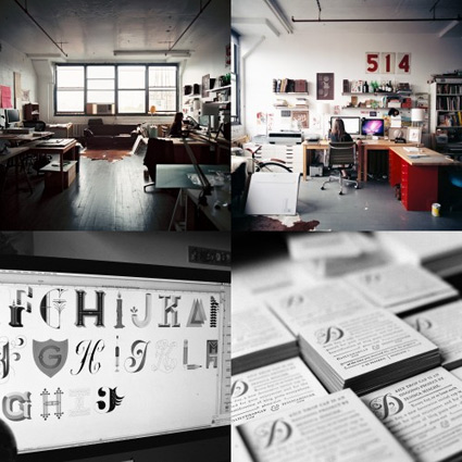
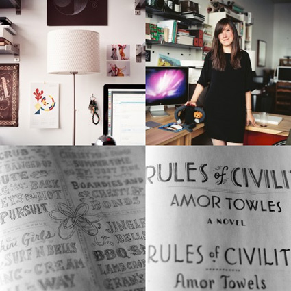
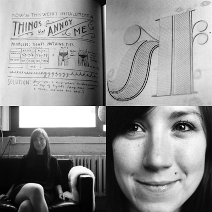
Designer Jessica Hische at her studio in Brooklyn.
Photographed by Pascal Béjean, October 14, 2010. Part a series on graphic designers at work.
More photos here.
Found via Jean François Porchez
Doret’s type
I have one little parallel with Michael Doret.
I like to do type revivals – interpretations – of vernacular lettering that we often take for granted.
My Martini at Joe’s fonts are all about this. I based them on my favorite restaurants, the Joe’s of Northern California.
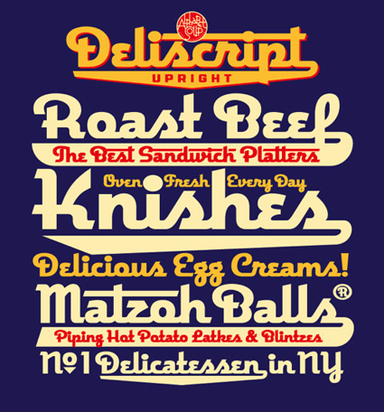
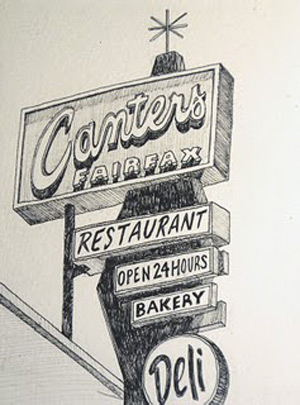
And Doret based his fantastic Deliscript on signage lettering of world famous Canter’s Deli on Fairfax in LA. This led to him developing their catering truck. All elements of an incredible body of work. [Read more →]
Glaser’s mom’s spaghetti
Legendary graphic designer Milton Glaser has been a foodie for years.
His original Underground Gourmet column for New York magazine – collected in book form here – looked at NY ethnic cooking before the rest of the food world jumped in.
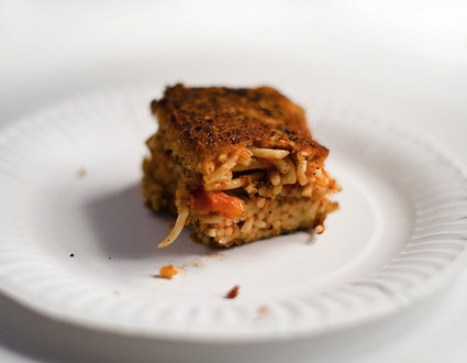
And his mother’s very Jewish spaghetti recipe takes things to a whole other place.
Recipe here.
And Glaser can be seen explaining how it came together – which in this version includes the extra step of baking before frying – in Wendy Keys’ documentary Milton Glaser: To Inform and Delight (2008).
Photo found via Slumber Dept
Allen
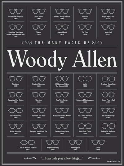
‘The Many Faces of Woody Allen’ by Brandon Schaefer. Prints available here.
Click to view larger/jump to source.
