entries Tagged as []
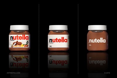
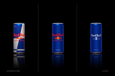
Simplifying packaging
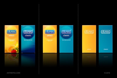
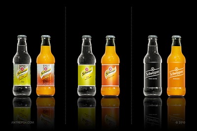
‘about unnecessary items on the global brands’
Products screaming far too much for attention? Competition for shelf dominance taken to excess? Overdesigned labels that are trying too damn hard?
Antrepo breaks things down into simple. And then more simple.
More studies here.
Found via Laura Serra
Shopping Cart Area
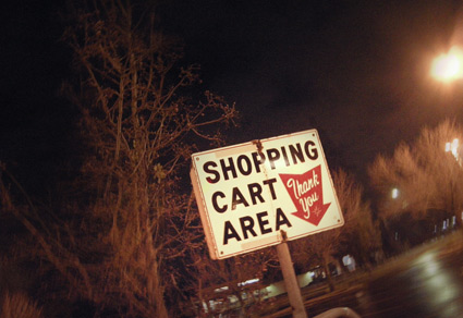
It’s cool to see a few of these vintage signs still doing their thing.
Photo by mehallo, December 2010.
Hillsdale Cinema, revisited
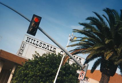
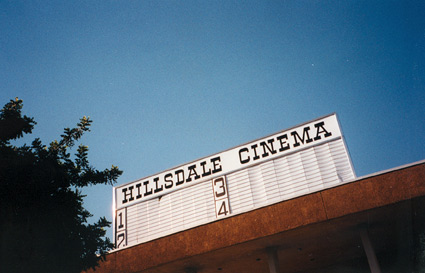
Across from Hillsdale Shopping Center in San Mateo, California was the Hillsdale Cinema. These are snapshots I took in 1997, before the building became something else.
Saw Superman: The Movie and The Wrath of Khan there on opening days. And for awhile, it was dang easy to sneak in; buy one ticket, watch for ushers, then let friends in thru the side door. The Hillsdale was part of the General Cinema chain.
Great article on GC’s history here.
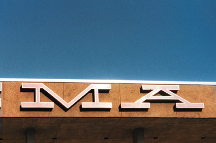
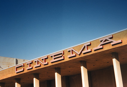
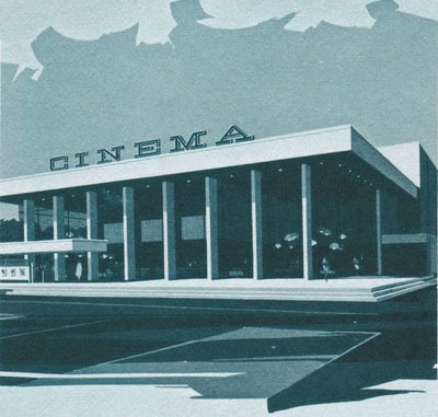
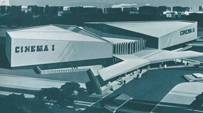
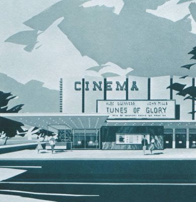
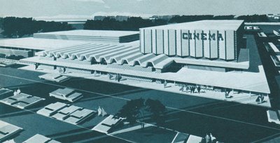
Below, 1964 concept drawings of General Cinema’s modernist theatres. Direct or not, there is a Herbert Matter influence in the type picks.
And I can’t forget General’s famous snap-yer-fingers bumpers.
Drawings found via Pleasant Valley Shopping
Gold Maverick
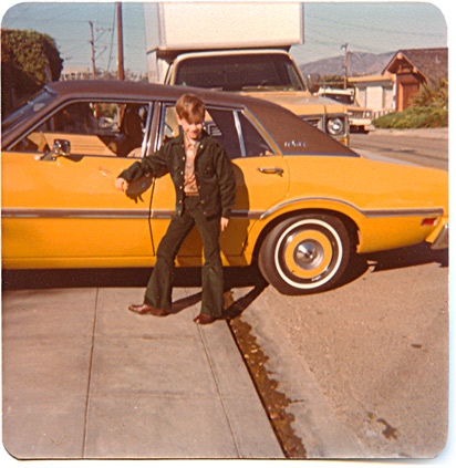
Me and my first car.
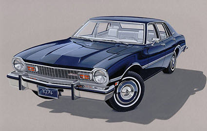
1974 Ford Maverick. Photographed December 1976.
In 1983 I inherited the car when my parents traded up to a Cutlass Supreme.
And I always thought it was odd that prints from 110 film came with funky rounded corners. Never knew what that was about.
The Helvetica Battery
The most incredible invention ever conceived by human beings.
These commercials scared the shit out of me.
Remembering The Treasury
‘BOY, DO YOU NEED US NOW!’
JCPenney had a discount chain that operated in the 1970s.
Similar to Target today, this odd Penney thing was The Treasury.
With Helvetica logo in place, our local Treasury moved into a former White Front locale – had midnight madness sales, aisles of cool stuff. They even sold comic books. And had the best damn snack bar pizza ever.
The chain didn’t last past 1981. Tho a new company – The Home Depot – opened their first locations in former Treasury digs.
Big Boxes were soon to take over.
Penney’s logo history
It all boils down to . . . Helvetica.
JCPenney started as The Golden Rule store – or so said the literature I read as a kid. Wiki says something else.
My mom worked for JCPenney for 22 years and they had a big anniversary in the 1970s. They had wooden rulers with ‘golden rule’ written on them as part of a anniversary suite of premiums. I remember lots of simple yellow (‘golden’) and black stuff, sort of a 70s take on Victorian style.
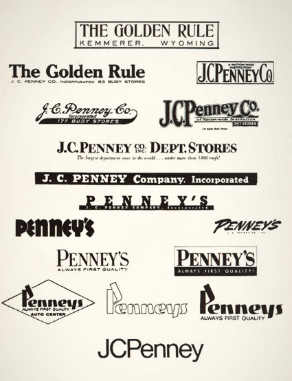
And I was fascinated with a logotype history chart that was part of a company history booklet. Above is an old photocopy.
Over the years, the company simply became known as Penney’s – logo treatments reflecting retail trends.
The possessive was dropped and the ‘JC’ was officially re-added in 1971 – the year its founder, James Cash Penney passed away.
