entries Tagged as []
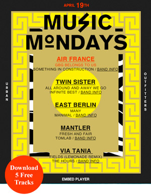
Air France, East Berlin: Monday tracks
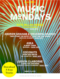
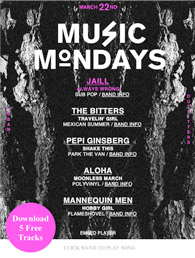
Urban Outfitters has free music tracks on their blog every Monday. Really enjoying East Berlin‘s Many.
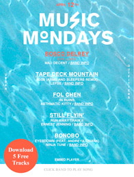
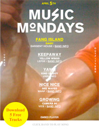
Click on the above image/jump for this week’s sounds. Below, some previous posts.
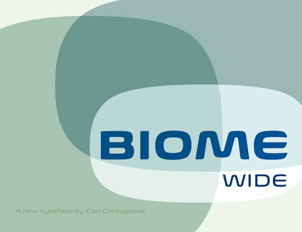
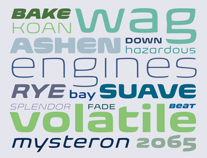
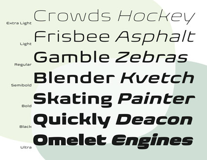
Biome
‘A retro-futuristic, soft display sans in seven weights’
Check out Carl Crossgrove’s fantastic new Biome Wide fonts. Details here.
Available thru fonts.com (and a few others).
The Endeavor, 1979
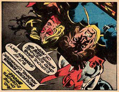
‘Pursued by the relentless minions of the cruel despot Baron Karza, the freedom-fighting crew of the Endeavor breach the Space Wall and emerge on a strange and dangerous new world – a planet known as Earth.’
In 1979, a comic book series quietly appeared at the local drug store. At the time, comic book stores were not common – and if one wanted each issue, they had to hunt it down.
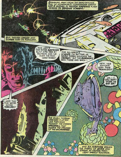
The Micronauts was a sleeper. And contained story and artwork years ahead of what was going on in mainstream comics at the time. [Read more →]
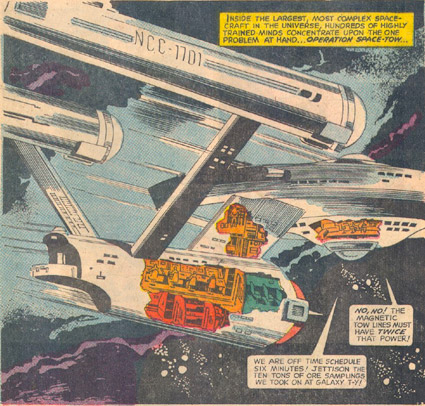
The Enterprise, not to scale
I actually had this original comic. Loved that they put a porch and a door where the hangar deck should be.
From Star Trek #6, December 1969. Art by Alberto Giolitti, Gold Key Comics. Click image for larger view/jump.
Want this comic (and a whole bunch more)? Grab this.
Kinda takes the fun outta collecting tho.
Congratulations Rebecca!

The randomly-picked winner of my under-the-radar, spur of the moment Jeanne Moderno giveaway contest thing from this past week is Rebecca Spencer, who posted the comment:
rebecca spencer// Apr 10, 2010 at 4:25 pm
I really like the Jeanne Moderno faces… hope I win!!
The winning font has been emailed using YouSendIt. Thanks to everyone for the great comments and entries!
Please keep reading. More to come.
Saul Bass’ Phase IV
‘Nobody ever mentions this. You can read about how Phase IV starts where 2001 left off and all that, and it’s true enough.’ -the looniverse
Trailer for Phase IV (1974) above. Directed by Saul Bass.
Saw this as a kid. Had nightmares for years. Intense visuals. Ants. Frightening, killer ants.
I have it on DVD, still haven’t watched it tho.
TRIO: cable, web, gone.
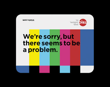
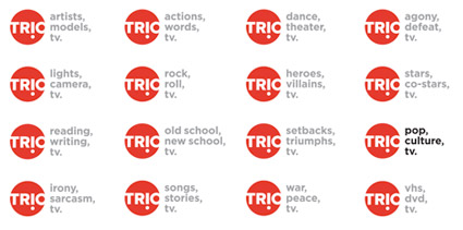
TRIO was a brilliantly odd cable network that sort of ended up being shuffled about and sort of vanished from tee vee in an acquisition by NBC that included similar net Bravo and a bunch of other things. That’s the short way to put it. In all, NBC ended up channeling its money and energy into Bravo.
Some of TRIO’s wares included Brilliant But Canceled, re-airings of great television programs that were too smart for their own good. Today, TRIO lives as a web archive (with a link back to Bravo, of course) – and Brilliant But Canceled is now a web blog.
In all this, Scott Stowell‘s open designed the look of the network, with design studio No.17 creating the logo; filmmaker Chris Wilcha and music supervisors Agoraphone along for the ride.
Official TRIO page here. Open’s portfolio (with videos) here. AIGA TRIO design article here.
They were brilliant, tho canceled.
