Knife trio
Here’s a trilogy of videos for Swedish electro-pop group The Knife.
Found via Victoria Arriaga
Here’s a trilogy of videos for Swedish electro-pop group The Knife.
Found via Victoria Arriaga
Star Wars vs. Saul Bass (2007)
Star Wars vs. Saul Bass (above) is described as ‘If Star Wars was filmed two decades earlier and Saul Bass did the opening title sequence, it ‘might’ look like this.’ The animation was created as part of a school project.
A more recent mashup is Tron vs. Saul Bass (below).
Tron vs. Saul Bass (2009)
The designer has also made a bunch of matching posters, sort of how Bass used to.
So for years I was under the impression that Saul Bass also designed the logo (above) for KTVU Channel 2 in Oakland. But only the master can do so much; turns out Michael Vanderbyl is the guy behind the two.
Can’t always be right (thanks for the update Jeff).
Below, KTVU 50th Anniversary spots from 2008. If you’re from the Bay Area – and happen to remember the 1970s – these may seem familiar:

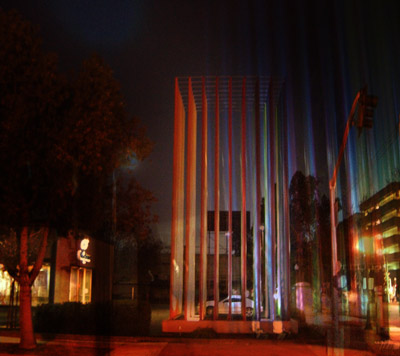
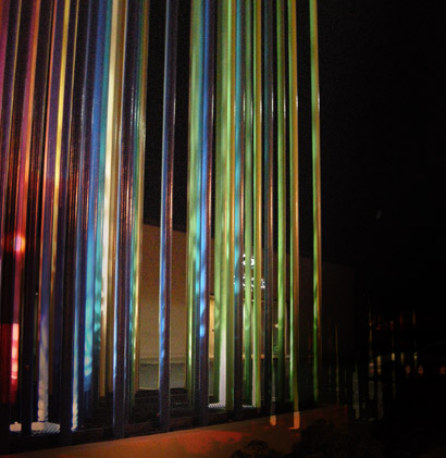
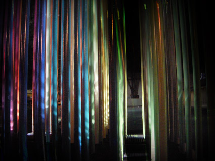
Located on the corner of 16th and Q Streets in Sacramento stands a colorful pole sculpture whose history is tied to that of legendary designer Saul Bass.
And back in 2006, former ADAC president Michael Kennedy dug up a ton of history/detail on the construct – which he compiled in an article for the club’s newsletter.
I’m reposting that article here.
Today, the sculpture is a nice punctuation for Sacramento’s coolest restaurant, Hot Italian. A study in stark black and white interior and graphic design, Hot Italian sits directly across the street.
Recently, I took some night shots.


Intro
Here are some highlights from a candid documentary (shot in 1986) on Saul Bass. The doc is available as a 2-DVD set here.
On making money vs. quality work
Advice to design teachers
Advice to students
Thoughts on his legacy
‘Bass on Titles presents a comprehensive, well-rounded retrospective of Academy Award-winner, Saul Bass’ film title sequence design.’
With really bizarre dialog screwy sound looping fx. Watch it above. From 1977.

James White has tracked down a bunch of logos created by graphic design legend Saul Bass. Blog post here.

Found via Scott Hansen
‘For the MuseumStore, typographer Jack Stauffacher designed a special line of products using the SFMOMA letters. Items include T-shirts, canvas tote bags, reusable grocery bags, mugs, ceramic double-walled coffee cups, and acrylic tumblers’
Details here. (Products are not quite at the SFMOMA site yet, hopefully they are coming soon!)
Plus
At Design Observer, Book Shelves from Stauffacher’s Greenwood Press. Photographs by Dennis Letbetter.
‘With over 1,000 examples in categories such as animals, circles, faces, or science, it’s fun to browse and serves as a curious retrospective of American entrepreneurism.’ -Fast Company
Eric Baker and Tyler Blik wrote one of the first logo books I ever owned. And their latest is the densely-packed American Trademarks: A Compendium.
Snag your copy here. Read the Fast Company review (with related links and a slideshow) here.
Found via Jamal Ahmad