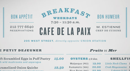
entries Tagged as [typography]

Picking fonts

‘Is there a way to know what fonts will work together? Building a palette is an intuitive process, but expanding a typographic duet to three, four, or even five voices can be daunting.’ –H&FJ

‘how do I pick the right font?’
. . .  is the most common question I’m asked in my type courses. And my answers aren’t usually simple. I liken it to picking the right suit, tie and shoes.

What handbag will work best, nail polish, lipstick, gloss or none, which eye liner will simply look great  . . .

One learns by doing. [Read more →]

Type-driven advertising

Many, many samples: Ads using fantastic typography. Go here.

Found via Veer

Joos Italic

‘Joos is a revival of an upright italic created in 1536 in Gent. This work is not a formal revival but it faithfully fits into the scheme of Joos Lambrecht (punchcutter), which was to idealize roman types by bringing together the characteristic graceful shapes of italics and the angularity of romans.’

Not all Italics are slanted – they have their origins in calligraphy.

More about Laurent Bourcellier’s beautiful Joos fonts here.

Found via Colin M. Ford

Aesthetics of sacrifice

‘Some of my favorite assignments are posters and program flyers for conferences dealing with complex subjects. This one was about patterns, forms, functions and aesthetics of sacrificial rituals. Raster design with blood (OK, beet juice)!’

The work of Nina Stössinger.

More project details in her blog post here.

Or you can read it in the original German here, or in bad Google translated English here.

Redesigning US bills, part four

‘Anyone who was following my Twitter personal account at the time may have noticed a fair bit of bitching about Illustrator’s pathfinder tools’

Aegir Hallmundur’s beautiful money illustration for Wired magazine. Details (and design considerations) here.

Again, can’t we just let someone like Aegir design our currency? Pleeease??

Found via expiro

Redesigning US bills, part two

Mo money! Richard Smiths’ Dollar ReDe$ign Project. See more here.

Click on images to jump/for design details.

The Book of Kells

Right now my history students are freaked out by the study guide they received this week.

Among the many graphic design historical items listed is the Irish Book of Kells, c. 800 A.D.

The Book of Kells is the most elaborate illuminated manuscript ever created – that we know of. A brief overview can be seen in the NBC video above; its origins are the stuff of legend.

book of kells resources
Many different resources exist for study. A detailed history can be found on the Wiki site here. There are also introductory books, official sites, fan sites and more. The most accessible would be The Book of Kells on DVD, which details every page of every folio. Preview video below:

Or
If you simply want a Kells-based journal, you can snag one here.

Today Show video found via MSNBC

More characters!

Poster by graphic designer Michael Ciancio, available thru his website.

Found via Apartment Therapy

Improve your typography

Here’s eight simple ways. Article at AisleOne.

The Philosophy of Typography

‘A sixty-page book covering the philosophical & semiotic aspects of typography, with content based on lectures by a SCAD professor & Robert Bringhurst’s The Elements of Typographic Style’

By Steven Acres. Details here.

Found Via Creativeoverflow

Typographic rhetoric 3

‘Typography is what language looks like.’ –Ellen Lupton

Great collection of typography quotes (with article), collected by Jacci Howard Bear. Go here for more.

And
Check out as8: Alessandro Segalini’s collection of quotes on typography here.

Image found via Lead Graffiti


Creative Commons License

the work at the mehallo blog. beta. is licensed under a creative commons attribution - noncommercial - no derivative works 3.0 united states license.  if reposting, credit must be given to steve mehallo - and if possible, please provide a link back to the mehallo blog. beta.

i include images for the purpose of critique, review, promotion and inspiration - and always make my best effort give credit/link back to the original source.  if i’ve screwed up, please fire me a note.

page layout based on the wordpress 'darkwater theme' by antbag, adapted and redesigned by mehallo.  valuable php assistance from bill mead.