The color of money
Posted on March 18th, 2010 by steve
These days, I get really depressed when I look the design of US money.
At least the one dollar bill is going to stay the same (not worth counterfeiting), but gads; new money we have: so ugggly. Tiny gold 20s floating everywhere. Horrid layouts, random mismatched Helvetica number on the back. Bleeeh.
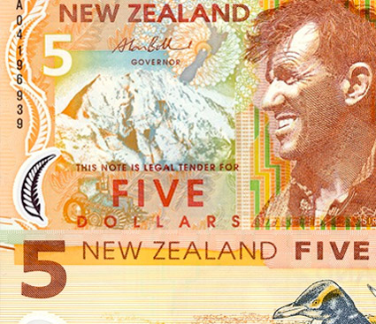
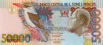
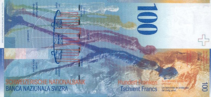
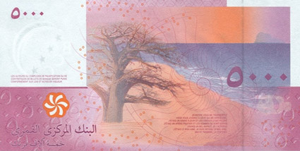
The Art of Money author David Standish picks the ‘top 10 most beautiful bills’ from around the world – check out the slideshow here.
And
Here’s a look at the color – and current, um, design – of US money at COLOURlovers.


is that what a redesign is? add color and call it a day? haha.
ugh. i hate our money. it’s so pitiful when you compare it to everyone else’s. *sadness*