Always Almost
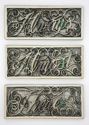
‘The mostly black-and-white collection of works includes ornate latticed designs and cursive phrases ‘tattooed’ with lasers into dollar bills.’
The ‘currency’ work of tattoo artist Scott Campbell.
Found via Young and Brilliant
‘The mostly black-and-white collection of works includes ornate latticed designs and cursive phrases ‘tattooed’ with lasers into dollar bills.’
The ‘currency’ work of tattoo artist Scott Campbell.
Found via Young and Brilliant
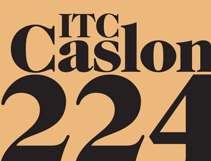
‘Benguiat has frequently said he chose the number 224 because it was the address of the building where he did most of his work.’
Ed Benguiat couldn’t leave well enough alone. And in 1982, created one of the funkiest versions of Caslon ever – for ITC.
I love the swoops and the ear on top of the lowercase g.
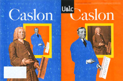
What would William Caslon look like if he were working today?
This is one of my favorite takes on Caslon (above) – editorial designed by Mark van Bronkhorst and written by John D. Berry.
It’s the 1998 front and back cover of one of the final print issues of Upper & Lower Case magazine (and as you can see, my copy is a bit mussed up). William Caslon would be wearing a blue suit today, such is the nature of the biz.
Inside U&lc was an incredible promo for the late Justin Howes’ historically accurate ITC Founders Caslon – one of the most faithful updates ever digitized. [Read more →]
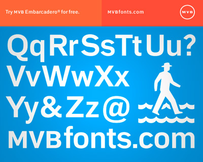
I’ve been a fan of the design work of Mark van Bronkhorst for years – and he’s just relaunched MVB fonts and fired up a new Twitter account.
And if you signup/subscribe/givehimyouremail, you’ll get cool things showing up in your inbox which will include a free copy of MVB Embarcadero Bold (a real font, worth 79 bucks) . . .
All you have to do is go here and do what it says.
Offer ends September 15, 2010.
Found via Delve
‘Moshun’s a fairly simple design – done in just two days in Illustrator and After Effects – that happens to leap, spiral, and shimmy into place.’
Moshun (pronounced Mo-shun, of course) was created by Dutch designer Jeroen Krielaars. Article (with much more detail) here.
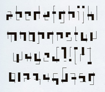
Experimental typeface inspired by the work of Gerrit Rietveld (1888-1964). Drawn in 1990 by Tobias Frere-Jones; now one of the co-owners of H&FJ.
I love how this face captures the orthogonals of the De Stijl movement, of which Rietveld’s famous Red Blue Chair was one of their icons.
Wish this Rietveld type were available somewhere.
Found via a book that I used to have – it vanished into a murky, dusty pile many, many years ago
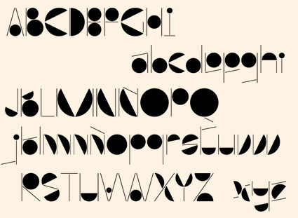
‘Aubhaus is a constructivist and geometric font. Great for use as a big display font on titles and short texts. It features Latin and Non Latin Characters.’
Rodrigo Fuenzalida’s Aubhaus font. Available thru YouWorkForThem.

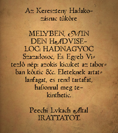
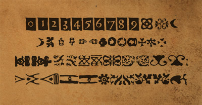
‘Abbot Nicolaus Telegdi purchased the Vienna Jesuit press in 1577 and started to work immediately with its own worn typefaces. His first works were publications of his own speeches.’
Amondó Szegi’s take on Telegdi’s types are a well-worn set of fonts. With some kooky dingbats.
The Caslon family took type to much bolder heights in the 19th century. And a copy of their 1841 specimen book can be perused thanks to Google Books.
Go here.
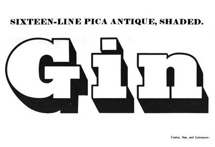
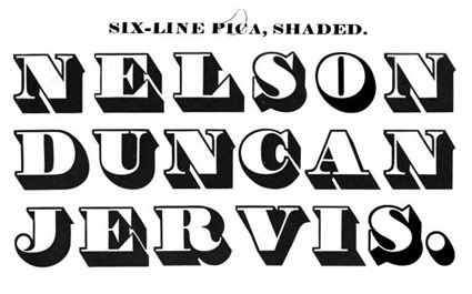
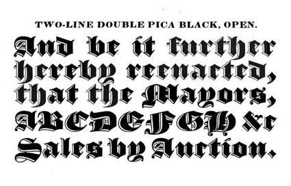
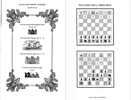
Found via I love typography
It had to do with pizza.
Font Bureau’s Nick Sherman dropped by my hotel room at TypeCon in Los Angeles. He read on Twitter that I had pizza left over – and he’s a major pizza freak.
I thought I was a pizza freak, but I don’t even come close (video below).
Nick said he was up late working on something big.
Turns out this big thing is the launch of Webtype, a collaboration between Font Bureau, Ascender Corporation, Roger Black, Petr van Blokland and DevBridge. [Read more →]
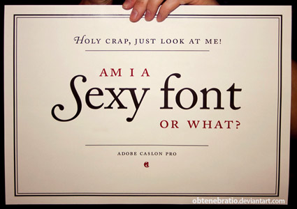
‘I’m a Sexy Font’ poster, created by Obtenebratio
Back in the early 1990s, the Carol Twombly-drawn Adobe Caslon was one of the first font packages I ever purchased.
I’ve been in love with it ever since. I use it on just about everything – including this blog’s title, my own logotype. I’m a font designer myself, but still don’t consider my own letterforms to even come close to what was accomplished with this particular interpretation of Caslon. [Read more →]


the work at the mehallo blog. beta. is licensed under a creative commons attribution - noncommercial - no derivative works 3.0 united states license. if reposting, credit must be given to steve mehallo - and if possible, please provide a link back to the mehallo blog. beta.
i include images for the purpose of critique, review, promotion and inspiration - and always make my best effort give credit/link back to the original source. if i’ve screwed up, please fire me a note.
page layout based on the wordpress 'darkwater theme' by antbag, adapted and redesigned by mehallo. valuable php assistance from bill mead.


