More Caslon: Today
What would William Caslon look like if he were working today?
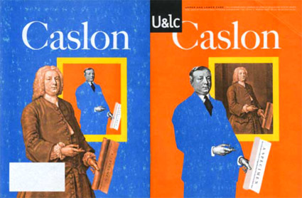
This is one of my favorite takes on Caslon (above) – editorial designed by Mark van Bronkhorst and written by John D. Berry.
It’s the 1998 front and back cover of one of the final print issues of Upper & Lower Case magazine (and as you can see, my copy is a bit mussed up). William Caslon would be wearing a blue suit today, such is the nature of the biz.
Inside U&lc was an incredible promo for the late Justin Howes’ historically accurate ITC Founders Caslon – one of the most faithful updates ever digitized.
the u&lc influence
In the 1970s and 80s, Upper & Lower Case: the International Journal of Typographics was the type bible for graphic designers. Editorial and design director Herb Lubalin used the newsprint magazine to not only talk type, but expound on his views of how type should be used.
‘Close but not touching’ was his take on how to set type. Not totally legible – and later condemned by the industry – his approach did allow text to take up less space on the page than usual. Art directors loved this.
Or as I like to put it: The 1970s looked like the 1970s because of Herb Lubalin.
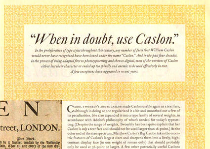
John D. Berry’s book, U&lc: Influencing Design & Typography, shows the wonder of the magazine. And below, the ‘cuts’ of Caslon.


