Typography Dude
‘The Dude can draw.’
Handlettering by Jeff Bridges for the cover of Esquire UK.
Behind the scenes here.
And check out more typographic wonders (some posted below) by Bridges at his own website.
Found via Stüf Stuff
‘The Dude can draw.’
Handlettering by Jeff Bridges for the cover of Esquire UK.
Behind the scenes here.
And check out more typographic wonders (some posted below) by Bridges at his own website.
Found via Stüf Stuff
Interpretation of Simon & Garfunkel’s Punky’s Dilemma. Animated by Scott Kellum.
The most incredible invention ever conceived by human beings.
These commercials scared the shit out of me.
‘BOY, DO YOU NEED US NOW!’
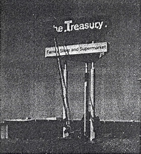
JCPenney had a discount chain that operated in the 1970s.
Similar to Target today, this odd Penney thing was The Treasury.
With Helvetica logo in place, our local Treasury moved into a former White Front locale – had midnight madness sales, aisles of cool stuff. They even sold comic books. And had the best damn snack bar pizza ever.
The chain didn’t last past 1981. Tho a new company – The Home Depot – opened their first locations in former Treasury digs.
Big Boxes were soon to take over.


It all boils down to . . . Helvetica.
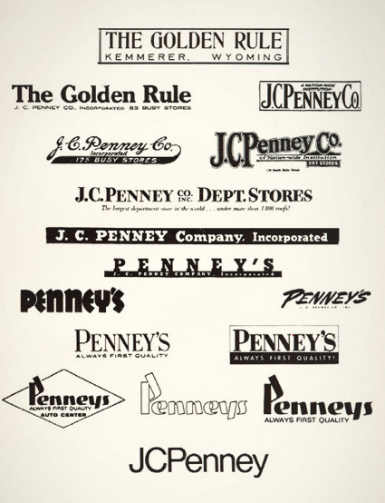
JCPenney started as The Golden Rule store – or so said the literature I read as a kid. Wiki says something else.
My mom worked for JCPenney for 22 years and they had a big anniversary in the 1970s. They had wooden rulers with ‘golden rule’ written on them as part of a anniversary suite of premiums. I remember lots of simple yellow (‘golden’) and black stuff, sort of a 70s take on Victorian style.
And I was fascinated with a logotype history chart that was part of a company history booklet. Above is an old photocopy.
Over the years, the company simply became known as Penney’s – logo treatments reflecting retail trends.
The possessive was dropped and the ‘JC’ was officially re-added in 1971 – the year its founder, James Cash Penney passed away.
‘for a charity exhibition in aid of the Center for Victims of Sexual Assault, using a pair of ladies’ white shoes’
The work of Oded Ezer.
‘The font is based on the concept of a thin and wide ribbon, bending freely through space’
A new take on the thick and thin strokes of letterforms. Type in your text and a final rendering is fabricated for a fee.
Details here and here. Test drive the Kasheeda font here.
Latin alphabet and Arabic script are both available.
Found via If It’s Hip, It’s Here.
‘Nation created Google Blacklist Christmas as an homage to the search giant’s censorship-tinged mini snafu.’
Make your own holiday card – using words that Google has blacklisted (typing them in will return zero search results). Send it to a friend. Or not a friend. Create your card here.
Found via Mashable
‘Stop motion animation that spells out the word ‘Tzvira’ in Hebrew which means State (The physical property of matter)’
Melting ice typography created by Adam Barak – as part of a typography workshop instructed by experimental designer Oded Ezer.
Found via Odedadali