Milk Bar
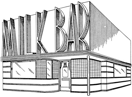
Store front design by Harry L. Wyman, 1939. US Patent Office drawing.
Found via Great Inventions, Good Intentions

Store front design by Harry L. Wyman, 1939. US Patent Office drawing.
Found via Great Inventions, Good Intentions
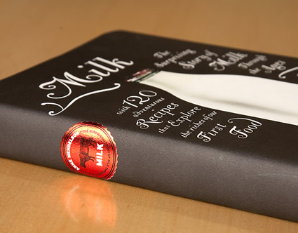
‘The Bodoni Classic Chancery set at different sizes and with as many swashes as I could create. The only color is the red foil cap in the picture. I loved that . . . so I made a foil milk cap for the spine.’
Pictured, Barbara deWilde’s design for Anne Mendelson’s Milk: The Surprising Story of Milk through the Ages.
Design details here. NPR interview with Mendelson here.
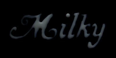
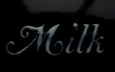
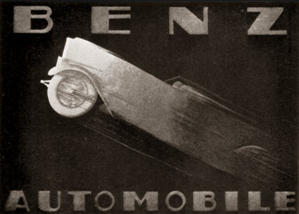
Advertisement for Benz Automobiles by Adalbert Roth, 1928.
Found via Advertising Art in the Art Deco Style
‘Originally made by the Czech type designer Carl Pracht in 1941–43. Having a rather calligraphic style both in regular and italic, MRF preferred it to be more straightforward and modern-looking.’
Another incredible type package by Stefan Hattenbach. Snag it here.
‘Sugary motion graphic piece inspired by a poem from Irish author Tony Curtis.’
Video by Fan Sissoko of the Dublin-based firm Stef&Fan. Check out the other cool stuff at their site.
Music: Birdy Nam Nam’s 2009 track, From Here to There.
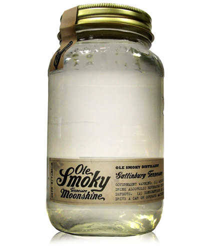
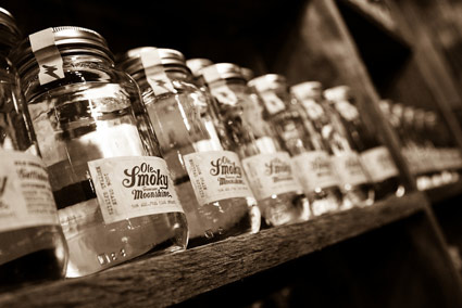
‘Moonshine now finds its first taste of legality with a recent state law in Tennessee allowing the distillation of spirits’
Of course, the ‘first legal moonshine in Tennessee’ needs some good branding.
Ole Smoky’s script logo was designed by letterpress specialist YeeHaw – with Ole Smoky Distillery owners Jessi and Joe Baker, Cory Cottingim and Tony Breeden developing the look of the mason jar bottle, label and seal.
The team at Robin Easter Design pulls it all together with a kick ass website.
More details here. Order here.
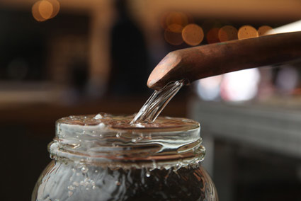
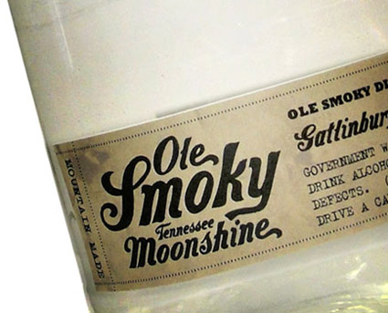
Info provided via Whitney Hayden at Robin Easter Design; images found via The Dieline, IVI Blog and Thirstysouth
JCPenney last ‘officially’ updated their logotype in 1971 – changing from a custom script (seen above) to Helvetica, set clean and neat (below).

1971
And last night – in a series of Academy Awards spots – jcp unveiled its new moniker (at bottom). Red box (retained from originally, their ‘it’s all inside’ campaign), lowercase helvetica, still clean and neat.
‘The winning design was provided by Luke Langhus, a third-year graphic design student at the University of Cincinnati.’
I do like when a redesign keeps the flavor of the original – here’s the official press release. Although this update does beg a few questions:
Doesn’t this look a lot like what GAP abandoned last year? And is the connection to Target’s brand a bit too obvious? And is ‘crowd sourcing’ how they went about this?
‘Participants included the Company’s associates, several design agencies and two art schools – University of Cincinnati and Rhode Island School of Design – that collectively submitted over 200 designs for consideration.’
I hope on the labor front, logo development participants were not as crowdsourced as is becoming commonplace. And it is a risky move to go this route – some could say jcp is running with what GAP chose to reject.
Though in the end, good merch behind the logo will determine what happens next. ‘What’s inside’ is still more important than not.
1964 Penneys architectural drawing found via Vintage Seattle, click image to view larger, more/jump
‘Nick’s Fonts is a modest little foundry dedicated to the preservation of our rich typographic heritage’
Nick Curtis’ Quigley Wiggly free font. Just because.
Found via Sean Ireton
Two type families from Sascha Timplan: St Marie and St Ryde.
Each family has one weight that retails for $0. Click the images to view/jump/download.