entries Tagged as [publication design]

Alta California: Named after a newspaper
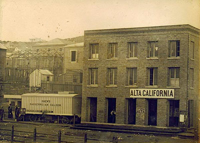

Alta California office, San Francisco 1851; found via Flickr

At one point in my life, I was going to be a journalist. So folly along  . . . .

I love history, so every one of my fonts falls into some historical category (or categories, if you look at Jeanne Moderno).

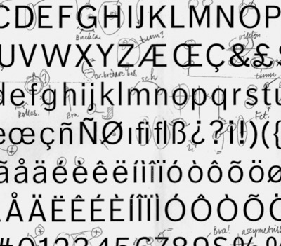
Alta California is my artist’s response to Susan Kare’s early Macintosh font, San Francisco. And it was a tricky build, as I was literally going thru book after book after book of old types – then messing them up, then messing them up more; and redrawing the edges until I had what I wanted.

(Please note, when it comes to ‘grunge typography’ – I don’t trust anything automatic; I’ve always gone in and tweaked the edges until I have something that looks – printed. Printed poorly, but printed.) [Read more →]
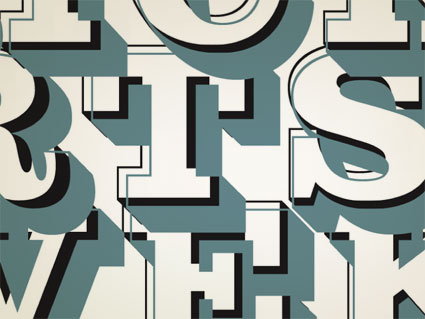
Parkinson’s Sutro fonts


ADAC 38th season promotional material

It’s not often one gets to meet one of their heroes.

When I was in high school, a bunch of kids thought it would be funny to sign me up for every magazine subscription they could find – by sending in a large pile of subscription cards. My parents were not amused; but it was Rolling Stone that I kept. I fell in love with the hand-inked masthead – and decided that that was what I wanted to do.

Hand-ink mastheads.

Not a big field. And who knew people actually did this? I wanted to do it, and early attempts (for my high school paper) netted not so wonderful results. Who knew that someday I’d actually be drawing fonts as a consequence.


Rolling Stone masthead by Jim Parkinson

Around five years ago, I finally met the guy behind the logotype – lettering artist Jim Parkinson. And the conversations have been great – as long as I don’t actually call him hero, he’s cool. And (who knew?) we both like fresh anchovies. Which I’ve found can gross out anyone who is eating near us.

using jim’s fonts
I used Jim Parkinson’s Sutro fonts on promotional materials for the 38th season of the Sacramento Art Directors and Artists Club. I was the newly appointed president, so I was determined to use fonts from the best of the best and (of course) Jim was on my list. [Read more →]

NYT: Turkish edition


Advertisement for the launch of the Turkish Edition of the New York Times, created by Istanbul-based studio Imago New Media

More typographic details via The Font Feed here.

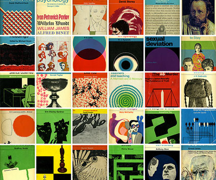
Penguin: The covers

Check out Joe Kral’s Flickr collection of some of Penguin (and Pelican)’s best cover designs.

And  . . .  check out Phil Baine’s Penguin by Design: A Cover Story 1935-2005.

Found via LifeClever

Penguin by Illustrators

When it comes to design, UK-based Penguin Books produces some beautiful specimens. And here’s a write up by Ace Jet 170 on the Penguin Collectors Society and their wonderful Penguin by Illustrators monograph.

Webster’s lost visual dictionary


Pictorial Webster’s: Inspiration to Completion from John Carrera on Vimeo

‘as a source for creativity in the human brain’
Yesterday, I thumbed thru Chronicle Books’ trade edition of Johnny Carrera’s Pictorial Webster’s: A Visual Dictionary of Curiosities. The video (above) details the inspiration for the project, historical cataloging, Linotype setting, as well as the design and hand binding of the fine press editions.

More detailed details are posted here. Also, check out the very Victorian Wall Cards and Stamp Set.

Carrera is the proprietor of Quercus Press, based in Waltham, Massachusetts.

2Edged Magazine: The sex issue

From Greece: 2Edged Magazine issue 5 was released this week. 284 pages of graphic design, motion graphics, photography, animation, art and music.

Download your free copy here.

Örjan Nordling’s Dagny, now at FontShop

All about FF Dagny: Evolution of a newspaper type font, interview and post at GarciaMedia.

FF Dagny is now available thru FontShop.

Hm. SacBee uses SacUnion’s fonts  . . . .

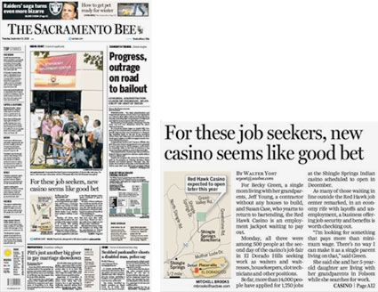
The Sacramento Bee redesign, as posted on Font Bureau’s Facebook page. Fonts used include Benton Sans, Miller, Miller Daily and Miller Headline

A few years back, I was the art director for a reincarnation of The Sacramento Bee’s long time rival, The Sacramento Union.

In this version, The Union was reimagined as a magazine. We did just a handful of issues, the design concept was: ‘newspaper in magazine’ format  . . . [Read more →]

The Esquire Magazine cover gallery

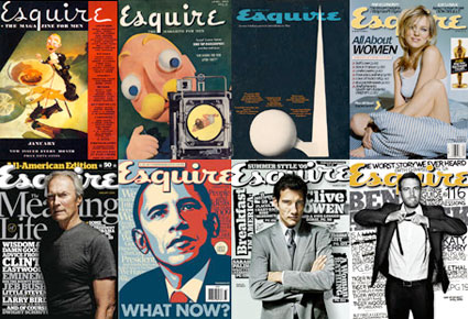
Esquire: The Magazine for Men covers going back to 1933.

Found via Twitter.com/retinart

Book cover design 2008

Here’s a sampling of The New York Times’ fav book covers of 2008  . . .

And I have egg on my face.

Christopher Le, a former student of mine, came up with a similar idea for a similar book (in my old publication design class). And I kinda talked him into doing something else:

Thanks for Campbell for sending this link over.


Creative Commons License

the work at the mehallo blog. beta. is licensed under a creative commons attribution - noncommercial - no derivative works 3.0 united states license.  if reposting, credit must be given to steve mehallo - and if possible, please provide a link back to the mehallo blog. beta.

i include images for the purpose of critique, review, promotion and inspiration - and always make my best effort give credit/link back to the original source.  if i’ve screwed up, please fire me a note.

page layout based on the wordpress 'darkwater theme' by antbag, adapted and redesigned by mehallo.  valuable php assistance from bill mead.