entries Tagged as [publication design]
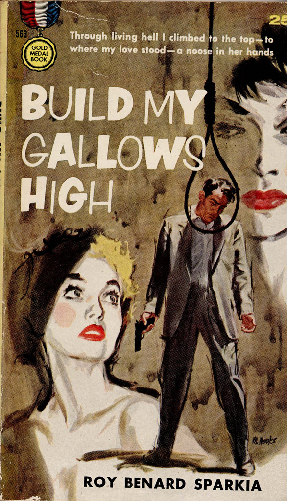
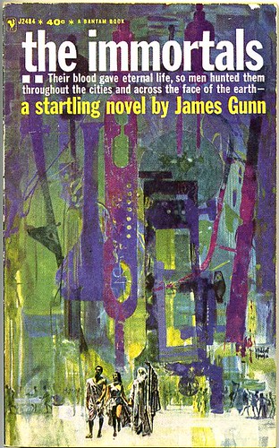
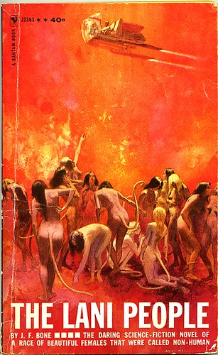
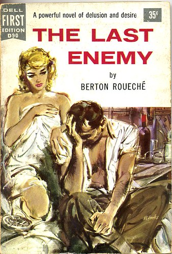
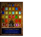
Judging books by (ugly) covers
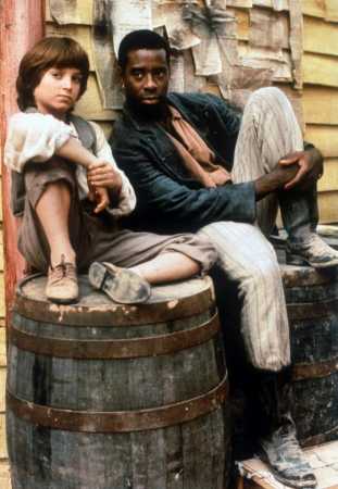
‘Gradually, I realized that the books I had put off reading for so long all had covers that screamed: ‘Pulp me! Pulp me!”
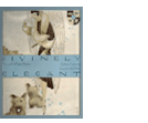
Joe Queenan looks at Huckleberry Finn, Elijah Wood (pictured, with Courtney B. Vance), Gatsby, Doctor Faustus, Death of a Salesman – and how a BAD cover design can ruin a perfectly good book.
NYT essay here.

What to do about an ugly cover: 1. Brown bag it; 2. Reverse it; 3. Try spandex; 4. Use house paint; 5. Duct tape it; 6. Tear it off
Exit Strategy now online

exit strategy, digital
The two editions of Aaron Winters’ Exit Strategy art annual are now available to peruse online at Issuu. Featuring art by Jessie LeDoux, Attaboy, Steak Mtn, Jay Howell, John Stuart Berger, Skinner and many, many more.
For Exit Strategy #1 (2005), go here.
For Exit Strategy #2 (2006), go here, registration required ’cause of naughty bits.


exit strategy, print
Some print editions are still available. ES #2 features a 10″ vinyl LP; bands include Sincabeza, PETS, Butch vs Femme, GOLAB and The Tangles (also available as a download).
Go here for more info.



The End of Print has arrived
So we just sat thru a really sucky decade. And there’s just a few weeks left.
And even though it was predicted, oh, almost 15 years ago; the End of Print may finally be here. Next year.
Watch the video.
The stiff hands may be caused by some atomic power issue thingie. I hear they’re working on it.
Bonehead

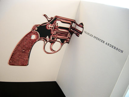
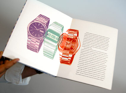
Every time I teach a publication design course, I assign a famous designer (or other acclaimed individual) as a biographical research subject. As part of the class, students have to do their own research, write their own text and design their own book.
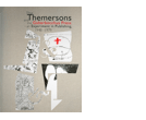
Back in the 1980s, Charles S. Anderson pioneered ‘bonehead’ design, which involved a midwestern attitude and lots of clip art. Art Institute of California Sacramento graphic design student Trixy Riggan ran with it, developing the handmade biographical tome pictured.
On the side, Trixy runs a clothing company, Fabulously Butch. I still have to snag one of her shirts. I’m told there would be irony in me wearing one.

Lustig collection
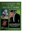
‘He was in the vanguard of a relatively small group who fervently, indeed religiously, believed in the curative power of good design when applied to all aspects of American life.’ -Steven Heller, Eye Magazine
Alvin Lustig (1915-55) didn’t limit himself to the field of graphic design – as a ‘generalist’ he designed just about everything he could leave his mark on. Including a helicopter.
Check out the incredible collection of book jackets designed by Lustig here. More here.
And for even more, visit the Alvin Lustig Archive.


 Found via Twitter.com/Sandoer
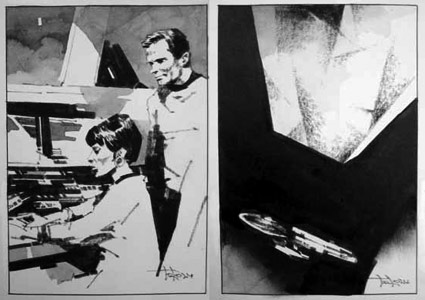
More Trek: Artist Toru Kanamori
When Star Trek first became a global sensation, Toru Kanamori landed a gig illustrating Japanese translations of the original series stories. Wouldn’t it be great to reprint a bunch of these in an art book with text from the Blish novels?
You know, I’d love to design something like that. Somebody call me.
For more about the work of Toru Kanamori, jump here.
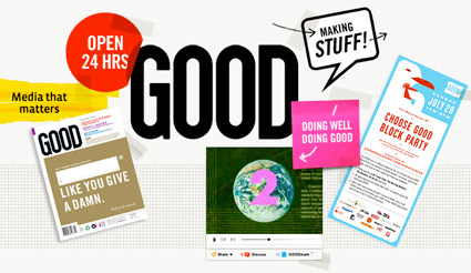
GOOD is good. So is Scott and his team.
GOOD is for people who give a damn – read more below.
but first . . .
OPEN studio’s Scott Stowell headed up the original design team for GOOD. And I have to write about Scott because he’s been a major influence on my work. Scott = GOOD influence.
I’ve been a fan of Scott’s work for years, ever since I saw a talk he gave at one of the 1990s ATypI conferences. His views/advice on design and teaching – for me – has been invaluable. [Read more →]
Newspapers: What should be next?
One thing I know about journalists: They’re slow to change. Once dug in.
Here’s an opinion piece about where newspapers could be headed. It involves The Times of London’s ePaper, which is a nifty idea.
The online market – which, c’mon, papers still haven’t figured out – is tappable. Just have to reframe the conversation. It’ll be interesting to see where all of this goes.
Found via Japan_Blogs on Twitter
