Slab serif ‘Egyptian’ types: A history
Here’s a detailed history over at Hoefler & Frere-Jones on slab serif typefaces; showcasing their new Clarendon-based Sentinel fonts.
Here’s a detailed history over at Hoefler & Frere-Jones on slab serif typefaces; showcasing their new Clarendon-based Sentinel fonts.

ADAC 38th season promotional material
It’s not often one gets to meet one of their heroes.
When I was in high school, a bunch of kids thought it would be funny to sign me up for every magazine subscription they could find – by sending in a large pile of subscription cards. My parents were not amused; but it was Rolling Stone that I kept. I fell in love with the hand-inked masthead – and decided that that was what I wanted to do.
Hand-ink mastheads.
Not a big field. And who knew people actually did this? I wanted to do it, and early attempts (for my high school paper) netted not so wonderful results. Who knew that someday I’d actually be drawing fonts as a consequence.

Rolling Stone masthead by Jim Parkinson
Around five years ago, I finally met the guy behind the logotype – lettering artist Jim Parkinson. And the conversations have been great – as long as I don’t actually call him hero, he’s cool. And (who knew?) we both like fresh anchovies. Which I’ve found can gross out anyone who is eating near us.
using jim’s fonts
I used Jim Parkinson’s Sutro fonts on promotional materials for the 38th season of the Sacramento Art Directors and Artists Club. I was the newly appointed president, so I was determined to use fonts from the best of the best and (of course) Jim was on my list. [Read more →]
‘Futurism was an international art movement founded in Italy in 1909. It was (and is) a refreshing contrast to the weepy sentimentalism of Romanticism. The Futurists loved speed, noise, machines, pollution, and cities; they embraced the exciting new world that was then upon them rather than hypocritically enjoying the modern world’s comforts while loudly denouncing the forces that made them possible. Fearing and attacking technology has become almost second nature to many people today; the Futurist manifestos show us an alternative philosophy. Too bad they were all Fascists.’ -Kim Scarborough’s Guide to Futurism

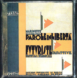
Parole in Libertà book cover (1932), found via laura@popdesign
This year is the 100th anniversary of F. T. Marinetti’s Manifesto of Futurism (1909) – and San Francisco has celebrations planned October 14th thru 18th. [Read more →]

Gin martini at Joe’s of Westlake, image found via zemistor on Flickr
Not to be confused with my fonts of the same name, this is the real thing. Including the iconic Joe’s of Westlake cocktail napkin.
Once upon a time in Northern California, there were a bunch of restaurants that went under the moniker of Joe’s . . .
Not Mel’s, but Joe’s.
The food: Italian, the atmosphere dark, the portions large. The waiters in suits and ties.
eat at joe’s
I used to eat at them with my father. They weren’t all owned by the same people, just adapted the Joe’s name and served variations of Italian food. Old school California Italian food. Joe’s history is legendary and Joe’s Special is still a staple on menus throughout the region: [Read more →]

Vintage Original Joe’s ashtray, photo by mehallo
Kick back, have a Martini at Joe’s.
get the playlist or watch video or create your own at mixpod.com
please support the musicians on my player by legally purchasing their music
. . . And when MyFonts did a write up of my Jeanne Moderno fonts for their Rising Stars newsletter – they spent some time digging thru so they could show some of my telescoping ascenders, alternates and ligatures (above). I like to hide things in my fonts, fill the blank slots as it were.
(Below) Psy/Ops new type sample for Jeanne Moderno. Psy/Ops also carries the Jeanne fonts, they did the final OpenType mastering before release (and without their support, Jeanne could possibly still be sitting in the 10 year limbo that was part of my process).