Dürer style
Sort of a 16th century fashion magazine spread.
Used as a promo piece for my Jeanne Moderno fonts. Available as a print or on a greeting card/notecard/postcard.
Sort of a 16th century fashion magazine spread.
Used as a promo piece for my Jeanne Moderno fonts. Available as a print or on a greeting card/notecard/postcard.
‘the font changes shape and colors as it breeds and dies’
Jelte van Abbema’s award-winning bacteria font, Symbiosis. Details here.
Found via Twitter.com/rogerioabreu
LAIKA from Michael Flückiger on Vimeo
Traditional fonts are static. For their bachelor thesis, Michael Flückiger and Nicholas Kunz created a dynamic typeface called LAIKA.
LAIKA isn’t static. Style, weight, size, kerning and other properties can be adjusted on the fly using a control panel, as seen in the video. LAIKA can also respond to outside stimuli, such as people.
To test drive/interact with LAIKA, go here.
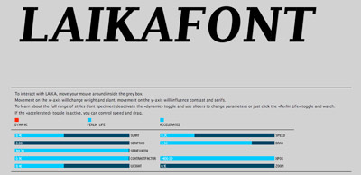
Interactive online interface for LAIKA
Found via Twitter.com/frank000
Sick of overdesigned interfaces? Go Swiss!
Emily Chang does a roundup of Helvetwitter, Helvetical and more.
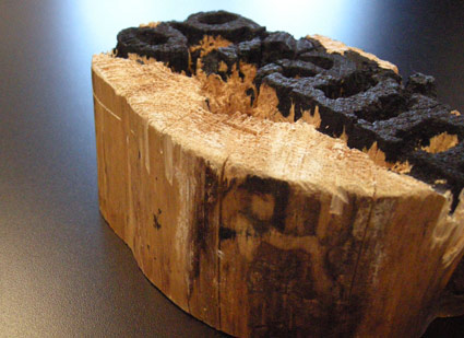
Experimental final project from my beginning typography course. Carved by student Rikki Morehouse.
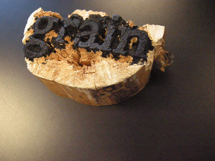
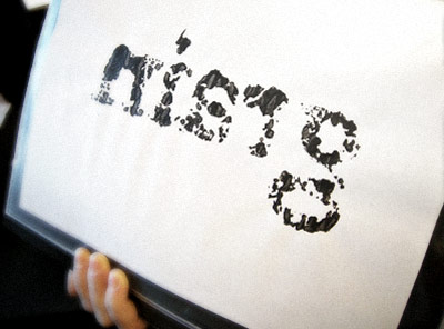
First print . . .
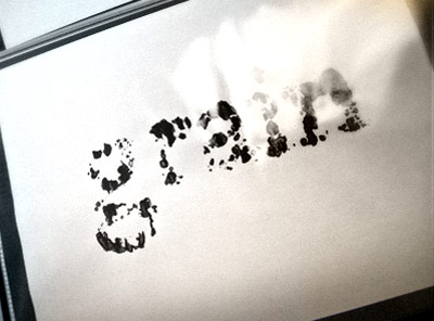
Offset print made from first print
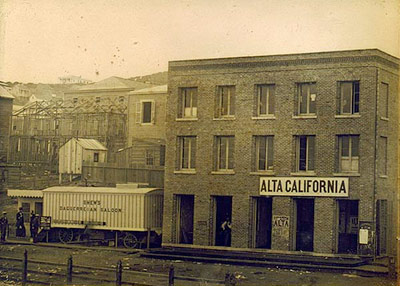
Alta California office, San Francisco 1851; found via Flickr
At one point in my life, I was going to be a journalist. So folly along . . . .
I love history, so every one of my fonts falls into some historical category (or categories, if you look at Jeanne Moderno).
Alta California is my artist’s response to Susan Kare’s early Macintosh font, San Francisco. And it was a tricky build, as I was literally going thru book after book after book of old types – then messing them up, then messing them up more; and redrawing the edges until I had what I wanted.
(Please note, when it comes to ‘grunge typography’ – I don’t trust anything automatic; I’ve always gone in and tweaked the edges until I have something that looks – printed. Printed poorly, but printed.) [Read more →]
‘Charting the intersection of Rural America and Contemporary Graphic Design’
The film about the Hamilton Woodtype Museum is making the rounds.
Official site here. Pictured: promo prints for the documentary.
Found via “JE NE SUIS QU’UNE PAUVRE PLUME…”