Jeanne Moderno in Ponytail
When I drew Jeanne Moderno, my hopes were the fonts would end up somewhere in a cool fashion magazine.
UK-based Ponytail has em and has used them beautifully in their third issue. Website here.
When I drew Jeanne Moderno, my hopes were the fonts would end up somewhere in a cool fashion magazine.
UK-based Ponytail has em and has used them beautifully in their third issue. Website here.
‘Talk about a psychedelic mimicking of rubricated blackletter!’ –Tiffany Wardle
South Central Swiss is a free fontstruct by dom nokes (domald). Grab it here.
Check out domald’s other fontstructs here.
Mota Italic the name of a type foundry out of Berlin. Their types are both unique and (most important) very usable. Check out their Vesper text types here.

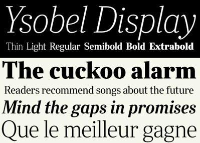
Nimrod is (secretly) one of my favorite type families. I used it on my father’s memorial booklet (he loved reading the daily newspaper). And Ysobel is a more modern interpretation in the same genre.
Newspaper (and publication design-friendly) Ysobel is now available as a superset thru Monotype. It was a collaborative design project with Robin Nicholas at the helm; Delve Withrington and Alice Savoie all making it work.
More details here.
Here’s an interview with Alice Savoie at i love typography.
And drop by Delve Fonts, where one can – for a limited time – snag a copy of Delve Withrington’s free type teaser, Blasphemy. And do check out the nifty Tilden Sans. I know Delve has some cool stuff up his sleeve (I’ve seen some of it), get on his newsletter mailing list for updates.
Taking the personality of Baskerville, mixing it with the thinking of Gill Sans (Sans version) and Futura (Modern version) . . . Zuzana Licko has finished work on the latest companion fonts for her popular Mrs Eaves typefaces.
Mr Eaves (above) is a sans serif take on the types of John Baskerville (1706-75). It can be snagged here.
And . . . also available is Emigre No. 70, a retrospect of Emigre Magazine. Emigre – which ran from 1984-2005 – was ‘the next big thing;’ which was a term they used a lot to describe design trends.
Emigre was a highly-influential, experimental and controversial design magazine that pushed the envelope to where the envelope didn’t look like the envelope anymore. I can safely say its influence can still be seen everywhere today. I miss going to Tower Books (owned by Tower Records) or Printers Inc. to snag the latest issue.
Details about Emigre 70 here.
Bet you didn’t even know they were gone.
Soul, hip hop, R&B. From Sweden. The band was started in 2004 and after some reshuffling (including the bass player suddenly moving to Israel to study Arabic) they’re back. New music is being mastered as I write this.
Font designer Göran Söderström is a band member, writer and producer. Check them out here. That’s Göran’s newest fonts all over their MySpace page.
Also, Göran’s turned me on to UK-based Speech Debelle. Get your type on!

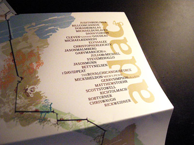
ADAC 40th Anniversary Season mailer (2006-7)
Stefan Hattenbach is a font designer from Sweden who I first met thru Rod Cavazos at Psy/Ops. His types always take me to another place. The forms are rooted in history, but his interpretations are all his own. And his typographic ornaments are exquisite.
I used his Anziano fonts for ADAC’s 40th Anniversary Season – teamed with a beta version of Stefan’s Beef fonts.
Beef will (finally) be released next year thru Veer. And I should note, Stefan is a vegetarian. Beef is pure irony. [Read more →]
The original type punches of Giabattista Bodoni (1740-1813) are in bad shape and the Friends of the Palatina Library and the Bodoni Museum are raising funds to restore the full set of over 600 alphabets.
Bodoni’s multiple alphabets contain some incredibly detailed wonders – with craft beyond many of the digital versions that exist today.
You can adopt part or a whole alphabet. For more info, go here.
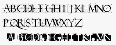
Albrecht Dürer’s contribution to typography took capitals in new directions.
His books on proportions, De Symmetria Partium in Rectis Formis Humanorum Corporum (books on the normal proportions of the parts of the human form) with Underweysung der Messung (instruction in measurement) cover drawing of human form, perspective – with a dissertation on Roman caps as well as gothics.
Both can be snagged in hi-res digital form from Octavo. Their Graphic Arts Bundle option also includes editions from Giabattista Bodoni (1740-1813), Geofroy Tory (c. 1480-1533) and Owen Jones (1809-74).
Dürer’s original letters exist today in the following fonts:
[1] Dürer Caps from P22

[2] Hands on Albrecht from URW

[3] Albrecht Dürer Gothic from Scriptorium
