entries Tagged as [fonts]
Gill on stage
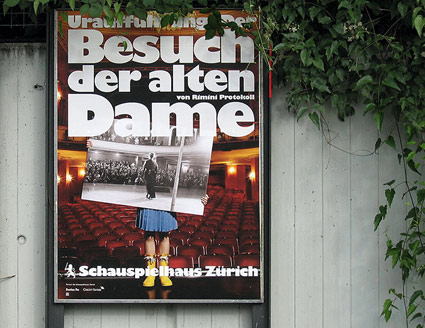
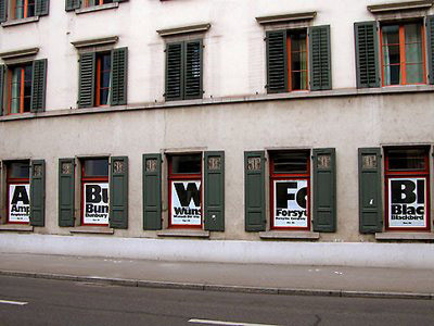
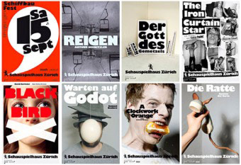
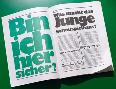
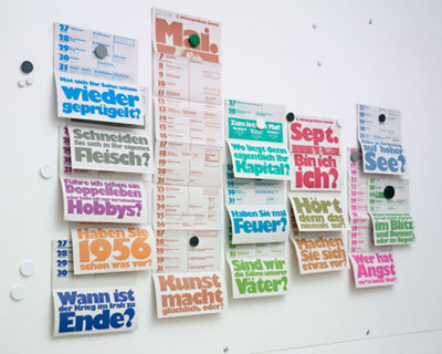
‘The Swiss firm boldly embraced the face’s strong character, making it the singular voice of the Schauspielhaus, a theatre in Zürich’
The work of Raffinerie – theatre branding using the oft-maligned Gill Kayo typeface.
Detailed article by Stephen Coles here.
Typography, iced
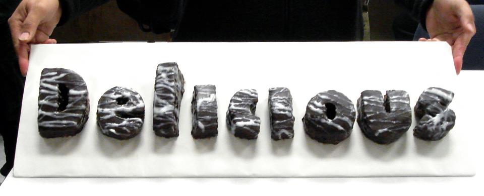
Final project from my beginning typography course at American River College: Futura Condensed Extra Bold, crafted as iced chocolate cake by student Lilie Matyuk.
Food-based type is always a tricky undertaking, but luckily we had Teresa Urkofsky teaching next door – in the culinary classroom. Teresa had recipes and techniques ready to advise.
Designing fonts: Shaping, kerning, tools
I’ve been drawing some form of type since the 1980s. And have been teaching type for several years now.
It’s hard to ‘go digital’ when introducing typography, since letterform history goes back hundreds (and thousands) of years.
So I still use 15th century era handtools in my introductory type courses.
Good fonts still contain elements from long ago – and today, all we really do is recreate what was once done with broad pens – using digital tools.
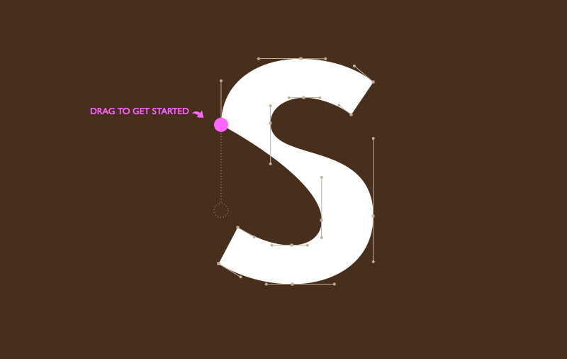
font games!
To get a taste of how ‘us professionals’ render type these days, check out Mark MacKay’s brilliant Shape Type (pictured above) and Kern Type. Both are nutshell adaptations of today’s process – kerning being a majorly overlooked, but necessary typesetting skill.
digital type tools
Fonts today are vector-based, so a mastering the basics of Adobe Illustrator is the start.
Beyond this, there are a bunch of applications on the market for drawing fonts. FontLab is the big one, Fontographer is the old one with the easy interface – and TypeTool is a barebones student-discounted alternative. Unlike Illustrator, these font tools take into account how letters are drawn, with built ins that make it easy to adjust edges. Karen Cheng’s Designing Type is also a must resource to have.
And I do all my logo drawings directly in FontLab – after multiple sketches in pen and ink. It’s just easier that way.
Shape Type found via Mark Nutini
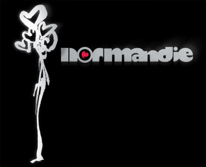
Champagne Valentine
The work of Amsterdam-based collective Champagne Valentine.
Reel features Stefan Hattenbach’s first typeface, New Global.
A World Without Type . . .
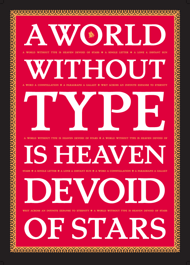
‘Screen-printed in Tokyo on beautiful, red Plike paper with gold, white and black inks.’
Just released: Limited edition typography poster designed by Swedish type designer Stefan Hattenbach, set in his own Tarocco Bold.
Available here.

handpicked posts

a piano falls in old manhattan
tetro and typography
it’s typography: film, song and dance
ghosts of gustov klimt
the great times new roman controversy
picking fonts
kapitaal
defining terms: design is not decoration
garcia's 'pure design'
'enhance that image!'
magic highway remixed
the cynic
rad anthem
Brought to you by man dom-


buy my fonts
go shopping
mehalloreads

Divinely Elegant: The World of Ernst Dryden
Jozsef Pecsi: Photo and Advertising
Color: A Natural History of the Palette
Collage: Assembling Contemporary Art
Modern Dog: 20 Years of Poster Art
Gaberbocchus Press: An Experiment in Publishing, 1948-1979
Advertising Art in the Art Deco Style
Googie Redux: Ultramodern Roadside Architecture
Hot Sour Salty Sweet: A Culinary Journey Through Southeast Asia
now playing


the work at the mehallo blog. beta. is licensed under a creative commons attribution - noncommercial - no derivative works 3.0 united states license. if reposting, credit must be given to steve mehallo - and if possible, please provide a link back to the mehallo blog. beta.
i include images for the purpose of critique, review, promotion and inspiration - and always make my best effort give credit/link back to the original source. if i’ve screwed up, please fire me a note.
page layout based on the wordpress 'darkwater theme' by antbag, adapted and redesigned by mehallo. valuable php assistance from bill mead.


