entries Tagged as [fonts]

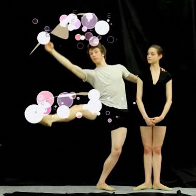
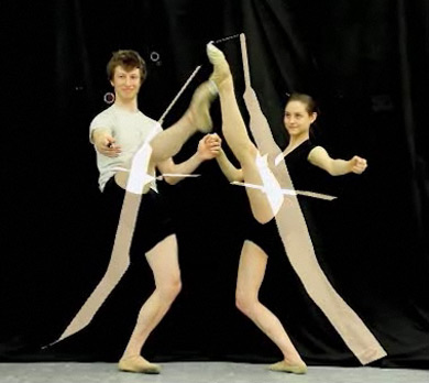
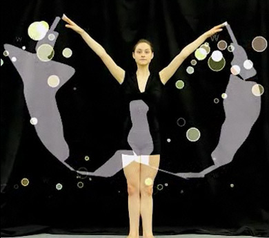
The Ballet Font Project

‘The resulting font is based on the physical movements of two Oregon ballet dancers  . . .  The dancers were fitted with infrared LED lights, which captured their steps in real time as they danced all 26 letters of the alphabet.’

Typography combined with ballet. Details (and final font) here.

Found via Lyndsie Ross

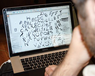
Vintage find

Jeanne Moderno spotted in the logo for Know-It-All Grrl Vintage’s Ebay shop. Though not too surprising. Know-It-All Grrl (Michelle, above) is a friend.

Cool finds, go shopping here. Facebook page here.

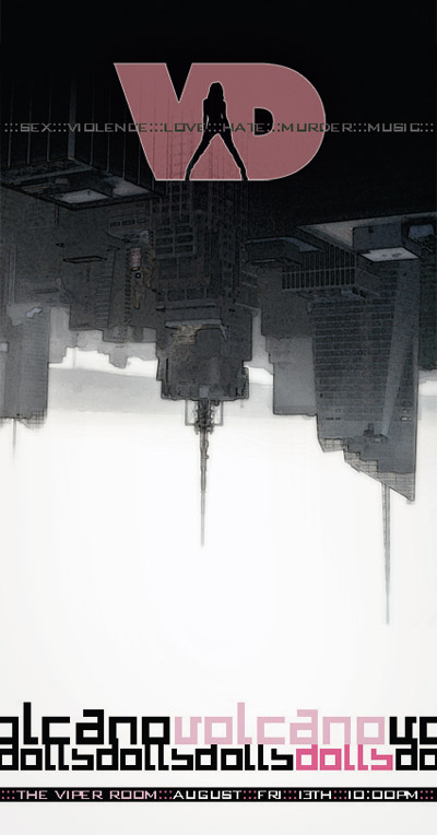
Volcano!

Everyone has their inspirations, their muses. And on the music front, one of mine is the incredible Chelsea Davis. I draw fonts, listen to her tracks. Design some stuff for her. She does a lot.

Chelsea’s classically trained, plays drums for theSTART, Normandie, among a few others. Her personal project is iVellora – and  . . .  great voice.

Her newest project is Volcano Dolls – a collaboration with Suicide Girl Jessica Goodwin (Google Zoli). They’ll be playing LA’s Viper Room this Friday.

Flyer (above) designed by Lux Nova. It features my 2491 font. Volcano Dolls Facebook page here – with new tracks posting soon.

Arial: ‘Bullshit’

Did Arial kill Helvetica? Or is it just bullshit?

Australia-based Hungry Beast correspondent Marc Fennell thinks it’s an ‘usurping bitch.’

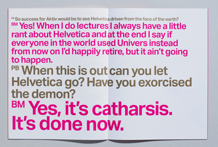
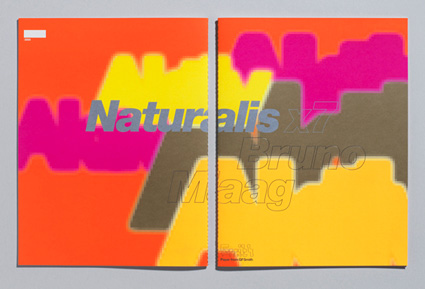
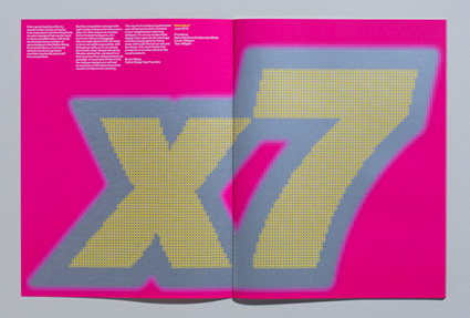
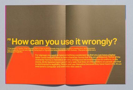
Aktiv Grotesk: The ‘Helvetica killer’

‘Bruno Maag is so enraged by Helvetica that he has designed a typeface aimed specifically at wiping it off the face of the planet.’

Details here. Snag Maag’s Aktiv Grotesk fonts here.

It’s Typography: Big screen premiere this Friday

The Sacramento International Film and Music Festival is underway – and this Friday night, my students’ type film (above) will be shown as part of the Art Institute’s Student Showcase, 6 p.m., July 30 at The Crest.

Festival details here.

Official It’s Typography website here.

Alta Cal

My font named for Northern California, warzone and great place to buy a damn good burrito.

Get the font here. Burrito here.

Emigre, picking fonts and the war in California

‘The pairing and combining of different typefaces has always been a particular graphic design challenge  . . .  Emigre has its own take on this typographic technique. But instead of providing rules, which often render safe but bland results, we believe that ultimately any font can be successfully combined with any other font. It’s not so much a matter of which font combinations to pick, it’s a matter of how you use the fonts in combination.’

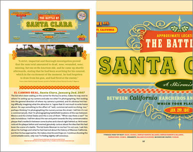
The latest Emigre font catalog – Historia – is a bit like an old issue of Emigre magazine. Strong concept, interesting point of view, wonderfully designed.

The 64-page specimen highlights battlefield locations of the Mexican-American war, 1846-48; specifically, the battles that took place in what is now California. [Read more →]

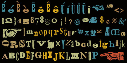
Free AGE font

Fontfabric’s new retro font, AGE. Snag it free here.

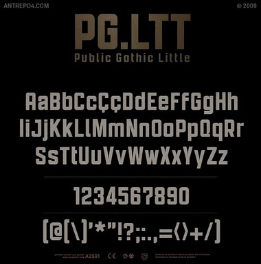
Public Gothic goes international

Antrepo‘s Public Gothic fonts are now available in 42 languages. Details here.

Chandler on Chandler

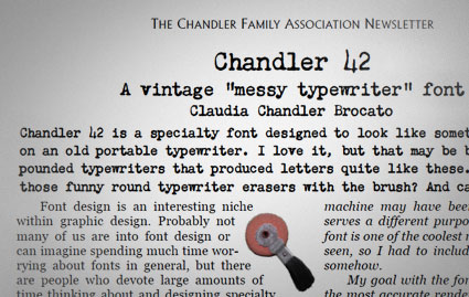
A few months back, Claudia Chandler Brocato of the Chandler Family Association contacted me about Chandler 42 – my 1994 contribution to the ‘messy typewriter’ font genre.

And they ended up giving me a really nice write up in their quarterly newsletter. Just click the above image to read/download a one page PDF.


Creative Commons License

the work at the mehallo blog. beta. is licensed under a creative commons attribution - noncommercial - no derivative works 3.0 united states license.  if reposting, credit must be given to steve mehallo - and if possible, please provide a link back to the mehallo blog. beta.

i include images for the purpose of critique, review, promotion and inspiration - and always make my best effort give credit/link back to the original source.  if i’ve screwed up, please fire me a note.

page layout based on the wordpress 'darkwater theme' by antbag, adapted and redesigned by mehallo.  valuable php assistance from bill mead.