Cooper Black Keys
‘Do it for Frank’ -set in Cooper Black
The Black Keys’ Tighten Up, from the album Brothers.
Found via David Rosales
‘Do it for Frank’ -set in Cooper Black
The Black Keys’ Tighten Up, from the album Brothers.
Found via David Rosales
Oswald Cooper’s most famous typeface gets a US postage stamp!
Well, sort of. But it is legal, usable US ‘Zazzle’ postage. Snag your’s here.
Designed by David M. Anderson.
‘Tipoteca Italiana is a private foundation that was founded in 1995 to advance printing knowledge and preserve venerable printing technologies. Its founder, Silvio Antiga, a 65-year-old printer who owns a printing firm in the Veneto region, has collected more than 20 vintage presses and typesetting machines, along with hundreds of wood and metal type ‘fonts”
From T Magazine, Steven Heller looks at the incredible Tipoteca (tif) and where the term ‘font’ comes from.
I haven’t been there, but a friend visited several years ago – and brought me a whole bunch of really cool ephemera.
Found via Campbell BrownKorbel
‘Baskerville, a bad asskerville’
This spring, my Digital Typography students set out to make a short film about type history.
The class – held at The Art Institute of California Sacramento – was set up like a working design studio – with myself as ‘hands off creative director.’ All students had a role, from art direction to project management, web design, editing and production.
At one point, songsmith John Slingerland threw a party at his home – and invited a few unwitting guests – just to record the background vocals for the film’s gets stuck in your head musical number.
And, featured in the credits, a very early beta version of Jeanne Texte – which I had to prep for them as my homework assignment.
It was a fun quarter; this was a great team to work with, their enthusiasm snagged everyone in their handmade typographic web.
‘A short and entertaining introduction to typography – made within 4 days. German with English subtitles.’
Short film by Philipp Strahl.
Above, Das – Conduct of War, a cool clogged up font by Stephen Faustina.
And here’s a link to some free fonts (below) available thru FontFabric.
And from The Font Feed, here’s a great article on what the deal is with Free Fonts – and why they’re not always totally free.

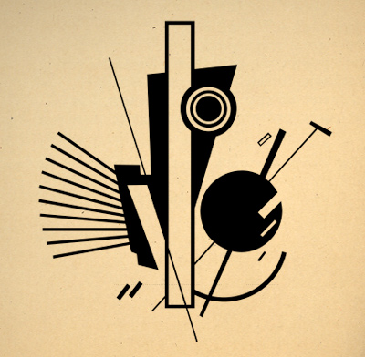
Here’s a sneak peek of some of the PROUNS-inspired dingbats that will be part of my upcoming Jeanne Texte font package.
The basic letterforms are now in technical review at Psy/Ops and I hope to have the new fonts completed and available by end of year. Crossing fingers.
Jeanne Texte is my sequel to Jeanne Moderno, which is available thru Psy/Ops, MyFonts and Ascender. Webfonts via Typekit.


‘Starring: Akzidenz Grotesk & Brooklyn’
Animation by Greg Solenström of Jay-Z’s Hello Brooklyn.
Found via Tipocracia