Emigre, picking fonts and the war in California
‘The pairing and combining of different typefaces has always been a particular graphic design challenge . . . Emigre has its own take on this typographic technique. But instead of providing rules, which often render safe but bland results, we believe that ultimately any font can be successfully combined with any other font. It’s not so much a matter of which font combinations to pick, it’s a matter of how you use the fonts in combination.’
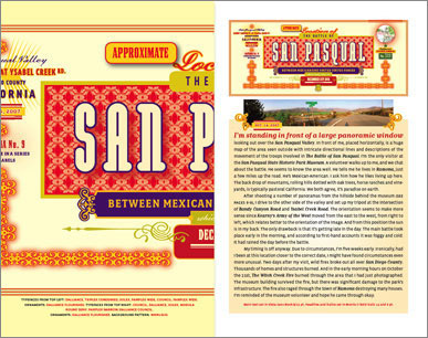
The latest Emigre font catalog – Historia – is a bit like an old issue of Emigre magazine. Strong concept, interesting point of view, wonderfully designed.
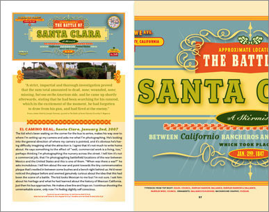
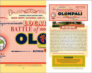
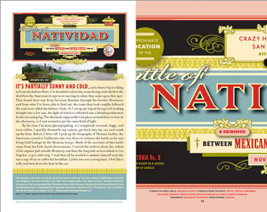
The 64-page specimen highlights battlefield locations of the Mexican-American war, 1846-48; specifically, the battles that took place in what is now California.
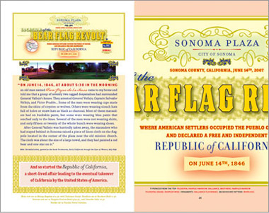
Included is the Sonoma Bear Flag Revolt, where the state’s Bear Flag was designed with a pig on it. It was supposed to be a bear, but apparently William L. Todd was so drunk in celebration, he couldn’t draw an actual bear.
Emigre is selling extra copies of Historia for 3 bucks (10 bucks outside the US). Details and interactive samples here.
This could have been Emigre #71.










1.) What do you think…
2.) […]it would be cool if you took a look at this site. It has some good information on it[……]…