entries Tagged as [education]
A Brief History of the Typewriter
Here’s an odd little video about this 19th century invention that put metal type in the hands of the general public.
And
Here’s an excellent resource: Professor Richard Polt’s original Classic Typewriter Page – live since 1995. Even answers that age old question, ‘Why doesn’t my typewriter have a numeral 1?’
The Island
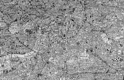
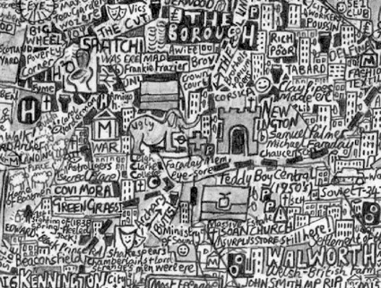
‘The Island satirises the London-centric view of the English capital and its commuter towns as independent from the rest of the country.’
Steven Walter’s personality-driven symbol and typographic map of London.
Available to view in full screen mode. Click on images to zoom/jump.
Found via Zara Evens
The Monsanto future
House of the Future part 1 of 2
Back in 1957, chemical company Monsanto gave the world a modular ‘tease’ of the future as part of Disneyland’s original Tomorrowland – a plastic house with plastic dreams.
House of the Future part 2 of 2
monsanto today
These days, Monsanto is doing something else to change the world of tomorrow; it involves soybeans, genetics, lawyers and massive control of our farming industry. Not too happy about it. There is some hope tho. Consumers do vote with their wallets.
This weekend, I saw Robert Kenner’s Food, Inc. It has some of the gory details about how our food is produced these days. Watch it here. Website (and blog and all kinds of stuff) here.
It’s been almost a decade since I read Eric Schlosser’s Fast Food Nation. Things haven’t gotten better.
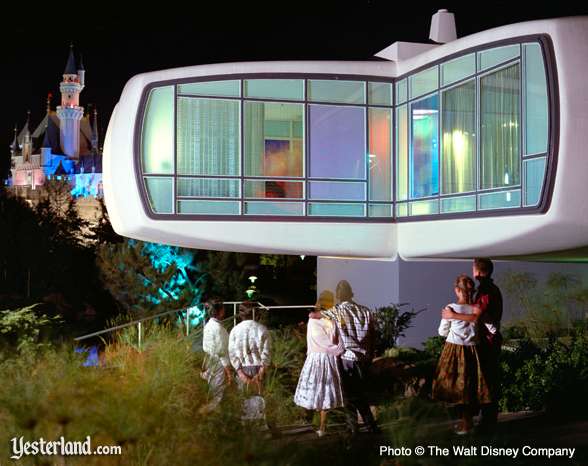
The House of the Future was demolished in 1967. In first attempts, the wrecking ball simply bounced off its plastic surface.
Eames Century Modern catalog
‘A look at printing the of House Industries’ Eames Century Modern catalog.’
Eames Lounge Chair debuts, 1956
Part one of two
‘Charles & Ray Eames show their then-new masterpiece on the Arlene Francis ‘Home’ show broadcast on the NBC television network in 1956.’
Part two of two
So you need a typeface
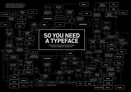
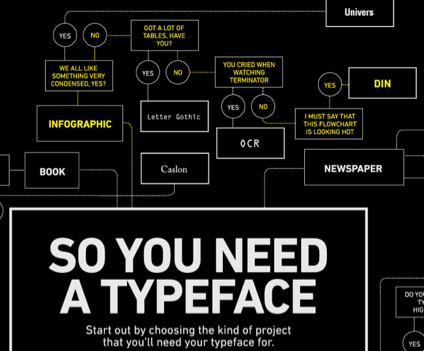
Picking fonts, not the easiest thing to do. But design student Julian Hansen has created a poster that kinda breaks it down into easy solutions.
Click the above image for a full size version.
Are there really easy solutions?
Swiss design uberguru Massimo Vignelli believes so. Here’s I Love Typography’s take on The Vignelli Twelve.
Found via Typekit
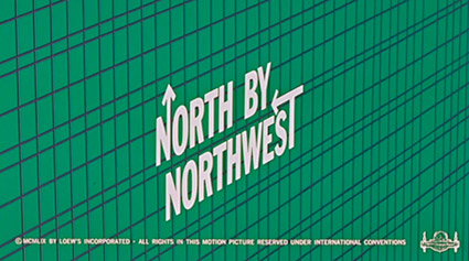
Chatting with Saul Bass
Intro
Here are some highlights from a candid documentary (shot in 1986) on Saul Bass. The doc is available as a 2-DVD set here.
On making money vs. quality work
Advice to design teachers
Advice to students
Thoughts on his legacy

