Bass on Titles
‘Bass on Titles presents a comprehensive, well-rounded retrospective of Academy Award-winner, Saul Bass’ film title sequence design.’
With really bizarre dialog screwy sound looping fx. Watch it above. From 1977.
‘Bass on Titles presents a comprehensive, well-rounded retrospective of Academy Award-winner, Saul Bass’ film title sequence design.’
With really bizarre dialog screwy sound looping fx. Watch it above. From 1977.
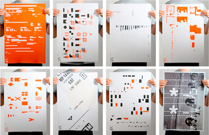
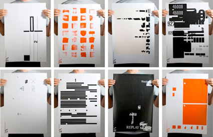
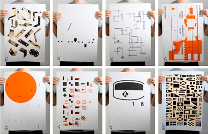
Found visual materials – such as ‘hardware catalogs, magazines, EU flags, product labels, forms or instructions for use,’ reorganized and reinterpreted into a poster series by students at Fachhochschule Mainz.
New order, new design. Details here (in German). Also here (in poorly translated English).
Posters (and other cool stuff) can be snagged here.
Part 1 of 2
‘Jim is affable and funny and incredibly humble, despite the caliber and profile of his work. It was a joy to spend time in his studio as he casually pulled from his flat files one landmark piece of design history after another.’
Stephen Coles sat down with Jim Parkinson and talked about his beginnings as a lettering artist, working at Hallmark, work for Rolling Stone, Newsweek (Dope-n-beer! Will never look at the Newsweek logo the same again), the circus and ‘cigar-smoking twits.’ FontFeed articles here, and here. Videos above (and below).
Roger Black on Jim Parkinson
Part 2 of 2
‘Hand compositors usually set the large type called ‘display line,’ used in advertisements and other printed matter. Hand composition offers opportunities for artistic expression. Compositors who have the ability to create original ideas are highly-paid craftsmen. The work requires manual dexterity, good eyesight and thoroughness.’
Vocational documentary on printing and typesetting. From 1947.
I like how he pronounces ‘ad-verr-tiz-mints.’
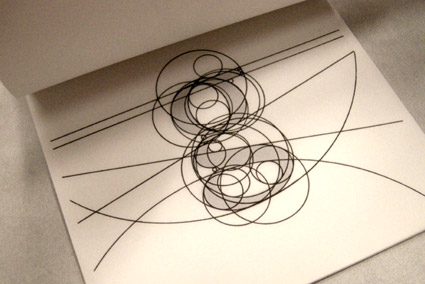
Lowercase ‘g’ study by Matthew Valentine from mehallo’s beginning type course
Here’s a great opinion piece on typographic education by Patrick Griffin.
Found via Oded Ezer
‘Award-winning Typo-Animation that gives you a clear impression of the enormous amount of visual stimuli that plague us every day.’
Grab a Heine and look around. Type is everywhere.
Kapitaal is a film by Ton Meijdam, Thom Snels, Béla Zsigmond of Netherlands-based Studio Smack. Music by The Exploding Shetland Ponies.
‘They are traveling the country . . . join us for the day as they work on producing a unique keepsake with the Museum’s presses and materials – and then have a talk’
This Saturday, April 10, Santa Cruz-based book artists Peter and Donna Thomas will be at the International Printing Museum in Carson, CA. Details here.
More about the Thomases here.
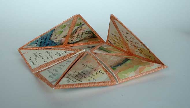
Peter and Donna Thomas’ Ditty of First Desire (2007), a ‘cootie-catcher’ shaped book – with paintings of nudes – showcasing the poem by Federico Garcia Lorca