entries Tagged as [education]

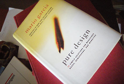
Garcia’s ‘Pure Design’

‘Included are insights into designing covers, formatting pages, selecting photos, using content, choosing a color palette, and picking type for newspapers, magazines, books, and websites’

Another great read. One of my favorites, Mario Garcia’s Pure Design is simple, to the point. A great overview of how to design for publications – from someone’s who been doing it a helluva long time. My copy is maimed by highlighter pen, my own notes and scribbles.

And it’s out of print. But one can easily peruse the free online reader version at issuu.

Follow Garcia’s blog here.
Type specimens galore!

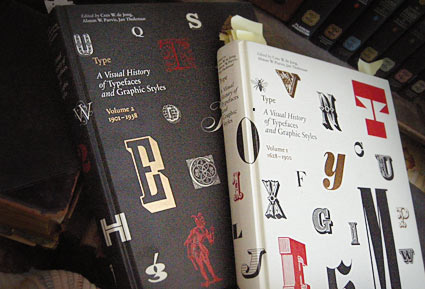
These two oversized coffee table books – which were published in the past year or so – are an odd sort.

Both volumes of Type A Visual History of Typefaces and Graphic Styles sell themselves as design history books.

They have the current editor of Meggs (and similar cover design), but the history is really just a backdrop (with, unfortunately, poorly annotated notes) to what the books are all about: They’re actually an incredible collection of rare typography specimens dated c. 1830-1930. [Read more →]

My take: Graphic design history fu


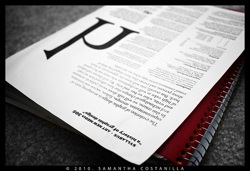
My syllabus, photographed by student Samantha Costanilla

So I’ve been teaching my version of ‘a history of graphic design’ for several years now. Just finished up my 9th session.

As a text, Philip B. Meggs’ landmark research book – History of Graphic Design, first released in 1984 – is the bible on the subject. Even the ‘making of’ has its own edition.

It’s the most thorough analysis, and one of the best graphic design reference books I own. But as Meggs points out in his introduction, it’s only the tip of the iceberg. There is so much more to discover, find, research and incorporate into one’s own view.

Finally, there is another book that just hit the market – The Story of Graphic Design by Patrick Cramsie. It tackles similar ground, but from another angle. A refreshing find. And from what I could tell so far, it syncs with my own classroom take on ‘The Story’ . . .   [Read more →]

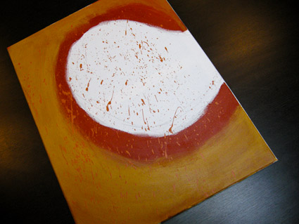
Anderson: Cooper Black

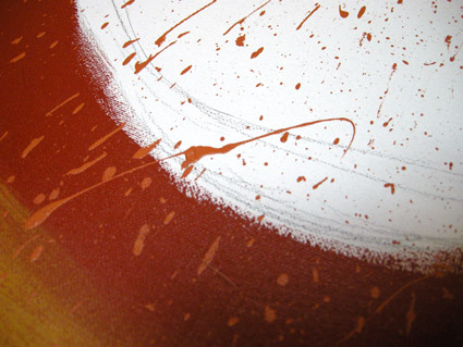
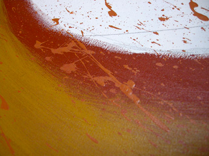
David M. Anderson’s Chaotic Times of Cooper Black, 2008. Mixed media on canvas.

Based on the type of Ozwald Cooper (1879-1940). From my Typography 3 course at Art Institute of California Sacramento.

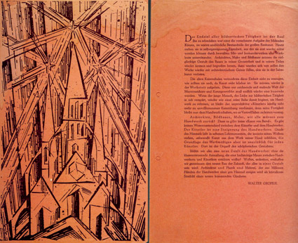
Design manifestos


“Gropius’ Bauhaus manifesto, 1919; woodcut by Lyonnel Feininger

Everyone needs a good manifesto. I have one.

Here’s 100+ years worth of em.

This Tuesday: ADAC’s back

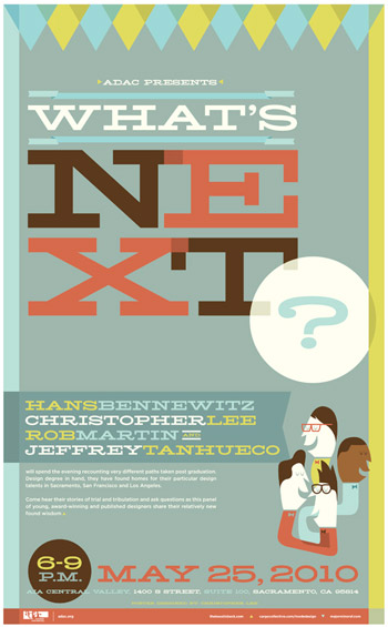
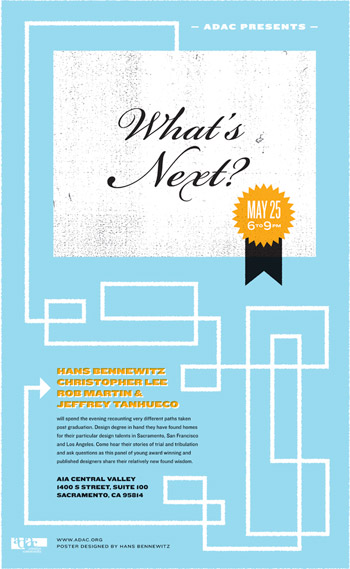
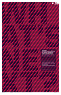
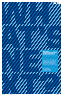
‘ADAC (the Art Directors and Artists Club) presents What’s Next?, a panel featuring four Sac State graduates speaking about the different paths they’ve taken in the design world since graduating five years ago.’

ADAC’s first event in – oh, Lord knows how long – happens this coming Tuesday, May 25, 2010 at the AIA Central Valley Building in Sacramento. Details and pricing here.

Pictured: Four cool event posters by the four designers. Top poster by Christopher Lee; bottom event posters by Hans Bennewitz, Rob Martin and Jeffrey Tanhueco.

Click on images to view large/jump.


Found via Hedie Joulaee

How do I become a graphic designer?

‘ohhhh THATS how i become a graphic designer.’

If you can touch your toes, you’re in.

Found via jescellophane

un-titled: SJSU senior show

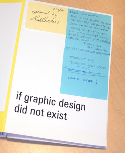
‘if graphic design did not exist, information would suffer, you’d die, and things would be ugly.’

This weekend, my alma mater – San Jose State University – is putting on their 2010 senior graphic design show – with two receptions scheduled.

Tough school. Even Businessweek thinks so – SJSU is one of their top 60 D-Schools worldwide. Always incredible work.

receptions
Friday May 21 and Saturday May 22, 2010 at art ark gallery in San Jose, CA. Details here (click on the people to see their work). Blog here.

Exhibition runs just under a week. Ends Thursday May 27, 2010.

What is design?

‘First and foremost, not everyone can be a designer’

Here’s a great post from former student Raina Dayne. Read it here.

Follow her on Twitter.

Pictured: Moon by R. Dayne

The Slow+Design movement

‘Giacomo Mojoli, vice-president of Slow Food International, contemplates what it means to mutually contaminate the sphere of food sensoriality with the wider one of material, manufacturing and creative sensoriality’

Applying the concepts of the Slow Food movement to design.

NYT article here. Recent article here. Website here.

Take your time, make something better. Very William Morris-like.

Illustration by Leigh Wells for the NYT

Avant garde eating: José Andrés

‘Cotton candy is the most amazing form of caramelization ever invented by man.’

And meat is overrated. Molecular gastronomy pioneer José Andrés is changing food as we know and experience it. Interviewed by Anderson Cooper for 60 Minutes.

Found via CBS News


Creative Commons License

the work at the mehallo blog. beta. is licensed under a creative commons attribution - noncommercial - no derivative works 3.0 united states license.  if reposting, credit must be given to steve mehallo - and if possible, please provide a link back to the mehallo blog. beta.

i include images for the purpose of critique, review, promotion and inspiration - and always make my best effort give credit/link back to the original source.  if i’ve screwed up, please fire me a note.

page layout based on the wordpress 'darkwater theme' by antbag, adapted and redesigned by mehallo.  valuable php assistance from bill mead.