Historical Fragments
The work of Chad Hagen.
Also available: Prints of his Nonsensical Infographics.
Found via Designer Daily
The work of Chad Hagen.
Also available: Prints of his Nonsensical Infographics.
Found via Designer Daily
The work of Mark Weaver.
I really enjoyed his redesign of the incredible Paste magazine (sadly, now an online-only venture) – and do check out his Make Something Cool Every Day project.
‘An original 21st-century design by Alejandro Paul, Brownstone is a monoline sans-serif with ornate details inspired by historic brownstone buildings of Brooklyn, NY.’
Love type. But also love Artie Shaw.
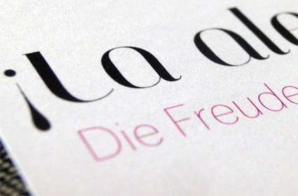
Nina Stoessinger does great work. Pictured, a bilingual birth announcement she designed for a friend, using my Jeanne Moderno Titling font, paired with FontFont’s Dagny Thin.
She dropped a few to me in the post. It’s always great to see how my fonts end up being used.
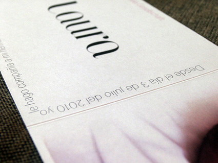
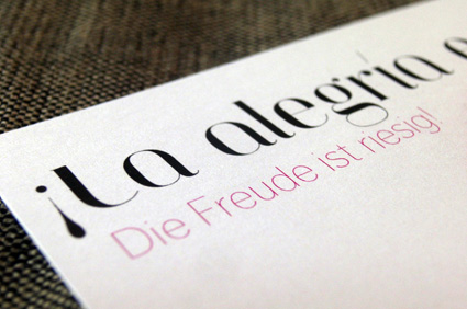
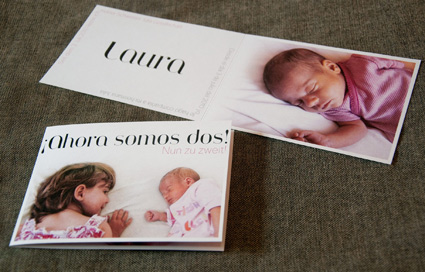
Congratulations to the new parents – and Laura!
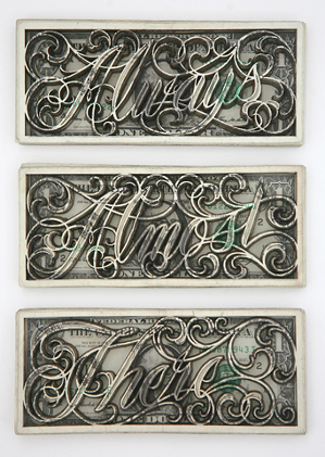
‘The mostly black-and-white collection of works includes ornate latticed designs and cursive phrases ‘tattooed’ with lasers into dollar bills.’
The ‘currency’ work of tattoo artist Scott Campbell.
Found via Young and Brilliant
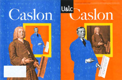
What would William Caslon look like if he were working today?
This is one of my favorite takes on Caslon (above) – editorial designed by Mark van Bronkhorst and written by John D. Berry.
It’s the 1998 front and back cover of one of the final print issues of Upper & Lower Case magazine (and as you can see, my copy is a bit mussed up). William Caslon would be wearing a blue suit today, such is the nature of the biz.
Inside U&lc was an incredible promo for the late Justin Howes’ historically accurate ITC Founders Caslon – one of the most faithful updates ever digitized. [Read more →]
‘Moshun’s a fairly simple design – done in just two days in Illustrator and After Effects – that happens to leap, spiral, and shimmy into place.’
Moshun (pronounced Mo-shun, of course) was created by Dutch designer Jeroen Krielaars. Article (with much more detail) here.
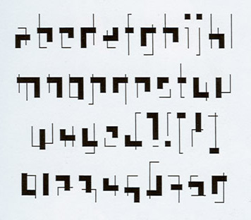
Experimental typeface inspired by the work of Gerrit Rietveld (1888-1964). Drawn in 1990 by Tobias Frere-Jones; now one of the co-owners of H&FJ.
I love how this face captures the orthogonals of the De Stijl movement, of which Rietveld’s famous Red Blue Chair was one of their icons.
Wish this Rietveld type were available somewhere.
Found via a book that I used to have – it vanished into a murky, dusty pile many, many years ago
‘Aubhaus is a constructivist and geometric font. Great for use as a big display font on titles and short texts. It features Latin and Non Latin Characters.’
Rodrigo Fuenzalida’s Aubhaus font. Available thru YouWorkForThem.
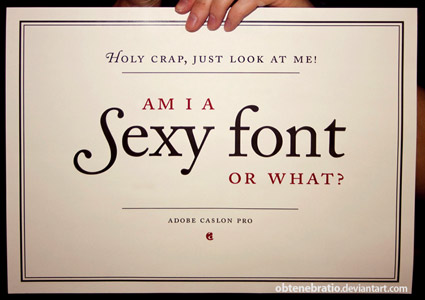
‘I’m a Sexy Font’ poster, created by Obtenebratio
Back in the early 1990s, the Carol Twombly-drawn Adobe Caslon was one of the first font packages I ever purchased.
I’ve been in love with it ever since. I use it on just about everything – including this blog’s title, my own logotype. I’m a font designer myself, but still don’t consider my own letterforms to even come close to what was accomplished with this particular interpretation of Caslon. [Read more →]