Clairol True-To-Light VII
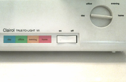
Control panel from my mother’s Clairol ‘True-To-Light’ makeup mirror.
Still in daily use after all these years. Here’s the original, original commercial.

Control panel from my mother’s Clairol ‘True-To-Light’ makeup mirror.
Still in daily use after all these years. Here’s the original, original commercial.
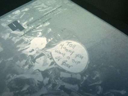
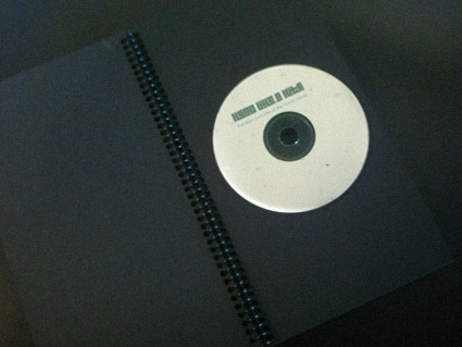
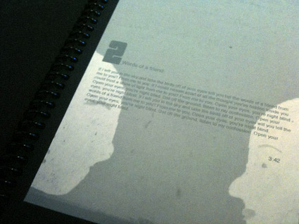
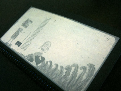
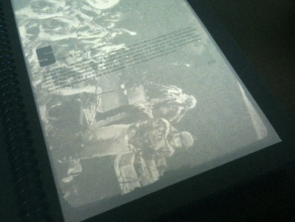
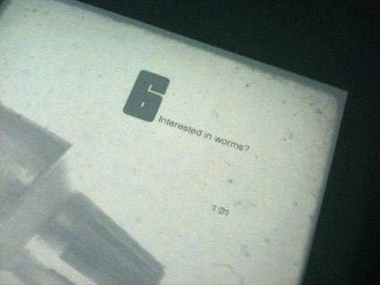
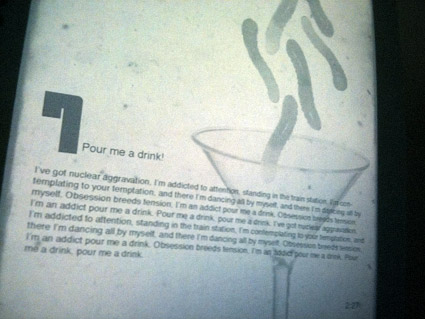
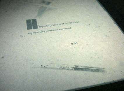
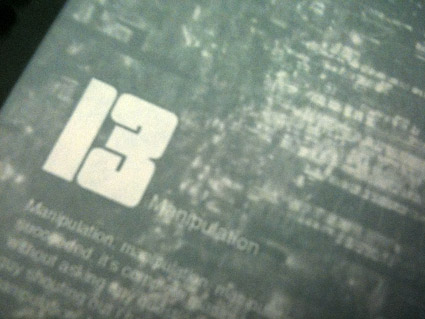
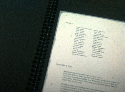
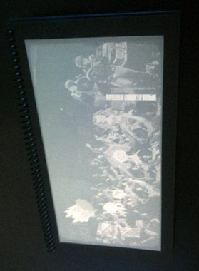
From my intermediate typography course: Student Allie Olcese’s experimental redesign of CD packaging for Head Like a Kite’s Random Portraits of the Home Movie.
Interpretative imagery veers from found photography, illustration, finger paints to hypodermic needles, gummy worms and tin foil – rendered in subdued, faded colors.
The final piece is housed in a wire-bound album, accented with carefully set 1970s-style shareware type.
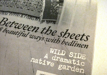
‘inspiring homes with heart’
Magazines are great sources for inspiration. Not as permanent as a logo – or brand – periodicals have a timer on them. After a few months, they’re gone.
A good newsstand is a treasure trove of the experimental, conservative, international, concise, good, bad, ugly. I drop by whatever I can find – even the Barney Noble chain if one is not nearby – just for a shot in the arm.
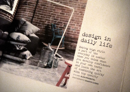
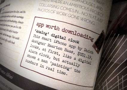
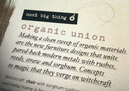
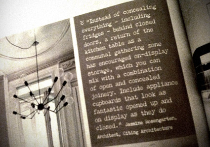
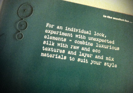
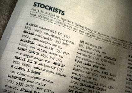
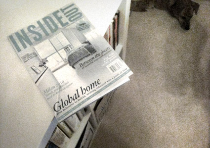
Earlier this year I spotted Chandler 42 being used in an Australian interiors pub. Alexendria-based Inside Out is using my typewriter type as a nice accent throughout their pages.
Here’s a few snaps (taken in my new home office – sleepy dog in background).
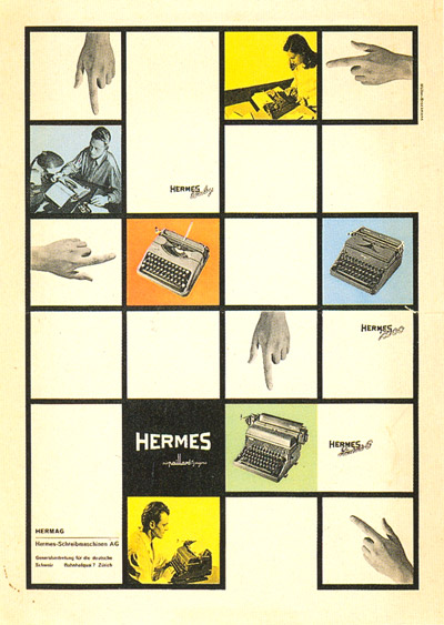
Ad for Hermes typewriters, designed by Josef Müller-Brockmann, 1950.
Müller-Brockmann video homage here.
Found via Josef Muller-Brockmann: Pioneer of Swiss Graphic Design
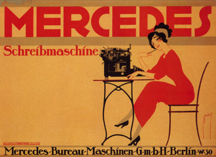
Mercedes Schreibmaschine poster by Ernst Dryden, 1911.
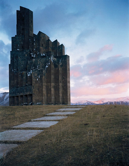
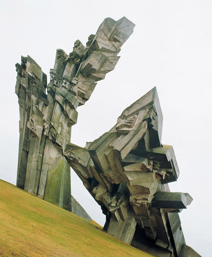
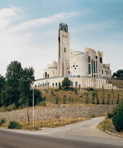
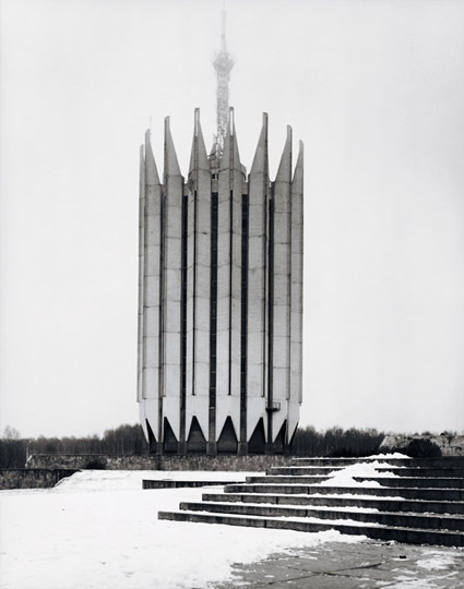
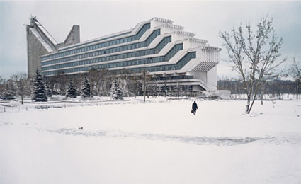
‘The beauty of Soviet brutalism’
Frédéric Chaubin’s photographs of 90 oddly-designed buildings constructed in the final decades of the Soviet Union.
And thru Taschen, available in handy book form.
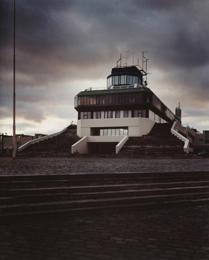
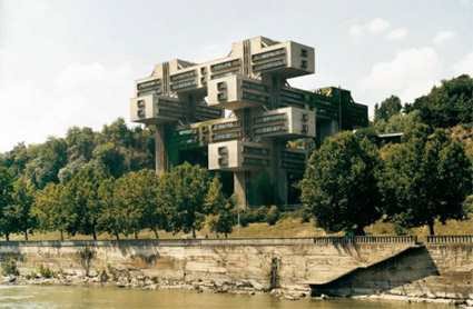
Found via RebeccaWho