entries Tagged as [design]
Andrews, 1934
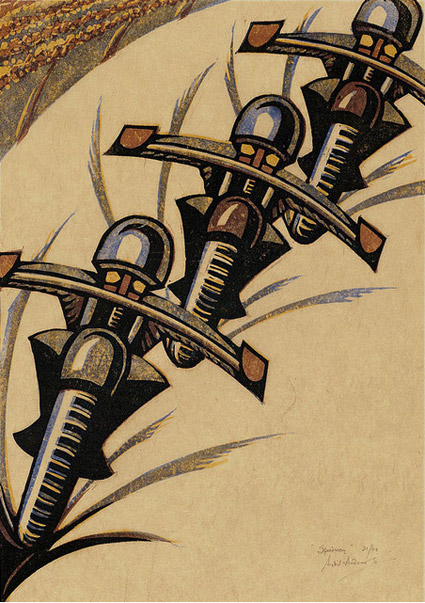
Sybil Andrews’ Speedway (above) is a linotype print commissioned by the London Passenger Transport Board in 1934 to advertise what was a new spectator sport, Speedway Racing.
The final piece – like the famous ‘keep calm’ poster – was never used for its intended purpose.
Found via Gunther Stephan
Goncharova, 1913
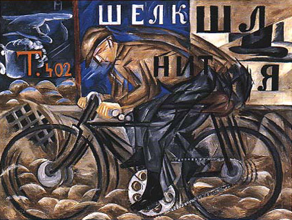
‘She did not hesitate to break up forms and rearrange their component parts. She introduced musical notation, letters and words, as they flash past in shop signs; she expressed movement by repeating the same form in several phases of its action and velocity by blurring contours.’ –Goncharova: Stage Designs and Paintings
The work of Natalya Goncharova (1881-1962).
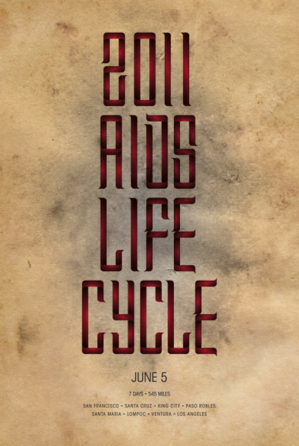
2011 AIDS Life Cycle
‘It’s a 7-day, 545-mile bike ride from San Francisco to Los Angeles to make a world of difference in the lives of people living with HIV and AIDS.’
This weekend, designer Christopher Le is biking south in support of the San Francisco AIDS Foundation.
Donate here. Snag poster (above) for contributions of $50 or more.
David Byrne: Architecture affects music
‘Does the venue make the music? From outdoor drumming to Wagnerian operas to arena rock, he explores how context has pushed musical innovation’
Found via Lucy Cook
Korean Convergence
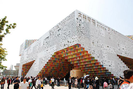
‘It’s an amalgamation of ‘sign’ (Korean written language) and ‘space’: signs become spaces, and spaces become signs’
The South Korean pavilion at the Shanghai World Expo 2010. Designed by Mass Studies. More info here.
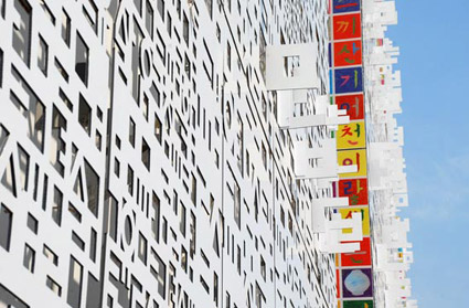
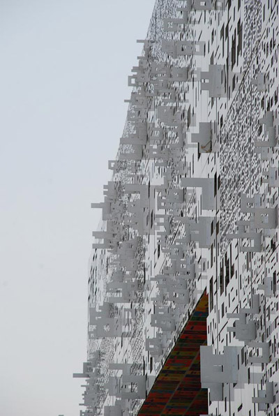
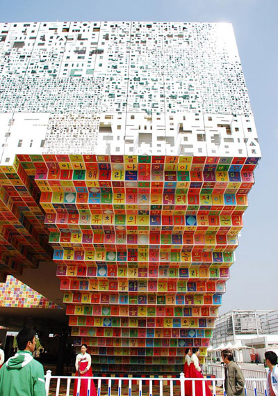
Found via Poketo
Design in use: ‘How Buildings Learn’
Designing for use is something often overlooked by designers. What happens once the design is in the hands of actual people?
Stewart Brand takes a long look at design AFTER it’s implemented – in this case, the design of buildings. Does ‘form follow function?’
6-part, 3-hour BBC Documentary. Based on Brand’s book. Music by Brian Eno. From 1997.
Posted in its entirety on Google. Part one above. For part two thru six, go here.
