entries Tagged as [design]
Atomic kitchen: Music and visual
Funki Porcini Atomic Kitchen
Short film from Funki Porcini’s CD/DVD album Fast Asleep.
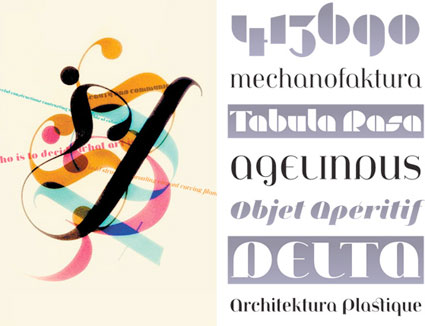
Typographic album cover:
(Hm. This cover reminds me of theSTART’s Chelsea Davis)
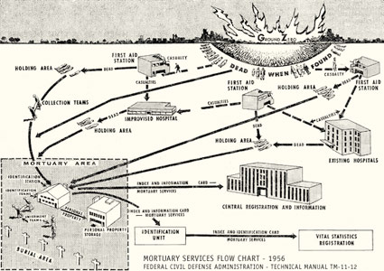
Atomic kitchen: Duck, cover!
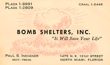
Bomb Shelters, Inc. business card, 1959
Everything you’d ever need to know about ‘The Golden Age of Homeland Security’ can be found at the Conelrad website.
The site is named for the Civil Defense emergency network – ‘CONtrol of ELectronic RADiation’ which was set up to broadcast on AM 640 and 1240 in the event of an atomic attack.

Illustration from Walt Disney’s Our Friend the Atom children’s book, 1956
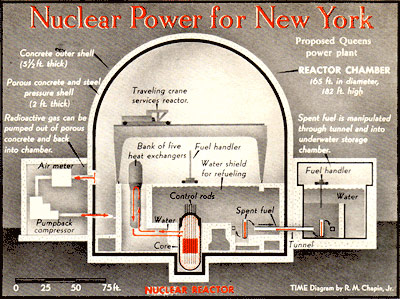
From TIME, July 26, 1963
Atomic kitchen: printing food and more
In the future, we were all supposed to live off of a never ending supply of nutritional pills. Which, from looking at the pill-based ‘natural’ supplements in my medicine cabinet – purchased in the pill section of the ‘natural’ food store – we’re not too far off.
From Wallpaper: Here’s three future of food videos by the Philips Food Design Probes project. Press release here. Gallery here.
The Nutrition Monitor
‘The Nutrition Monitor scanning wand consists of a sensor which is swallowed, and a scanning wand which can measure the nutritional value of food. It can determine exactly what sort of food you need, when you need it, and how much of it you actually need to eat to match your requirements and achieve optimum health.’
The Food Printer
‘The Food Printer provides molecular gastronomy at the touch of a button by using the principles of rapid prototyping. Simply pop in a couple of cartridges of, say, carrot and onion, and ‘print’ them into whatever shape and consistency you fancy.’
The Biosphere Home Farm
‘The Biosphere Home Farm contains fish, plants and other mini ecosystems, and allows different life forms to live in harmony with each other. It looks like a 21st century aquarium crossed with stylish shelving unit.’
Jeanne Moderno detergent
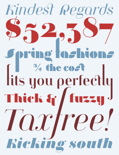
I was told when I released my Jeanne Moderno fonts, they’d probably end up being used on a cereal box.
Instead, I’ll settle for this cool laundry detergent box designed by Bootleg.
Jeanne Moderno type samples
. . . And when MyFonts did a write up of my Jeanne Moderno fonts for their Rising Stars newsletter – they spent some time digging thru so they could show some of my telescoping ascenders, alternates and ligatures (above). I like to hide things in my fonts, fill the blank slots as it were.
(Below) Psy/Ops new type sample for Jeanne Moderno. Psy/Ops also carries the Jeanne fonts, they did the final OpenType mastering before release (and without their support, Jeanne could possibly still be sitting in the 10 year limbo that was part of my process).
Making a type sample
The Making of a Type Sample from FontShop on Vimeo
Once a font is completed, showing the letters and glyphs in their best light is a tricky exercise. FontShop does it right and in this video shows some of the decisions made when creating a good type sample – in this case, the sample for Matthew Carter’s beautiful Miller typefaces, which I used for The Sacramento Union Magazine.
In the 1800s, type foundries used to set their samples in Latin – following the belief that our alphabet looks best in its original language. Marcus Tullius Cicero’s first speech against Lucius Sergius Catilina (below) was popular for samples.
Today, graphic designers use Lorem Ipsum for placeholder text.
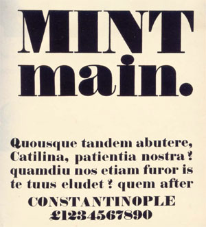
Robert Thorne’s Fat-Face type sample, 1821
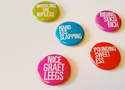
Really seksi spam buttons – for charity
As I write this, there are 2,728 items in my spam folder; most of them involve some form of penis renovation, ‘The Big Pink,’ ‘urgent and confidential business’ inquiries from deposed royal family members that need my help – and on my blog, 2,201 spam posts sitting in what I call my ‘hey asshole, don’t spam my blog’ folder.
Designer Floyd Hayes has decided to turn annoying spam into money – for a good cause. Since a lot of spam is about freaky misspelled sex stuff, every four weeks Hayes will be issuing the best subject lines as buttons and donate all the profits to a sexual health charity. Details here.
Oh and wait – ‘The Big Pink’ is actually a cool new band, it’s an email I’m actually subscribing to. Here’s their debut album, A Brief History Of Love. Drops September 22nd.
I really wish spam filters worked better.
Buttons found via PSFK
Information design: Life, death, taxes and spam
‘Le Grand Content examines the omnipresent Powerpoint-culture in search for its philosophical potential. Intersections and diagrams are assembled to form a grand ‘association-chain-massacre’ which challenges itself to answer all questions of the universe and some more.
‘Of course, it totally fails this assignment, but in its failure it still manages to produce some magical nuance and shades between the great topics death, cable tv, emotions and hamsters.’
For more about the work of Clemens Kogler, go here.


