entries Tagged as [design]

Redesinging the threat level

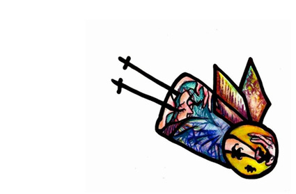
‘To mark the return to sanity, The New York Times asked four graphic designers to imagine a new warning system. Their designs range from the cheeky to the possibly useful. Kurt Andersen provides commentary and explains why the current system is a joke.’ -Andrew Price, GOOD

Legendary SPY magazine was one of my favorites – and founding editor Kurt Andersen is still making snarky commentary. Click either the image or the quote link to read more.

For more from Kurt, check out his weekly radio program Studio 360 and ‘Get inside the creative mind.’

And for the record, I am really glad the Obama administration recognizes the value of good graphic design. Makes me all warm and fuzzy inside just knowing this.

Found via GOOD

Disgust this

San Francisco is a beautiful city.

But there is a dark, very visible problem – one that frames our current national Health Care debate. The problem stems from what has been the traditional US approach: It’s not even happening or We wish all that would just go away.

For the rest of the country, it can be adapted to the acronym: NIMBY. It’s Not In My Backyard so it doesn’t exist. Or: we don’t see it in our backyard, so it’s not actually there.

Danish band Mew was in SF recently and guitarist Bo Madsen posted a simple but poignant observation on their MySpace blog. Here’s the text: [Read more →]

Tschichold: distinguisted typographer

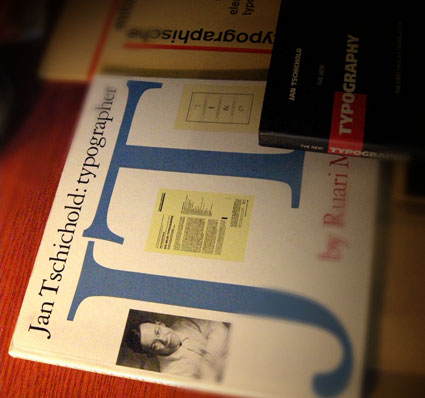
When I want to design something that calls for sophistication, I thumb thru the work of Jan Tschichold (1902-1974).

Modernist and  . . .  Classicist. This contrast leads to some interesting thinking that informs my own ability to design for different industries.

Tschichold put The New Typography on the map by publishing the book on the subject and helped spread the idea of the bauhaus – and modernism – worldwide.

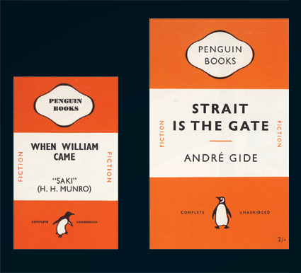
The largest project of his career took place in the late 1940s – the redesign of Penguin’s line of paperbacks (below). As a whole, Penguin’s quality hasn’t wavered since.

Here’s an overview of the work of Tschichold at retinart – with some good links for additional info.

And I’m still looking for a decent (inexpensive) replacement text for my beginning type courses since Tschichold’s Treasury of Alphabets and Lettering is now out of print. Nothing I’ve found so far comes close to showing well-drawn – and well selected – metal specimens.


Penguin redesign, an exercise in subtlety: before (1941) and after (1947)

Penguin by Illustrators

When it comes to design, UK-based Penguin Books produces some beautiful specimens. And here’s a write up by Ace Jet 170 on the Penguin Collectors Society and their wonderful Penguin by Illustrators monograph.

David A. Carter: Popping up in Roseville


The Pop Up Artist
Video produced by Manny Crisostomo for The Sacramento Bee

 
Pop-up book master – and paper engineer – David A. Carter has been expanding his art into geometric abstraction.

Inspired by the work of Alexander Calder (1898-1976), Carter’s Red Dot series will be on display at the Blue Line Gallery in Roseville, CA [map]

The opening reception is this weekend: Saturday, September 19th, 2009 from 6:30 – 9 p.m.

Read The Sacramento Bee article here.
Show information here.
Exhibition runs thru January 9, 2010.

Found via Jonathan Weast

Advertising: the movie


Trailer for Doug Pray’s Art & Copy

Premiered at Sundance. Coming to a place near you. Details.

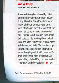
And here’s the review from Entertainment Weekly  . . .

It’s not all about fonts


Shirley-Ann Dick’s There’s more to life than Helvetica tee

Designed in under 10 minutes.

Found via Whitezine

& cufflinks

Ampersand Faux Cufflinks at Veer.

Found via swissmiss

Type mistakes you may be making


Fonts can’t handle being stretched, they end up looking awkward/slows down reading

Fonts require a lot of massaging in order for them to work for you. Here’s a list of some fairly common mistakes – posted over at The Design Cubicle.

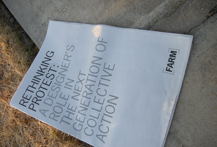
FARM: Rethinking protest

Robyn Waxman’s FARM project broke ground Saturday March 28, 2009 – with the goal to build a 66 foot long community-servicing/maintained farm on a toxic strip of land in San Francisco. FARM is in full swing on Hooper Street, which segments the SF campus of California College of the Arts. The project now has plans to branch out into Davis and Sacramento.

Find out more about FARM here.

Melbourne: new identity

Melbourne, Australia has a Landor-designed new identity, all built around some funky M treatments. More images here.


Creative Commons License

the work at the mehallo blog. beta. is licensed under a creative commons attribution - noncommercial - no derivative works 3.0 united states license.  if reposting, credit must be given to steve mehallo - and if possible, please provide a link back to the mehallo blog. beta.

i include images for the purpose of critique, review, promotion and inspiration - and always make my best effort give credit/link back to the original source.  if i’ve screwed up, please fire me a note.

page layout based on the wordpress 'darkwater theme' by antbag, adapted and redesigned by mehallo.  valuable php assistance from bill mead.