entries Tagged as [fashion]
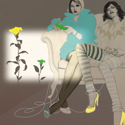
Karlina and Naty
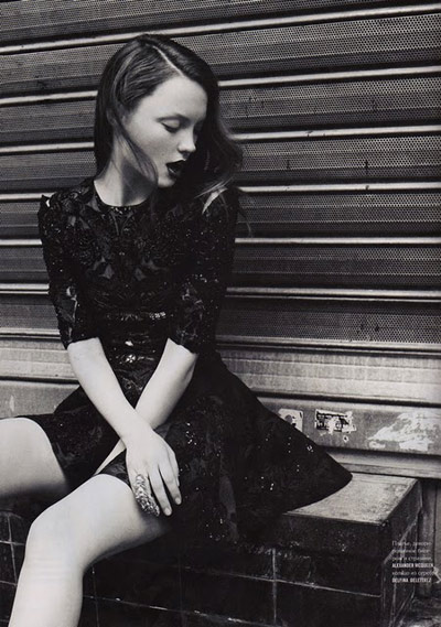
Karlina Caune and Naty Chabanenko photographed by Andreas Öhlund.
Fashion editorial for L’Officiel Russia, March 2011.
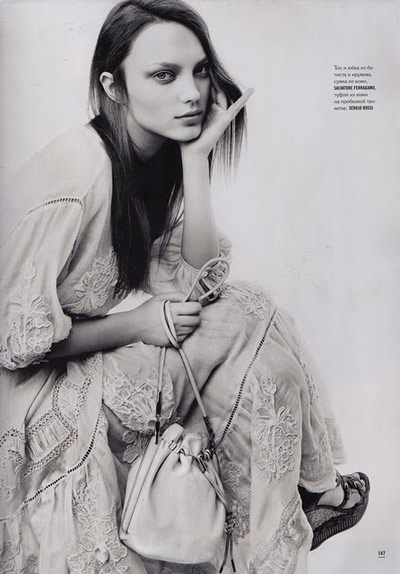

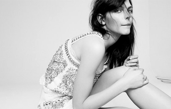
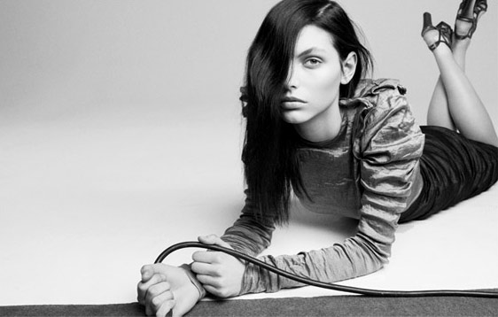
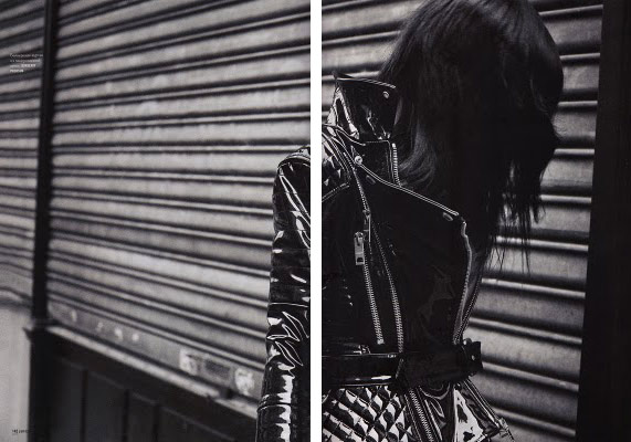
Found via Love Life
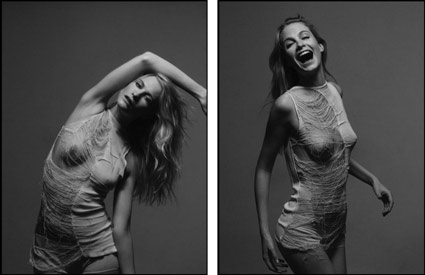
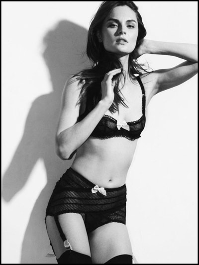
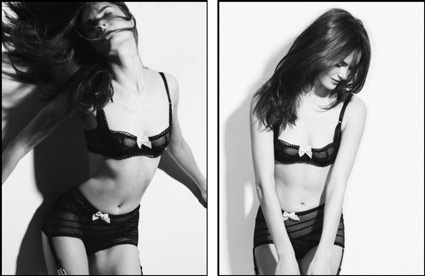
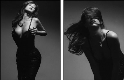
FLIP
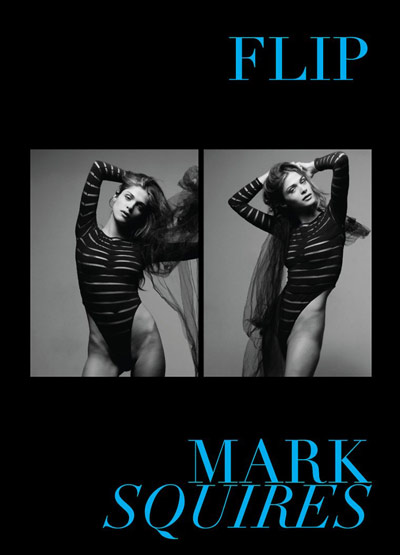
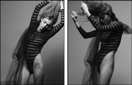
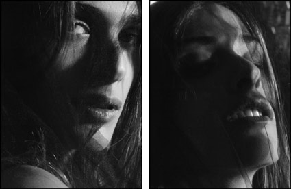
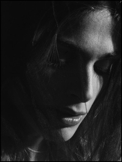
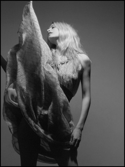
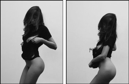
‘It is in an essence a ‘flip’ book, you can see the models . . . move from frame to frame.’
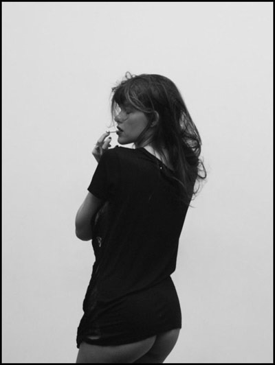
Photographer Mark Squires’ FLIP book.
Featuring Elisa Sednaoui, Poppy Delevingne, Anouck Lepere and Paz de la Huerta.
Found via Natasha Scarlet
Sela
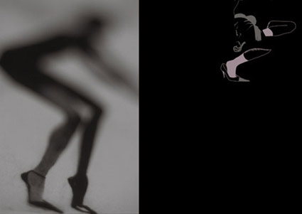
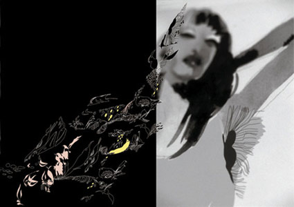
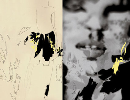
Advertisement produced by Itai Bachar for Russian clothing company Sela.
Street meat
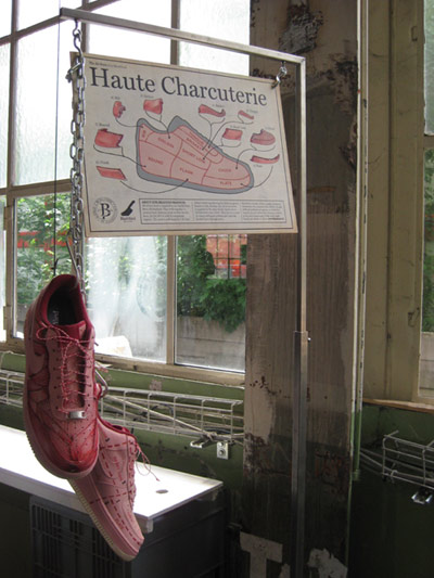
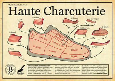
‘The sneakers, a pair of Nike Air Force Ones are called ‘Haute Charcuterie”
Meat shoes designed by Swiss design firm BlackYard, presented at Art Clash 2009. More info here.
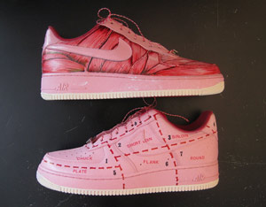
Found via Modern Urban Style
‘If pigs could fly’
Pink Floyd’s Pigs (Three Different Ones).
Old Penney, new logo
JCPenney last ‘officially’ updated their logotype in 1971 – changing from a custom script (seen above) to Helvetica, set clean and neat (below).

1971
And last night – in a series of Academy Awards spots – jcp unveiled its new moniker (at bottom). Red box (retained from originally, their ‘it’s all inside’ campaign), lowercase helvetica, still clean and neat.
‘The winning design was provided by Luke Langhus, a third-year graphic design student at the University of Cincinnati.’
I do like when a redesign keeps the flavor of the original – here’s the official press release. Although this update does beg a few questions:
Doesn’t this look a lot like what GAP abandoned last year? And is the connection to Target’s brand a bit too obvious? And is ‘crowd sourcing’ how they went about this?
‘Participants included the Company’s associates, several design agencies and two art schools – University of Cincinnati and Rhode Island School of Design – that collectively submitted over 200 designs for consideration.’
I hope on the labor front, logo development participants were not as crowdsourced as is becoming commonplace. And it is a risky move to go this route – some could say jcp is running with what GAP chose to reject.
Though in the end, good merch behind the logo will determine what happens next. ‘What’s inside’ is still more important than not.
1964 Penneys architectural drawing found via Vintage Seattle, click image to view larger, more/jump
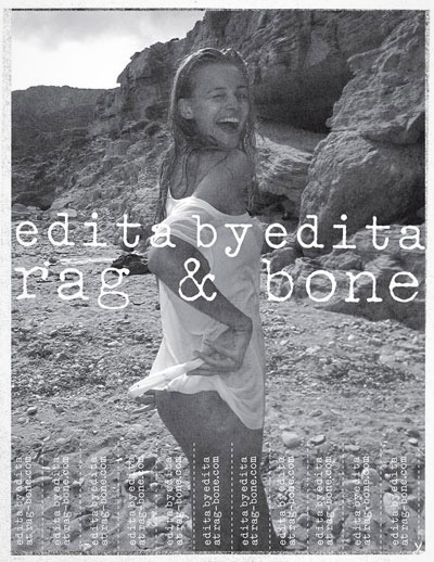
Rag, Bone, Default
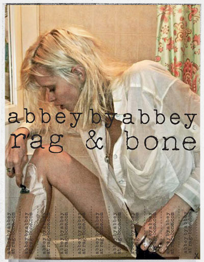
‘Rag & Bone enlists an astonishing top models cast for their SS11 campaign shoot – photographed by models themselves and their friends’
Many years ago, I worked on an ad campaign that took this candid approach. Only without the supermodels. And ultimately, without approval. Our series, targeted to IT professionals, would have been the first printed appearance of Psy/Ops’ Default Gothic – we were doing our mockups using beta versions of the fonts.
Pictured: Abbey Lee Kershaw, Sasha Pivovarova, Lily Aldridge and Edita Vilkeviciute
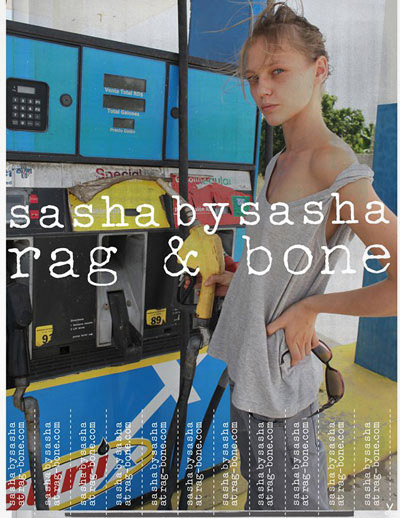
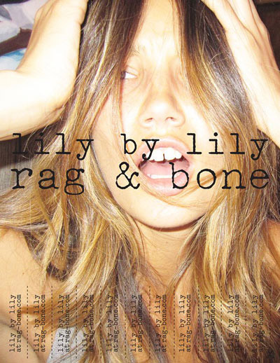
Found via Design Scene
