entries Tagged as [art]

‘A boldly different Star Trek experience’

I read somewhere that this novel sent Gene Roddenberry into a tizzy. Don’t know if it were true, but this book has some nasty religion stuff, nymphomaniac Ensign Sara George, lots of sex and the crew in a nakkid crucifiction in the rain something or other. I remember reading this as a kid and thinking about the rather frank, adult content, This is NOT going to be made into a movie is it? Also thought: This Star Trek thing is pretty damn interesting (teenage hormones speaking, of course).

‘Ensign George was pure, unadulterated, wanton sex.’

Yeah.

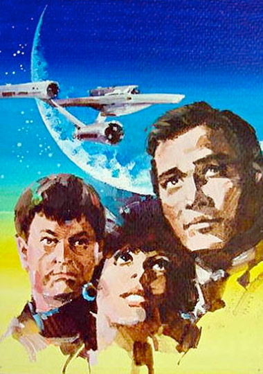
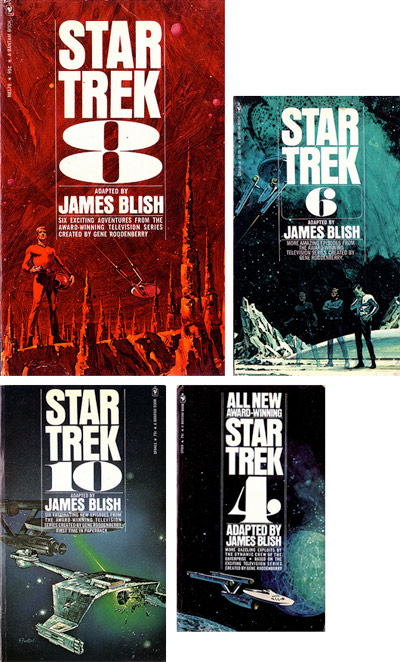
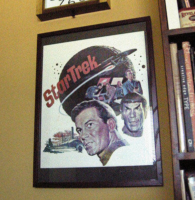
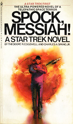
This was one of the first original Trek novels, released in 1976. I loved the stark whiteness of the original glossy Helvetica-set cover (now faded); paired with wonderful artwork by Gene Szafran. Unfortunately, future printings ended up with more literal interpretations up front.

Here’s a blow by blow review. Snag a copy here (is this thing even still in print?)

The long lost Star Trek comic strip

In 1979, the week the first movie premiered, Paramount launched a daily Star Trek comic strip. Thomas Warkentin was the first writer/artist to work on the title and I loved his attention to detail.

The strip adapted the production design of the first motion picture and Warkentin even went so far as to put small details on the viewscreens that was often wasted when printed small in the paper. I had a drawer full of the clipped strips, they’d turned a nice gold color over time.

The strip itself has never been reprinted, lost in a world of legal ownership issues. But the entire run can be found here. Though not in the best user friendly format. There’s also links to some great UK-based Star Trek comics from the 1970s. Handy checklist here.

More Trek: Artist Toru Kanamori

When Star Trek first became a global sensation, Toru Kanamori landed a gig illustrating Japanese translations of the original series stories. Wouldn’t it be great to reprint a bunch of these in an art book with text from the Blish novels?

You know, I’d love to design something like that. Somebody call me.

For more about the work of Toru Kanamori, jump here.

Edu in Spain: Friday night show

The jazz-inspried work of Edu Camacho. MySpace here. His work reminds me of several artists, including Fortunato Depero and Ben Shahn.

Edu is part of a group show Friday night (tomorrow): which includes paintings, illustration, projected photography and short film. November 20, 2009 in at maumau underground in Barcelona. Details here (translated).

Mitchell Hooks: Pulp

Mitchell Hooks was one of the pioneers of the ‘literal’ illustration style employed on pulp paperback covers.

Overview here. Flickr collection here.

And
UK Vintage has a whole photostream of paperback covers in the same genre here. Even more here. And gads, here.


Found via Drawn!

Early Star Trek novel design

Author James Blish turned the original episodes of Star Trek into short stories, which have been printed and reprinted by Bantam Books.

The original cover paintings (above) were top notch. Lou Feck’s incredible brush strokes and fanciful landscapes took Star Trek beyond the confines of a television SFX budget (he did #s 4, 7 and 8). Eddie Jones made a blasted Klingon engine look really cool on #10 (Jones did the later numbers in the series, under the pen name S. Fantoni).

And the type: Helvetica Condensed and some ultra bold numbers (you know, like one of my fonts).

Cool design for explorers on the edge of space. Here’s Modern Fred’s Flickr/photoset of the bunch. And while you’re out exploring, check out Fred’s other space age modern snaps.

Star Trek-n-me


Star Trek poster 1966, art by James Bama

Okay, I’ll admit it. I was a trekkie from way back. Sort of lost interest along the way, but I did enjoy the new movie. Which releases in all sorts of formats this Tuesday.

The message of Star Trek is a good one, when it works. A future utopia where humans have gotten past all their petty hangups. President Obama thinks this way. It’s good thinking.

velour: fabric of the future!
Of course, the early design of the show fascinated me. The look changed after its second pilot episode – which featured cast and crew in these really nifty velour shirts (that Kirk could rip at will). I have the original publicity poster framed in my office (above). The art is by the incredible James Bama, great write up at the Drex Files.

The poster really captures the original look, which was a mix of mid-century modern, googie and space age Disney.


In the future, everyone gets a gooseneck video monitor!

It would have been fun if the new movie had the original velour shirts (above) on the bridge of the Kelvin. The U.S.S. Kelvin, at least, had Star Trek’s signature ‘ping’ noise and the lighting was a little bit like the scene from above. Those were a nice touches. [Read more →]

Bauhaus at the MoMA

”It’s a Haushold word, the Bauhaus, but a misunderstood one. Its influence is all around us, from Ikea furniture to glass skyscrapers, but it is credited – and blamed – for much more than it should be.’ -Candace Jackson, Wall Street Journal

The bauhaus was about advanced thinking in design, and it has its successes and failures. It was a great experiment and it changed the world. Its influence can be seen in everything today.

Workshops for Modernity: Bauhaus 1919-1933 just opened in NYC. And the exhibition is about going beyond the basics, show how far reaching the school actually was.

WSJ article here. Exhibition info here. Catalog here. TIME magazine video here. Show runs thru January 25, 2010.


Ludwig Mies van der Rohe armchair, 1927-30

Global type art

Arabic and more. The work of Saeed Al Madani.

Barbara Kruger: Born/Dying

Continuing in NYC is Barbara Kruger’s typography-based exhibition about media bombardment, Between Being Born and Dying. Show runs thru November 21. More info here and here.

Found via Michael Martinho

Dürer’s rhino


Albrecht Dürer’s Rhinoceros broadside, 1515

‘probably no animal picture has exerted such a profound influence on the arts’ -T.H. Clarke

The story behind Dürer’s Rhinoceros involves a Pope, some guesswork, a sketch and a shipwreck.

And the famous 16th century poster (above) influenced rhino art for years to come. This Wiki has some great historical detail (with derivatives) – including Salvador Dalí’s sculptural take on Dürer’s famous Rhino (below).


Salvador Dalí’s Rinoceronte vestido con puntillas, 1956

rhino prints
And one can snag a giclee print of Dürer’s rhino here. Or here. Or if a poster doesn’t suit and you’d rather have a tee, mug or stein, check out these wares at Cafe Press. This one hops. Or here’s basic black.

rhino book
The story behind the actual rhino became the basis for Lawrence Norfolk’s epic novel The Pope’s Rhinoceros. Snag a copy here.

rhino sale
Plus, a few years back – in lieu of a White Elephant – a handful of volunteers from ADAC had a White Rhino Sale. Because ‘white rhinos trump white elephants.’

Dürer said so. Flyer below.


Design by mehallo and Jeremy McCain (with a little help from Dürer), 2006


Creative Commons License

the work at the mehallo blog. beta. is licensed under a creative commons attribution - noncommercial - no derivative works 3.0 united states license.  if reposting, credit must be given to steve mehallo - and if possible, please provide a link back to the mehallo blog. beta.

i include images for the purpose of critique, review, promotion and inspiration - and always make my best effort give credit/link back to the original source.  if i’ve screwed up, please fire me a note.

page layout based on the wordpress 'darkwater theme' by antbag, adapted and redesigned by mehallo.  valuable php assistance from bill mead.