Normandie: the band
David Letterman 101

Late Night with David Letterman premiere, February 1st, 1982
Photo: Nancy Kaye/AP
I’ve been a fan of David Letterman for years. Back when he used to guest host the Tonight Show and he did a long, long bit on how thick the chili was in the NBC commissary, when he once mentioned that the word ‘snacks’ never, ever appeared in the Bible, and asked a store called ‘just light bulbs’ if they sold anything else. [Read more →]
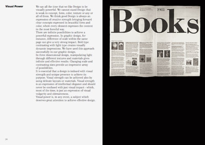
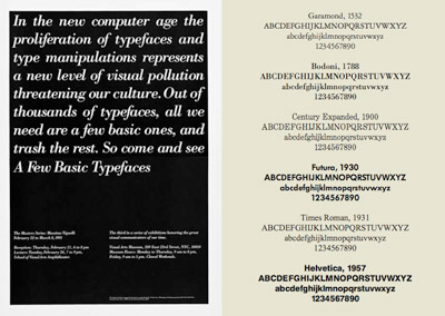
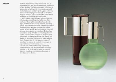
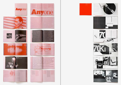
Vignelli’s new type book: free download
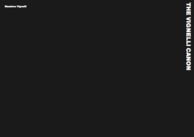
Swiss International Style guru Massimo Vignelli has released a new book on using type in graphic design. In it he explains in concise detail how it’s done. And as with all his work, it’s precise, clean, neat. Also, it’s free.
Download here: The Vignelli Canon [PDF]
Kroy!
I used to use ‘The Kroy Machine’ for the Monday Morning Blues.
The Blues was a college zine. I was editor and designer. We had no Macintosh, only an old Apple II with a basic word processing program hooked up to an inky typewriter-like dot matrix printer. Most articles were typed on an actual typewriter because that was sometimes easier.
The Kroy was a lot like a large Dymo labeller. And it was a BITCH to work with, the kerning sucked (the dial on the bottom was for kerning/tracking, but you couldn’t easily see what you were doing), the letters jumped around a lot – the gum on the labels was very sticky/not repositionable. But you could make little headlines on transparent tape – and it was a huge step up from rub off lettering.
Learned to hate the Souvenir and Stymie fonts while using that thing. Cooper, LOTS of Cooper Black!
Here’s more info about this particular machine, via our design studio uses only the finest state of the art technology.
The art of Calligraffiti

The work of Niels Shoe Meulman, via Some Type of Wonderful
This comes up a lot in my type classes. Urban lettering – graffiti – is often practiced by students in my typography courses. The work is typically great, however, where things tend to fall apart is when I’m teaching traditional form, such as script or italic.
As one student put it, “in this class I learned not to be gangsta . . . . ” [Read more →]
TheSTART at the Troubador
Introducing: Jeanne Moderno, 9 new modernist fonts
get modern[o]
This is what I’ve been up to for the past year. Instead of plopping down in front of the tee vee, I decided to do something a bit more productive. [Read more →]
Illustration Play
History of the Internet
History of the Internet from PICOL on Vimeo
Plus, check out The National Science Foundation’s official Birth of the Internet page.
I keep meaning to add a short web history component to my graphic design history class – and found some great classroom-friendly sound bytes in NSF’s collection.
Also found this fun little history of Twitter ditty.
The Oval Office: IKEA makeover
IKEA sets up a mock Oval Office in Union Station – bringing a touch of low cost Sweden to the White House. (or to make a Carter reference: Looks like IKEA is bringing ‘Billy’ back to the White House.)
