Totally blunt: 8 common graphic design myths revealed
Thinking about going into graphic design? Wanna know what you’re getting yourself into? What’s it all about?
Click the image and read thru:
Found via Twitter.com/Colorburned
Thinking about going into graphic design? Wanna know what you’re getting yourself into? What’s it all about?
Click the image and read thru:
Found via Twitter.com/Colorburned
‘It’s basically a set of modernist re-workings of classic album covers, where the album title has been distilled into a simple little black and white pictogram which acts as the artwork. So far the collection has 25 hits and misses.’ – Heath Killen, Illumination Ink
See em here.

Image via dvisible magazine
Graphic designer Reid Miles and the Blue Note label – incredible album cover design. Here’s a great article on Miles.
And here’s the Wu-Tang albums as Blue Note releases. Found via Twitter.com/Sandoer.

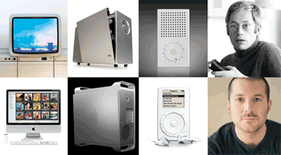
Pictured: The products and designers; top: Braun, bottom: Apple
Great article at Gizmodo: 1960s Braun Products Hold the Secrets to Apple’s Future.
Found via twitter.com/undrln

The work of Andrew Jones, found via the Alchemy Gallery
Check out Alchemy, experimental software that merges sound with artwork.
Former student Callista sent the link to me – it’s a similar concept to a ‘glyph’ project students do in my type classes.
A collection of historical bits and ends . . . .
F.T. Marinetti’s Futurist Manifesto as film, by D. Christie
‘An animated/live action interpretation of F.T. Marinetti’s 1909 Futurist Manifesto. Inspired by the artwork and design of Norman Bel Geddes and Raymond Loewy.’ [Read more →]
 Grain Edit has posted the “50+ Designers on Twitter: Our favorites to follow.”
(and I’m one of them!) Twitter.com/mehallo
+ my very first tweet:
mehallo forming a band called SpinachCan, with this one-eyed guy as lead singer and this sqawky skinny chick on bass.
2:04 PM Nov 26th, 2008 from web
Good graphic designers are trained to do amazing things in the realm of communication. And many clients just see the surface: make me a logo, I like yellow, so you should use yellow.
This article really nails it:
How to (and not to) work with a designer by Daniel Will-Harris
(Nails it so well, I’ve posted it as a link as part of the Manifesto at my website)

Jeanne Moderno Bold is this week’s featured font at Typophile; it’s being used for heads, titles etc. The experimental background on the home page changes as users post messages.
And huge thanks to Psy/Ops for not only doing the final mastering of the font, but also setting up this deal (actually, advertisement).