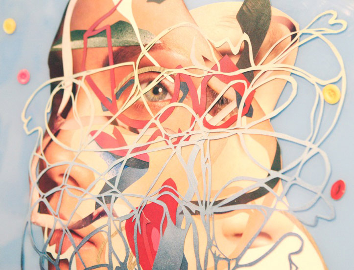
Permabond
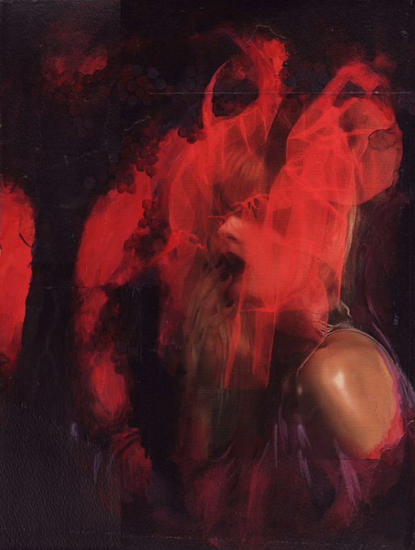
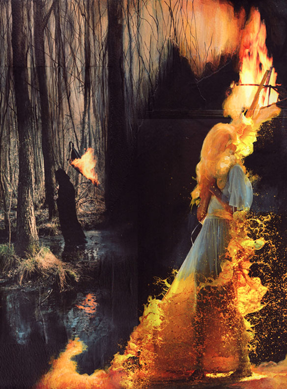
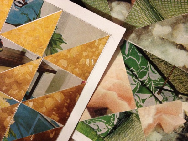
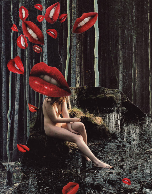
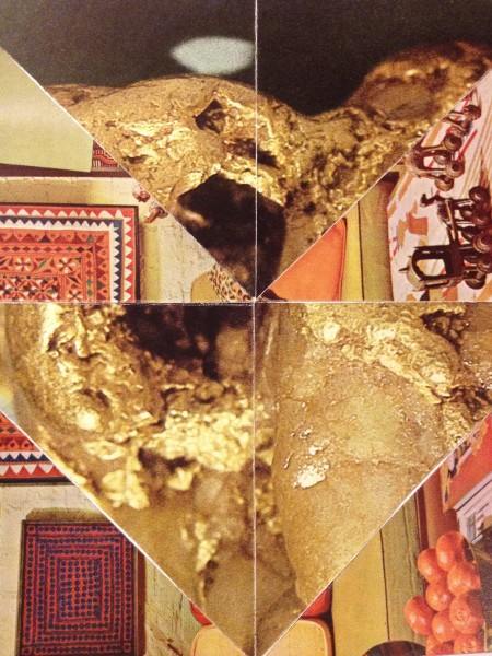
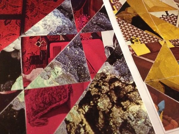
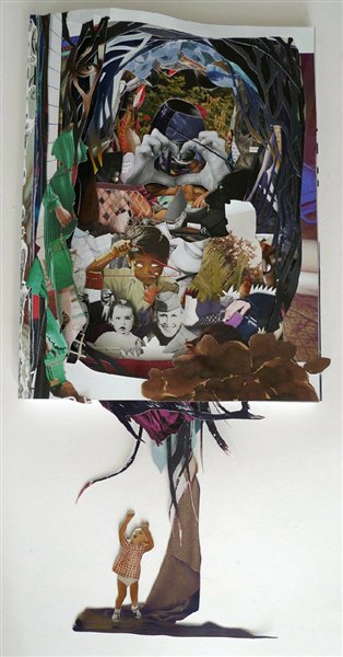
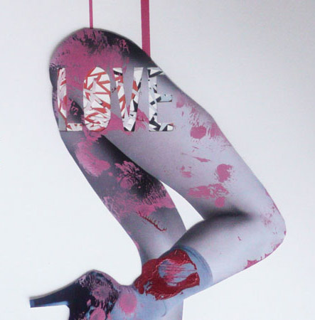
‘You may have visited Fools Foundation, Liz’s gallery and music venue, had your hair done by Sarah at Honey Salon, or seen their band Screature play around town. Liz and Sarah dabble in various mediums and collage is just one of many outlets for these two.’
I loved Fools Foundation – it was in the basement of a building in Sacramento’s midtown and a regular stop whenever I was in the area.
And opening this weekend is Permabond: New work by Liz Donner and Sarah Scherer at Sacramento’s Bows & Arrows.
Details and interview here.
Nostalgia
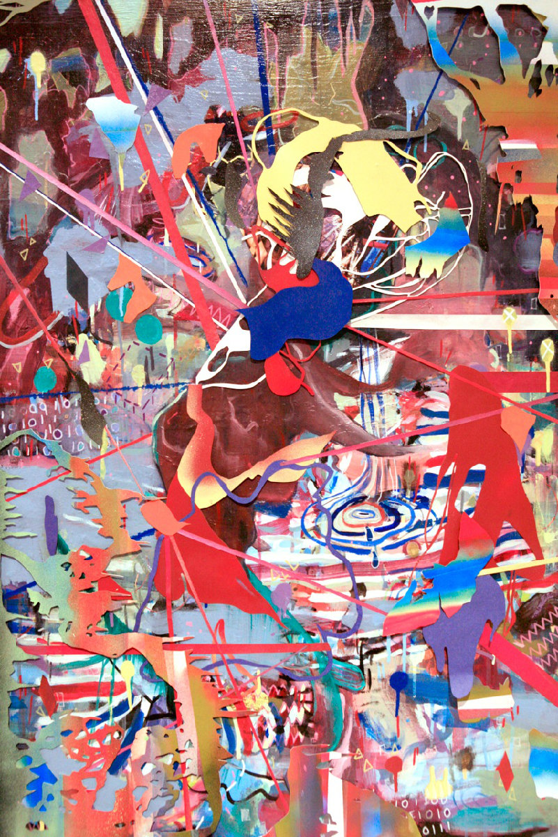
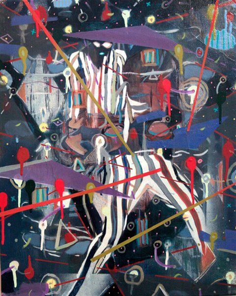
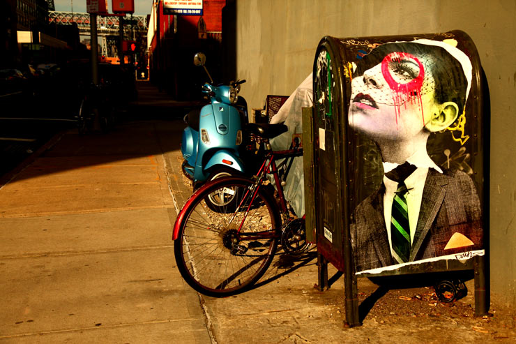
‘Blurring the lines between street art and fine art’
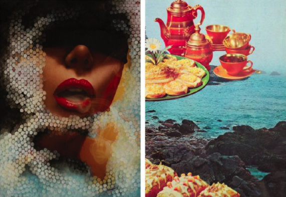
The work of London-based Alex Daw – currently on exhibit as part of Rook & Raven’s Nostalgia.
Website here, blog here, interview here.
Show runs thru February 23, 2012.
Sunrise
JCPamerica

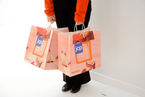
“Every initiative we pursue,’ starting February 1, reads the press release, ‘will be guided by our core value to treat customers as we would like to be treated — fair and square.”
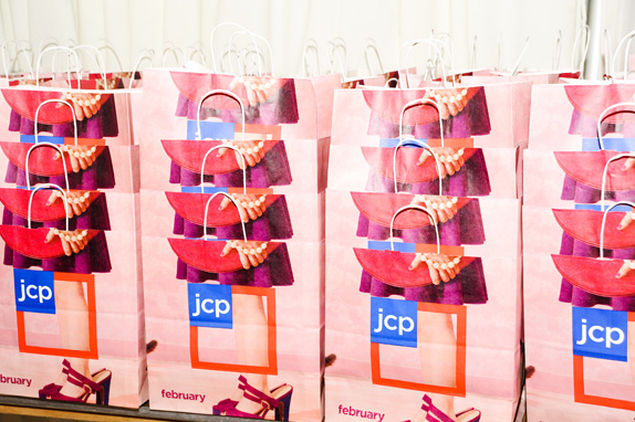
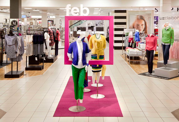
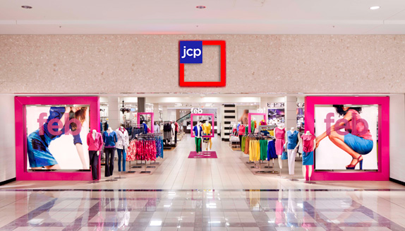
In just under a year, JCPenney rebrands again. Out is Helvetica, in is Gotham. Also in is a whole new approach to store organization and product pricing.
Brand New article here, press release here.
Changes start tomorrow. Bold design move, bold ad campaign.
Historical color
‘Help me Spock!’
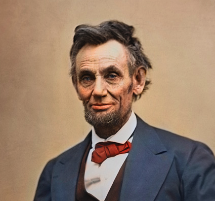
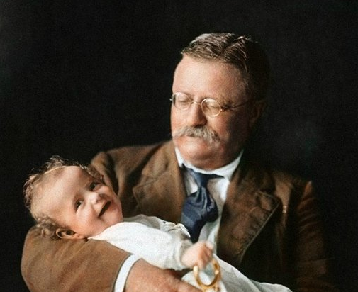
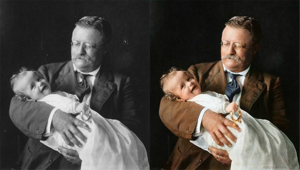
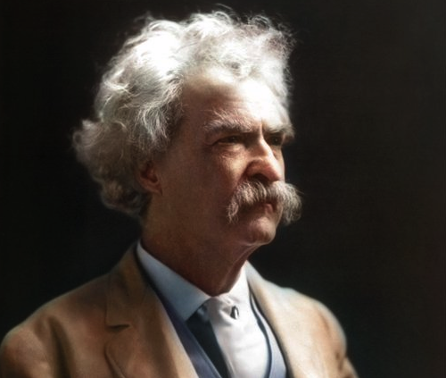
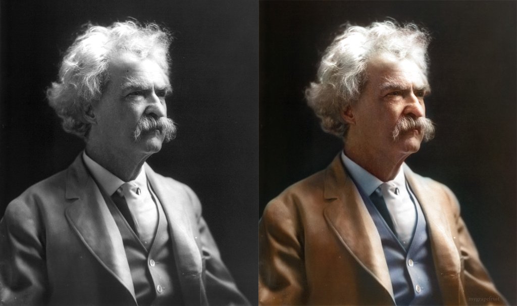
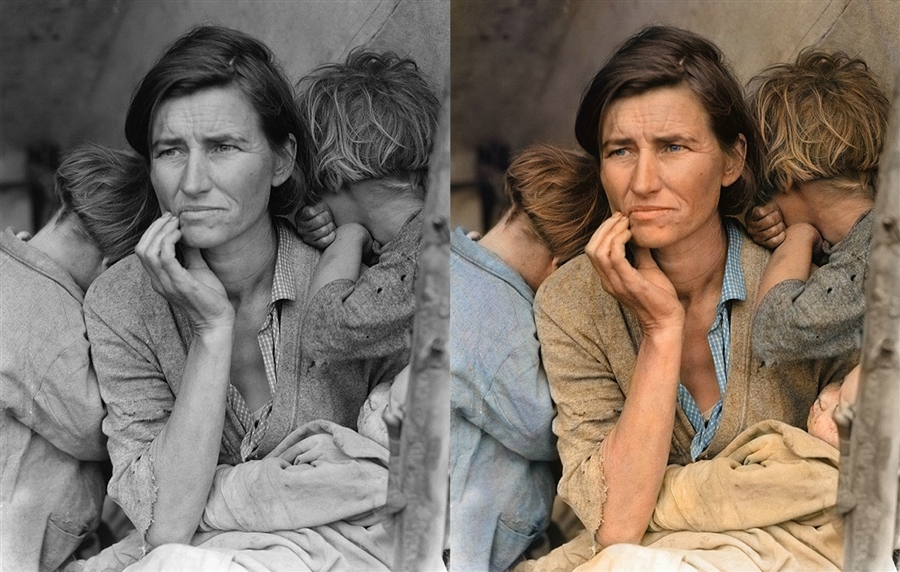
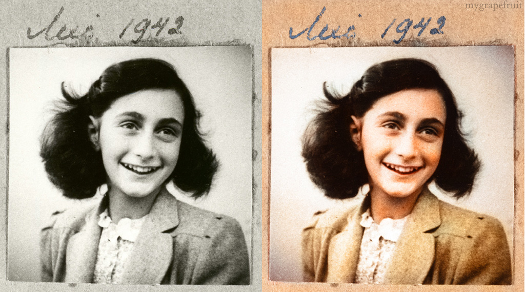
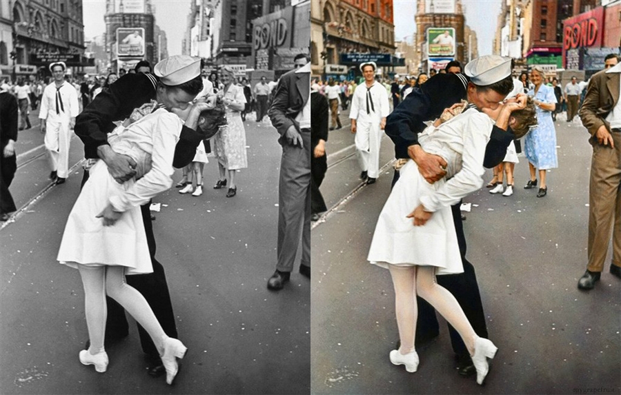
I’ve always wondered what Abraham Lincoln really looked like – beyond the 5-spot engravings, time-worn photographs and the Star Trek episode.
Pictured, the beautifully-detailed (tho controversial) work of Stockhom-based retoucher Sanna Dullaway.
More photos here, deviant art page here.
Found via Eric Whitacre
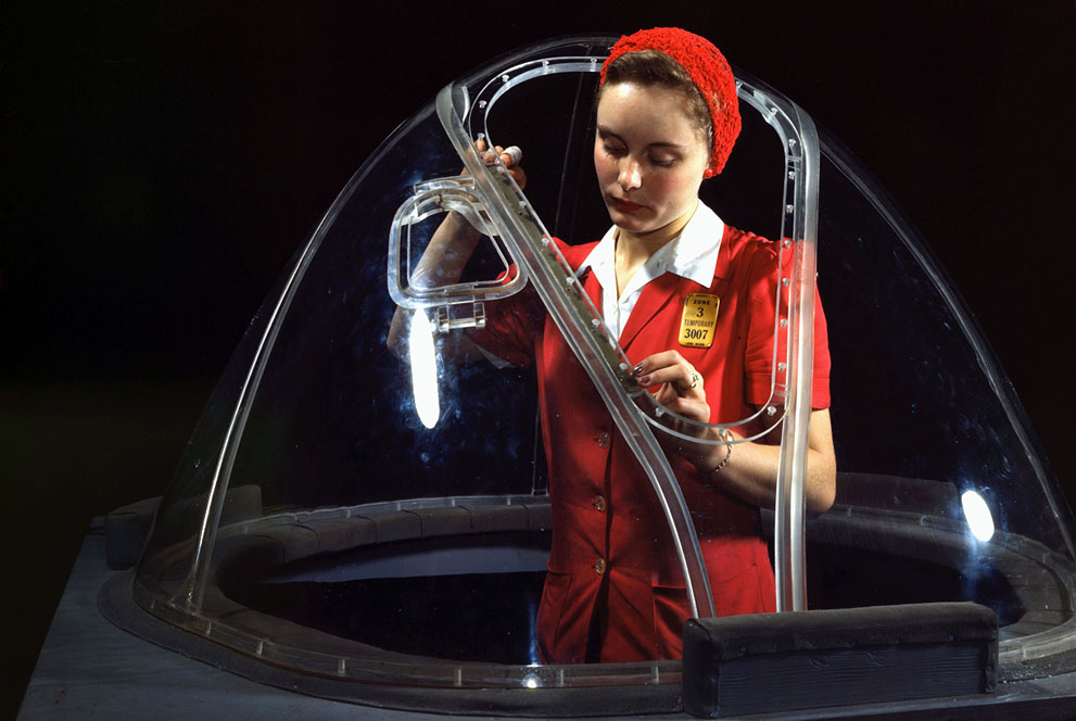
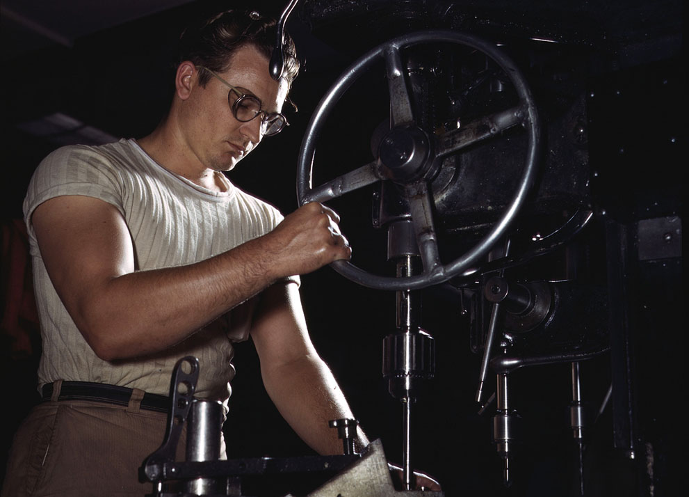
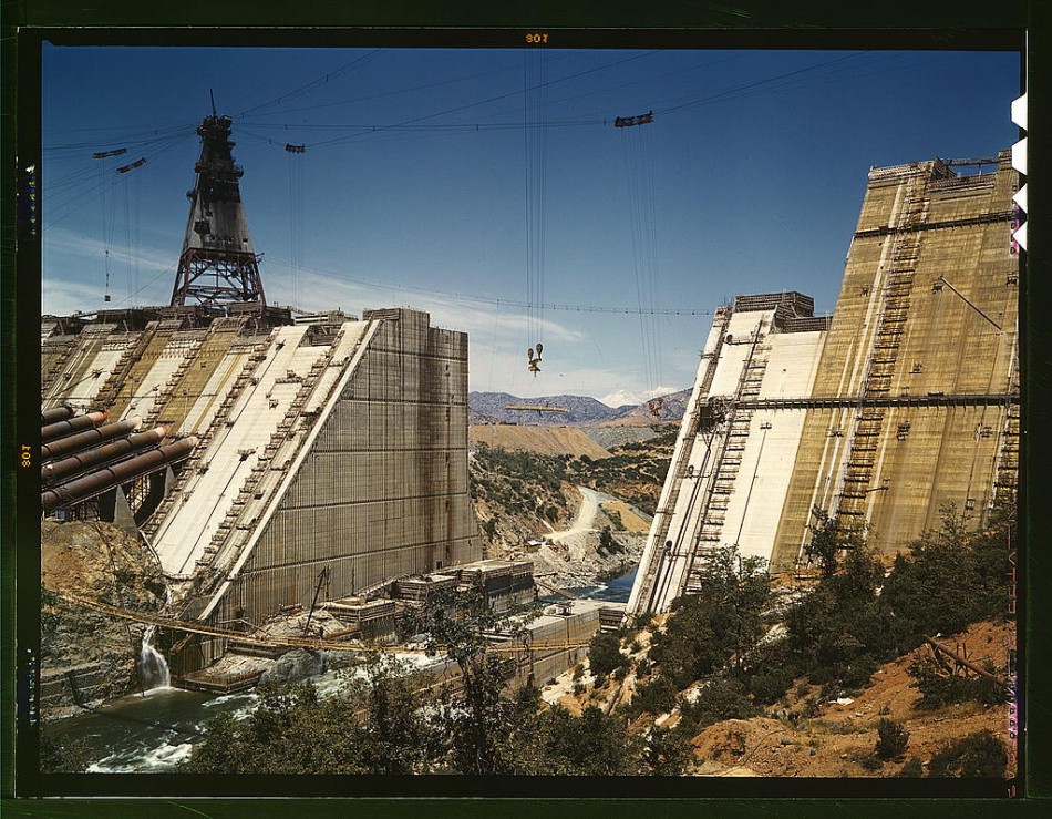
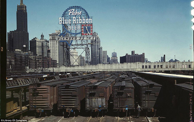
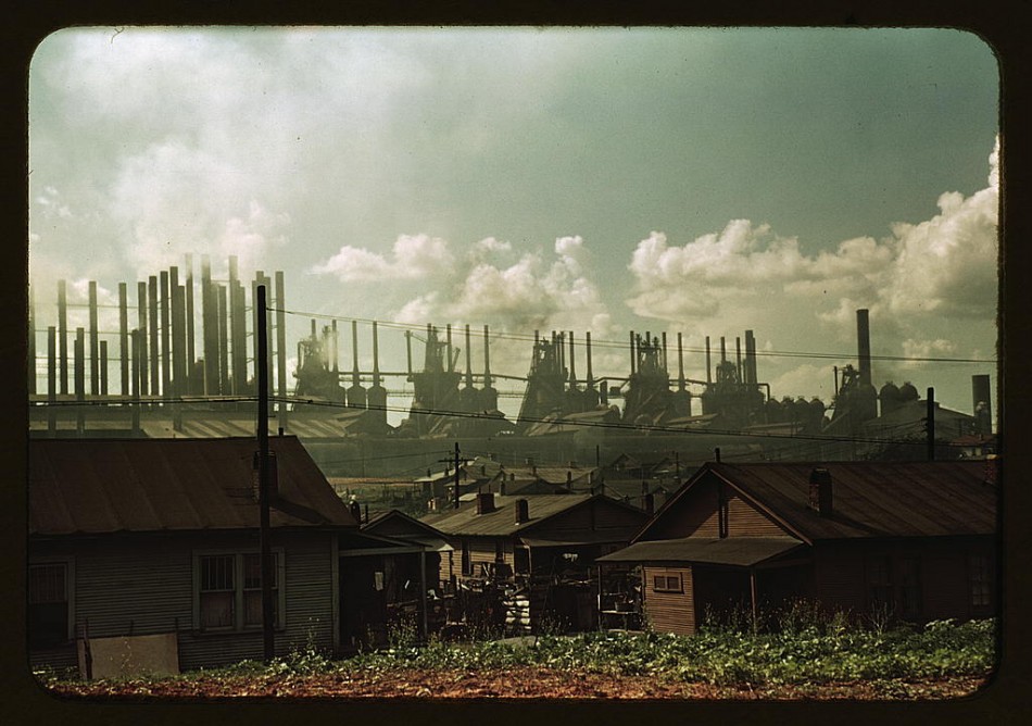
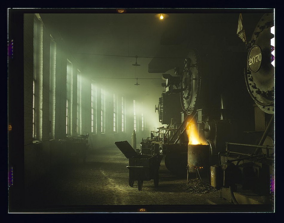
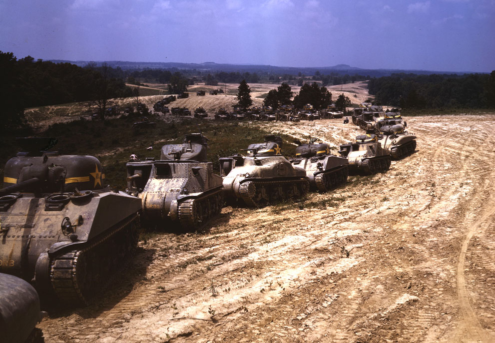
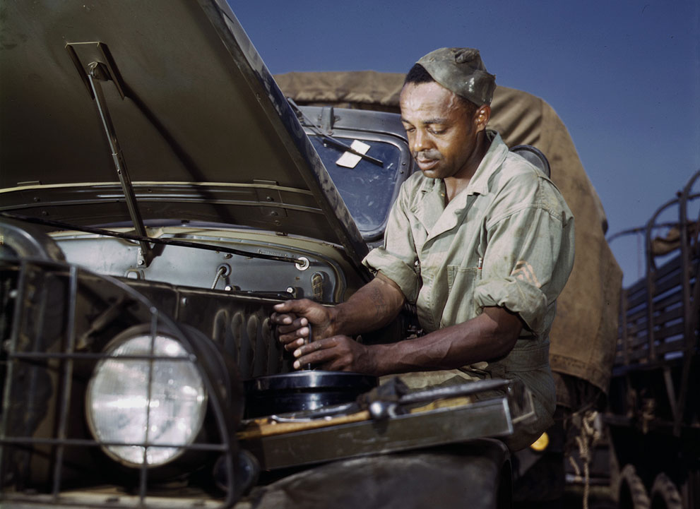
Homefront in color
SF, 1955
‘You’ll see Playland, our oceanside amusement park which was closed in 1972, very rare footage of the SkyTram (an extinct ride over Seal Rocks and Sutro Baths), and a brakescreeching ride down the Crookedest Street in the World.’
From 1955: Color Cinemascope footage of San Francisco by Tullio Pellegrini.
Found via Boing Boing
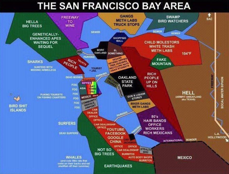
SF Bay Area, the illustrated guide
GGNP and Schwab
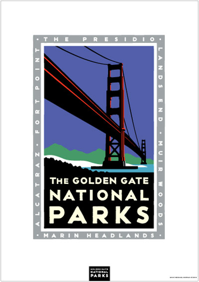
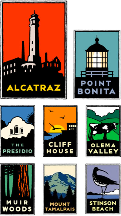
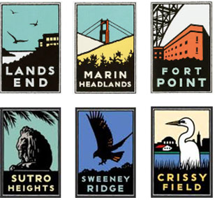
‘The graphic images were an instant success when they premiered in bus shelters around the city. San Franciscans loved them. Too much, in fact, as some of the posters were stolen from the shelters.’
Often copied, Michael Schwab’s posters for Golden Gate National Parks. Brand implementation by Rich Silverstein and Jeff Goodby, circa 1993-7.
Case study here. Parks Conservancy store (Schwab’s art on prints, mugs, shirts, chocolate tins and more) here.
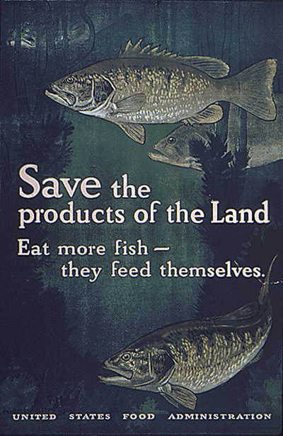
‘Eat more corn, oats and rye products –’
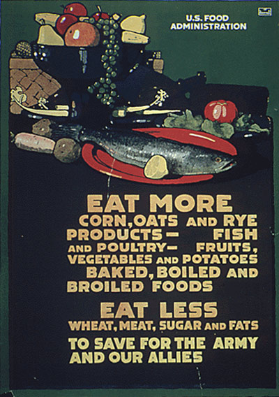
‘This poster was created by L.N. Britton circa 1918. It promotes food and resource conservation.’
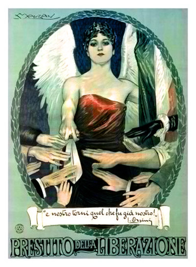
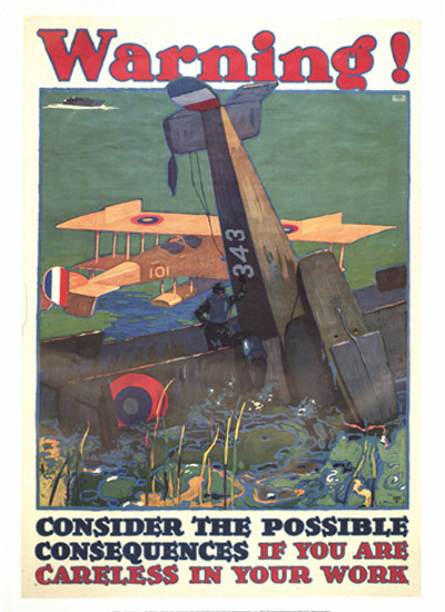
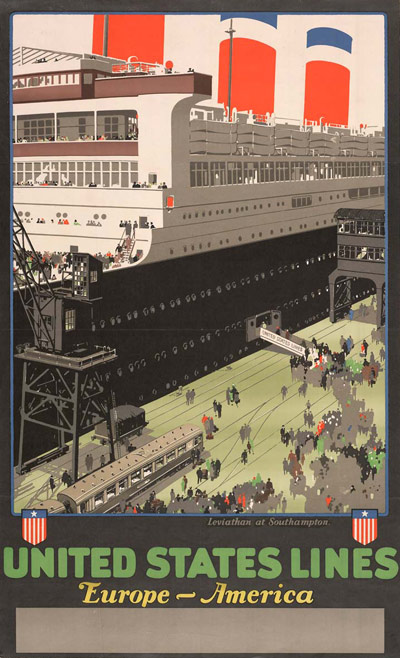
Many years ago I found a small brochure at the National Archives building in San Bruno, CA. From it I ordered a bunch of inexpensive reproductions of early 20s century posters (pictured) – direct from the government. Framed, they looked great in my first apartment.
Everything is now online. All around 10 bucks a pop.
