JCPamerica

“Every initiative we pursue,’ starting February 1, reads the press release, ‘will be guided by our core value to treat customers as we would like to be treated — fair and square.”
In just under a year, JCPenney rebrands again. Out is Helvetica, in is Gotham. Also in is a whole new approach to store organization and product pricing.
Brand New article here, press release here.
Changes start tomorrow. Bold design move, bold ad campaign.


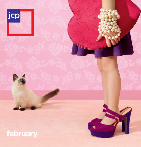
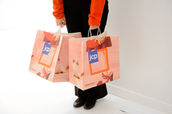
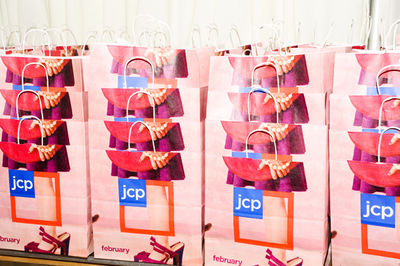
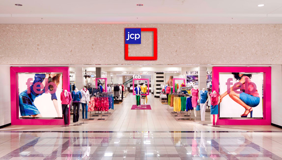
I like the update to Gotham, the rest of the design is weird, and i don’t see it growing on me. Why the pink? and why the little box in the big box?