Eric Gill: The wine
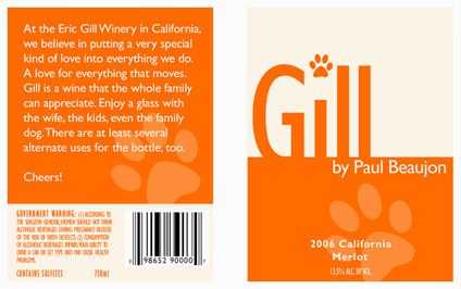
Wine label inspired by the work (and life) of font designer Eric Gill (1882-1940). Student-designed project.
Wine label inspired by the work (and life) of font designer Eric Gill (1882-1940). Student-designed project.
i’m digging all this
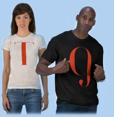
I’ve had these merchandise ideas for a few years and just never got around to building them until recently. Production issues always held me up . . . so did fulfillment, pricing . . . inventory . . . [Read more →]
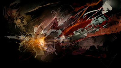
The work of Andrew Jones, found via the Alchemy Gallery
Check out Alchemy, experimental software that merges sound with artwork.
Former student Callista sent the link to me – it’s a similar concept to a ‘glyph’ project students do in my type classes.

The work of Niels Shoe Meulman, via Some Type of Wonderful
This comes up a lot in my type classes. Urban lettering – graffiti – is often practiced by students in my typography courses. The work is typically great, however, where things tend to fall apart is when I’m teaching traditional form, such as script or italic.
As one student put it, “in this class I learned not to be gangsta . . . . ” [Read more →]
![]()
get modern[o]
This is what I’ve been up to for the past year. Instead of plopping down in front of the tee vee, I decided to do something a bit more productive. [Read more →]
This summer I moved a bunch of my fonts over to MyFonts.com. They have a been a great resource for really interesting fonts, many from independents (like myself) that don’t always make it on to mainstream radar – or get lost in very large catalogs.
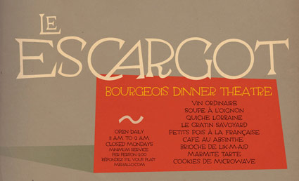
Today I found that one of my newest – Escoffier Capitaux – is profiled in the Fall 2008 edition of In Your Face; written up by Joshua Lurie Terrell, founder of the Typographica blog. See: 1st column, part way down.
I’d love to see it being used in a menu somewhere. I’d been tinkering with it on and off for the past 5 years or so.
Banned from YouTube (really!) this expose by Cheshire Dave is one of my favorite documentaries. Click the image to watch.
+

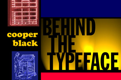
College zine logotype by mehallo, 1985
It was a decorative update from a plain Cooper Black version, which first appeared on the zine in 1980. I made this one using presstype and a little bit of nervous sweat.


the work at the mehallo blog. beta. is licensed under a creative commons attribution - noncommercial - no derivative works 3.0 united states license. if reposting, credit must be given to steve mehallo - and if possible, please provide a link back to the mehallo blog. beta.
i include images for the purpose of critique, review, promotion and inspiration - and always make my best effort give credit/link back to the original source. if i’ve screwed up, please fire me a note.
page layout based on the wordpress 'darkwater theme' by antbag, adapted and redesigned by mehallo. valuable php assistance from bill mead.