entries Tagged as [typography]

Keeping calm, carrying on

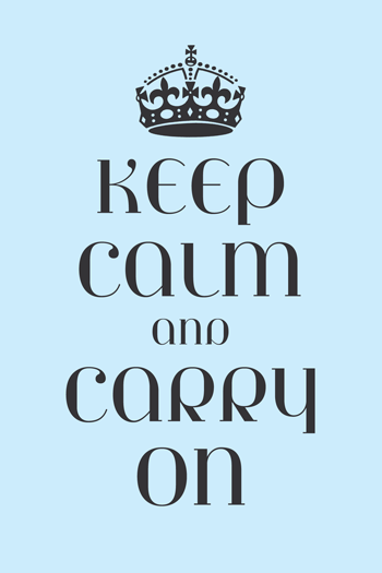
Designer Steven Shearer’s update of the iconic British Keep Calm and Carry On poster – typeset in one of my fonts, Jeanne Moderno. Available now on some nifty Cafe Press items.

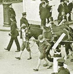
Sort of reminds me of the revisionary 1930s British history portrayed in this version of Shakespeare’s Richard III (1995).

It’s okay, it’s alright, don’t worry


Released just a few days ago: Jackson Cavanaugh’s Alright Sans

Alright Sans is a really nice contemporary update of early 20th century grotesk types. With roots related to the wonderful ATF gothics (which exist today in the form of the Knockout group and Benton Sans), but with a humanist twist. Sixteen styles designed by Jackson Cavanaugh, it can be found at MyFonts here. And it’s on sale right now: 20% off.

Follow Jackson on Twitter here. Visit his foundry, Okay Type & Design here.

Found via Twitter.com/Typegirl

Örjan Nordling’s Dagny, now at FontShop

All about FF Dagny: Evolution of a newspaper type font, interview and post at GarciaMedia.

FF Dagny is now available thru FontShop.

Design exhibitions at the San Francisco Public Library


Calligraphy by Marsha Brady, found via the MyFonts Blog


Kalligraphia 12,
an exhibition of hand-lettered art and calligraphy

Runs thru August 23, 2009


A Trip to the Fair, 1939:
The Golden Gate International Exposition in San Francisco

Runs thru August 23, 2009

Both are the main branch of the San Francisco Public Library, 100 Larkin Street (at Grove), sixth floor, San Francisco, CA 94102 [map]

Details here.

John Downer exhibition in El Lay


John Downer doing his thing, via The FontFeed

An Exhibition of Hand Lettered Posters by John Downer
Opening Reception Thursday, August 13, 2009 from 8 to 11 p.m.

At RESERVE, 420 N. Fairfax Avenue, Los Angeles, CA 90036
(directly across from Canter’s Delicatessen) [map]

Details here.

‘I am type’ – Frederic W. Goudy

‘Of my earliest ancestry neither history nor relics remain  . . . .


Via Typoretum

Lights and type of Reno

Snapped these while in Reno a few weeks back. Love 1950s vernacular typography, I’ve built an entire font family around this.

Drove the guy at the motel front desk crazy with my flash.

A really nice drug dealer tried to sell me his wares.

I’m not being sarcastic, he was really, really nice.

Took me a long moment before I realized what he was up to.

Baby, baby, baby

Baby Baby Baby, Make The Girl Dance, shot in Paris

 
It’s the type that’s sexy.

If it were one of my fonts, that’d made it even sexier.

Make The Girl Dance is Campana & Perrin, aka Greg & Pierre. This is their MySpace page.

Found via Ashley Simko’s blog

Organon: New font superset by Nick Cooke


Organon Sans Family


Organon Serif Family

Robust and playful, Organon is Nick Cook’s new superset type family – now available thru Fontworks UK. Click on the links above to order. Detailed release notes can be also be found in this post at Typophile.

As for the moniker, Nick says, ‘I got the name from the first line of ‘Cloudbusting’ by Kate Bush.’

Found via Twitter.com/typegirl

Coming soon: Typophile Film Fest 5

Typophile Film Fest 5 Trailer from Typophile on Vimeo

Preview for Punchcut’s 5th Typophile Film Fest. Typographic films, shorts and more. Here’s a list of who’s showing.

The Fest is confirmed for Typ09, the 2009 ATypI conference in Mexico City, October 29th. And coming to other places too.

TETRO and typography

Watch this beautiful title sequence for Francis Ford Coppola’s TETRO. Designed by SFAUSTINA. Both avant garde and not at the same time.

And  . . .  I’ve always wondered why so many motion picture title sequences end with a shot of a bus.

Found via Twitter.com/Typegirl


Creative Commons License

the work at the mehallo blog. beta. is licensed under a creative commons attribution - noncommercial - no derivative works 3.0 united states license.  if reposting, credit must be given to steve mehallo - and if possible, please provide a link back to the mehallo blog. beta.

i include images for the purpose of critique, review, promotion and inspiration - and always make my best effort give credit/link back to the original source.  if i’ve screwed up, please fire me a note.

page layout based on the wordpress 'darkwater theme' by antbag, adapted and redesigned by mehallo.  valuable php assistance from bill mead.