entries Tagged as [typography]

The originals

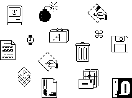
I miss these icons. Susan Kare developed them – and the standard city-named fonts – for the original Apple Macintosh in the early 1980s.

I particularly like the alert message guy in the right corner – a playful bitmapped take that has a similar feel as Oskar Schlemmer’s 1921 bauhaus icon.

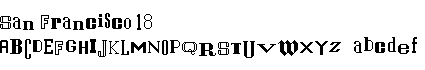
My grungy Alta California font was inspired by Kare’s original San Francisco font; which, unfortunately hasn’t been available on a Macintosh for many years. I have a great respect for her ability to convey so many many different letters within a small 72 dpi black and white space. Unfortunately – thru gratuitous use – San Francisco did sort of become the Comic Sans of its day. Sort of.

Check out Kare’s online store for some fantastic tees and notecards. Rad digital art from a simpler era. An era that didn’t need gradients and drop shadows in order to dazzle.

And drop by the Japan-based Vintage Mac Museum to see some of Kare’s original icons in action.

Lite-Brite blackletter


Lite-Bright typography created by Brooklyn-based GrandArmy

More detail here.


Vintage Lite-Brite commercial

Found via Type Theory

A bit about creativity


Line art by Steve Masseroni

gurus plant ideas
Steve Masseroni is an incredible artist I knew in high school. He was dabbling with working for Marvel Comics at the time, but set out in his own direction. In a afternoon critique in 1985, he gave me his favorite brush and a few tips on being an illustrator. [Read more →]

Type Daily launches

If you’re one who thinks there just aren’t enough font resources worth blogging about, Johno of I Love Typography begs to differ.

His newest endeavor – the Type Daily news aggregator – will embed you in a universe of lettering arts. A one-stop-source for typography, fonts and lettering; just about all the major resources are there.

Pop by and fill that typographic need you know you have.

Movie poster typography


Neville Brody’s New Deal fonts in use, custom designed for Public Enemies

Yves Peters over at The FontFeed gives their monthly roundup of movie poster typography.

New life for dead type

‘These pieces of typography are all unique design objects, why should they be demolished?’ – Aleksi Hautamäki, Character

In Finland, the Character company is salvaging dismantled signage and repurposing the individual letters. Find out more here.

Found via Yatzer

Akzidenz Grotesk and industry

Köln-based graphic designer Tobias Battenberg projects Akzidenz Grotesk (the forerunner of Helvetica) onto industrial surfaces.


Found via Flores en el Atico

Building


Building design by Giulio Cittato
From Basic Typography: Design With Letters (1974) by Ruedi Ruegg

In order for the Swiss International Style to actually work, it needs a sense of drama. Imagine how interesting our industrial zones could have been with this sort of design thinking.

Even more type  . . .


Via design*sponge

Words and Eggs has posted a bunch of cool type images, linking to some really cool design blogs. (Yes, I’ve been in quite the type mood this week – with a little bit more on the way)


Via Typoretum

A font primer: Comic Sans walks into a pub  . . .

Writer Ian Peacock looks at the ‘hidden power of typography

Via the Times of London

Plus, here’s that wonderful Typographics video that’s been bouncing around, produced by Boca and Ryan Uhrich  . . .

The changing ‘faces’ of the web

Typography on the web is about to change dramatically. Several entities are involved. I have a bunch of my fonts about to launch with Typekit.

And here’s a really good rundown by Elliot Jay Stocks, posted on the i love typography blog.


Creative Commons License

the work at the mehallo blog. beta. is licensed under a creative commons attribution - noncommercial - no derivative works 3.0 united states license.  if reposting, credit must be given to steve mehallo - and if possible, please provide a link back to the mehallo blog. beta.

i include images for the purpose of critique, review, promotion and inspiration - and always make my best effort give credit/link back to the original source.  if i’ve screwed up, please fire me a note.

page layout based on the wordpress 'darkwater theme' by antbag, adapted and redesigned by mehallo.  valuable php assistance from bill mead.